Part 2: Statistical Tools and Concepts
How Nature Computes | Statistical Thinking Module 1 | ASTR 596
Learning Outcomes
By the end of Part 2, you will be able to:
Distinguish between correlation and independence in physical systems and identify when each assumption is valid
Apply marginalization to reduce complex high-dimensional problems to tractable calculations
Explain ergodicity and why it enables both MCMC sampling and molecular dynamics simulations
Calculate error propagation through multi-step computations using proper statistical rules
Predict when the Law of Large Numbers ensures statistical reliability in astrophysical systems
Apply Bayesian thinking to update beliefs with data using prior knowledge and likelihood
2.1 Correlation and Independence: When Variables Connect
Priority: 🔴 Essential
Physical intuition: Watch a flock of starlings move through the sky. When one bird turns, nearby birds turn too. Their velocities aren’t independent — they’re correlated. The same thing happens in stellar streams, where stars that were stripped from the same dwarf galaxy move together through space with correlated velocities.
So far, we’ve assumed particle velocities are independent. But what if they’re not? Understanding correlation is crucial for everything from gas dynamics to Gaussian processes.
💻 Computational Demo: Visualizing Correlation
See how correlation affects the joint distribution of variables:
import numpy as np
import matplotlib.pyplot as plt

# Generate correlated velocities with different correlation strengths
fig, axes = plt.subplots(2, 3, figsize=(12, 8))
correlations = [0, 0.3, 0.6, 0.9, -0.5, -0.9]

for idx, rho in enumerate(correlations):
    ax = axes[idx // 3, idx % 3]

    # Generate correlated data using covariance matrix
    mean = [0, 0]
    cov = [[1, rho], [rho, 1]]  # correlation matrix with variance 1
    vx, vy = np.random.multivariate_normal(mean, cov, 1000).T

    # Convert to physical units (km/s for stellar velocities)
    vx = vx * 50  # velocity dispersion ~50 km/s
    vy = vy * 50

    # Plot scatter
    scatter = ax.scatter(vx, vy, alpha=0.5, s=10, c=np.sqrt(vx**2 + vy**2), cmap='viridis')
    ax.set_title(f'ρ = {rho}')
    ax.set_xlabel('vx (km/s)')
    ax.set_ylabel('vy (km/s)')
    ax.set_aspect('equal')
    ax.grid(True, alpha=0.3)

    # Add best-fit line to show correlation
    if abs(rho) > 0.3:
        z = np.polyfit(vx, vy, 1)
        p = np.poly1d(z)
        x_line = np.linspace(vx.min(), vx.max(), 100)
        ax.plot(x_line, p(x_line), "r--", alpha=0.5, lw=2)

    # Add text box with statistics
    measured_corr = np.corrcoef(vx, vy)[0,1]
    text_str = f'Measured: {measured_corr:.2f}'
    ax.text(0.05, 0.95, text_str, transform=ax.transAxes,
            verticalalignment='top', bbox=dict(boxstyle='round', facecolor='wheat', alpha=0.5))

plt.suptitle('How Correlation Shapes Velocity Distributions', fontsize=14)
plt.tight_layout()
plt.show()

# Show how correlation affects the velocity ellipsoid
print("Effect of correlation on velocity ellipsoid:")
print("-" * 50)
for rho in [0, 0.5, 0.9]:
    cov = [[1, rho], [rho, 1]]
    eigenvalues, eigenvectors = np.linalg.eig(cov)
    print(f"ρ = {rho}:")
    print(f"  Principal axes ratios: {eigenvalues[0]:.2f} : {eigenvalues[1]:.2f}")
    print(f"  Ellipse rotation angle: {np.degrees(np.arctan2(eigenvectors[1,0], eigenvectors[0,0])):.1f} degrees")
Key insights:
: Circular distribution (isotropic velocities)
: Elliptical, tilted toward positive correlation
: Elliptical, tilted toward negative correlation
: Distribution collapses toward a line
Physical examples of correlation:
Ideal gas: Particle velocities are independent
Pressure tensor is diagonal:
No shear stress, no viscosity
Stellar streams: Velocities are correlated
Stars moving together have correlated velocities
Off-diagonal pressure terms represent streaming motion
Turbulence: Strong velocity correlations
Eddies create correlated motion
Kolmogorov spectrum from correlation functions
Why correlation matters for your projects:
Project 2 (N-body): Initially uncorrelated velocities become correlated through gravity
Stars in the same cluster develop correlated orbits
Tidal streams show strong velocity correlations
Project 4 (MCMC): Autocorrelation determines effective sample size
High correlation = slow exploration
Need to account for correlation in error estimates
Effective sample size: where τ is autocorrelation time
Project 5 (Gaussian Processes): Entire method based on correlation!
Covariance kernel defines correlation between points
Predictions use correlations to interpolate
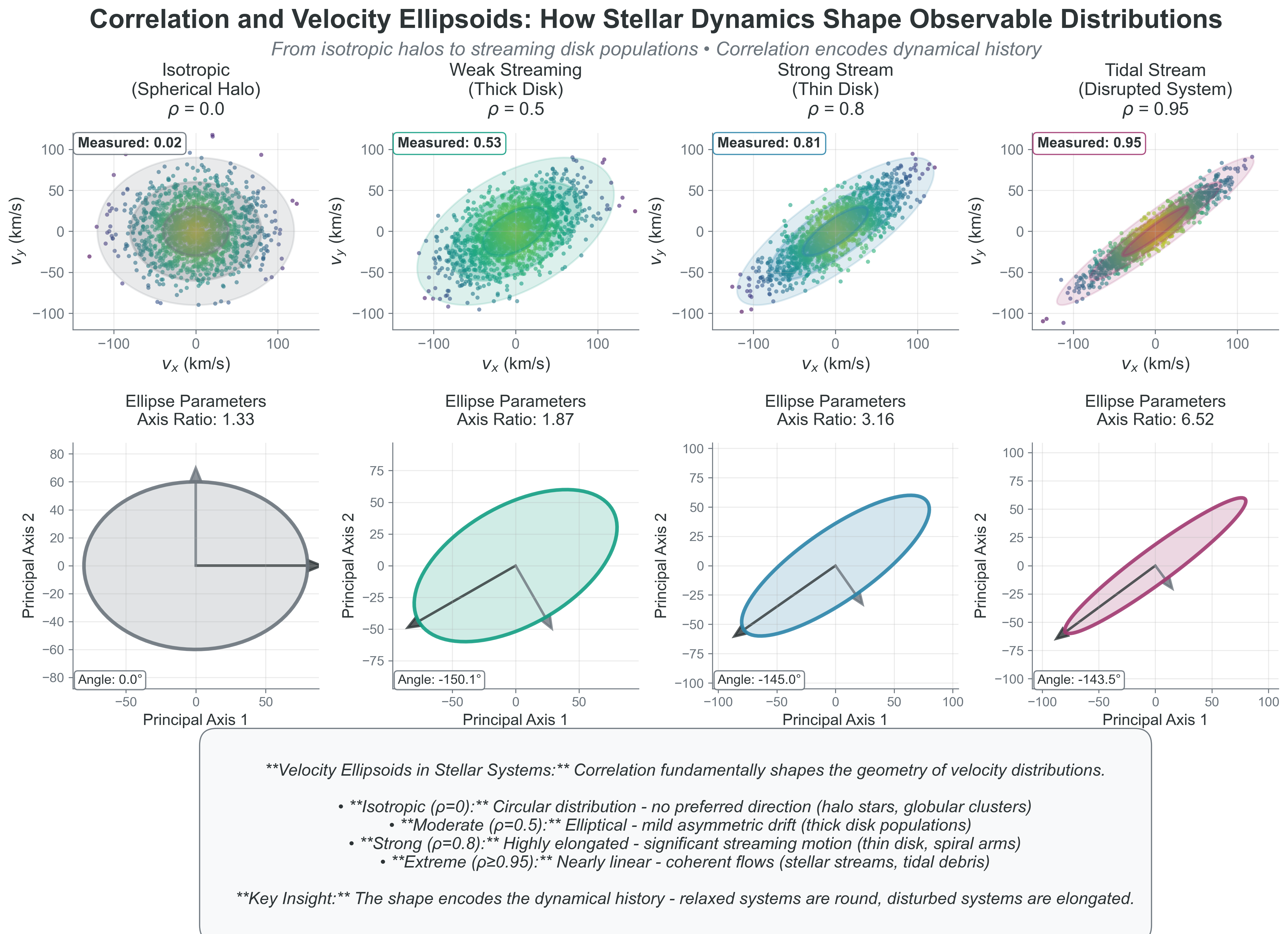
Figure 1:Correlation and Velocity Ellipsoids: How Stellar Dynamics Shape Observable Distributions. This comprehensive demonstration shows how correlation fundamentally shapes velocity distributions in stellar systems, directly connecting statistical concepts to observable astrophysics. Top row: Stellar velocity scatter plots across different dynamical environments, from isotropic spherical halos (ρ=0.0) through increasingly correlated systems representing thick disk (ρ=0.5), thin disk (ρ=0.8), and tidal stream populations (ρ=0.95). Each panel shows 1,500 synthetic stars with speeds color-coded (darker = faster) and confidence ellipsoids (1σ, 2σ, 3σ) revealing the characteristic elliptical structure that emerges from correlation. Bottom row: Principal component analysis of the same systems shows the underlying elliptical geometry explicitly, with major and minor axes proportional to the eigenvalues of the covariance matrix. As correlation increases, the axis ratio grows from 1.33 (nearly circular) to 6.52 (highly elongated), while the orientation encodes the preferred direction of streaming motion. The progression from ρ=0 → 0.95 represents the evolution from relaxed systems (globular clusters, stellar halos) to dynamically young or disturbed populations (stellar streams, spiral arm features). This figure illustrates why velocity ellipsoids are fundamental tools in galactic archaeology - the shape directly encodes the dynamical history and current state of stellar populations, making correlation a powerful diagnostic of astrophysical processes.
The key insight: Independence makes problems tractable (can multiply probabilities). Correlation makes problems realistic (real systems have relationships). Understanding when to assume independence and when to model correlation is crucial for both physics and ML.
2.2 Marginalization: The Art of Ignoring
Priority: 🔴 Essential
Physical intuition: Imagine a 3D sculpture casting a shadow on a wall. The 2D shadow is a marginalization of the 3D object—you’ve integrated out the depth dimension. Similarly, when we observe stellar velocities along the line of sight, we’re seeing a marginalization of the full 3D velocity distribution.
We have velocities in 3D but often need just speeds. We know positions and velocities but only care about energy. How do we extract what matters? Through marginalization—integrating out unwanted variables.
The mathematical operation:
“Sum over all possible values of what you don’t care about.”
💻 Computational Demo: Marginalization in Action
Watch how we go from 2D joint distributions to 1D marginal distributions:
import numpy as np
import matplotlib.pyplot as plt
from scipy import stats

# Create a 2D joint distribution (correlated Gaussian)
mean = [2, 3]
cov = [[1, 0.7], [0.7, 2]]
rv = stats.multivariate_normal(mean, cov)

# Create grid for visualization
x = np.linspace(-2, 6, 100)
y = np.linspace(-2, 8, 100)
X, Y = np.meshgrid(x, y)
pos = np.dstack((X, Y))
Z = rv.pdf(pos)

# Setup figure
fig = plt.figure(figsize=(12, 8))
gs = fig.add_gridspec(3, 3, width_ratios=[2, 1, 0.5], height_ratios=[1, 2, 0.5])

# Main 2D distribution
ax_joint = fig.add_subplot(gs[1, 0])
contour = ax_joint.contourf(X, Y, Z, levels=20, cmap='viridis')
ax_joint.set_xlabel('X (e.g., velocity_x)')
ax_joint.set_ylabel('Y (e.g., velocity_y)')
ax_joint.set_title('Joint Distribution P(X,Y)')

# Marginal distribution for X (top)
ax_margx = fig.add_subplot(gs[0, 0], sharex=ax_joint)
marginal_x = np.trapz(Z, y, axis=0)  # Integrate over y
marginal_x = marginal_x / np.trapz(marginal_x, x)  # Normalize
ax_margx.plot(x, marginal_x, 'b-', lw=2)
ax_margx.fill_between(x, marginal_x, alpha=0.3)
ax_margx.set_ylabel('P(X)')
ax_margx.set_title('Marginal P(X) = ∫P(X,Y)dY')
plt.setp(ax_margx.get_xticklabels(), visible=False)

# Marginal distribution for Y (right)
ax_margy = fig.add_subplot(gs[1, 1], sharey=ax_joint)
marginal_y = np.trapz(Z, x, axis=1)  # Integrate over x
marginal_y = marginal_y / np.trapz(marginal_y, y)  # Normalize
ax_margy.plot(marginal_y, y, 'r-', lw=2)
ax_margy.fill_betweenx(y, marginal_y, alpha=0.3)
ax_margy.set_xlabel('P(Y)')
ax_margy.set_title('P(Y) = ∫P(X,Y)dX')
plt.setp(ax_margy.get_yticklabels(), visible=False)

# Add colorbar
ax_cb = fig.add_subplot(gs[1, 2])
plt.colorbar(contour, cax=ax_cb, label='Probability Density')

# Add text explanation
ax_text = fig.add_subplot(gs[2, :])
ax_text.axis('off')
ax_text.text(0.5, 0.5,
             'Marginalization: To get P(X), integrate out Y. To get P(Y), integrate out X.\n' +
             'Physical example: Observing only radial velocity (1D) from 3D velocity distribution.',
             ha='center', va='center', fontsize=12, bbox=dict(boxstyle='round', facecolor='wheat'))

plt.suptitle('Marginalization: From Joint to Marginal Distributions', fontsize=14)
plt.tight_layout()
plt.show()

# Quantitative analysis
print("Statistics of the distributions:")
print("-" * 50)
print(f"Joint distribution mode: X={mean[0]:.1f}, Y={mean[1]:.1f}")
print(f"Marginal X: mean={np.trapz(x*marginal_x, x):.2f}, std={np.sqrt(np.trapz((x-mean[0])**2*marginal_x, x)):.2f}")
print(f"Marginal Y: mean={np.trapz(y*marginal_y, y):.2f}, std={np.sqrt(np.trapz((y-mean[1])**2*marginal_y, y)):.2f}")
Example: From 3D velocities to 1D speeds
Starting with Maxwell-Boltzmann in 3D:
To get speed distribution, integrate over all directions:
📝 Step-by-Step: Where the factor comes from
To marginalize from velocity vectors to speeds, we integrate over all directions:
Convert to spherical coordinates:
The Jacobian:
Integrate over angles:
Since f only depends on v (isotropic):
The factor has a geometric meaning: It’s the surface area of a spherical shell in velocity space. There are more ways to have large speeds than small speeds—more directions point to the same speed magnitude!
This is why the Maxwell speed distribution peaks at non-zero velocity even though the velocity distribution (for each component) peaks at zero.
Marginalization appears everywhere:
| Context | Marginalizing Over | To Get |
|---|---|---|
| Bayesian inference | Nuisance parameters | Posterior of interest |
| Gaussian Processes | Unobserved points | Predictions at test points |
| Statistical mechanics | Microscopic details | Macroscopic observables |
| Neural networks | Hidden layers | Output predictions |
| Image processing | Noise dimensions | Clean signal |
The profound pattern: Complex high-dimensional problem → Marginalize → Simple low-dimensional answer
This is how we go from 1057 particle coordinates to 4 stellar structure equations!
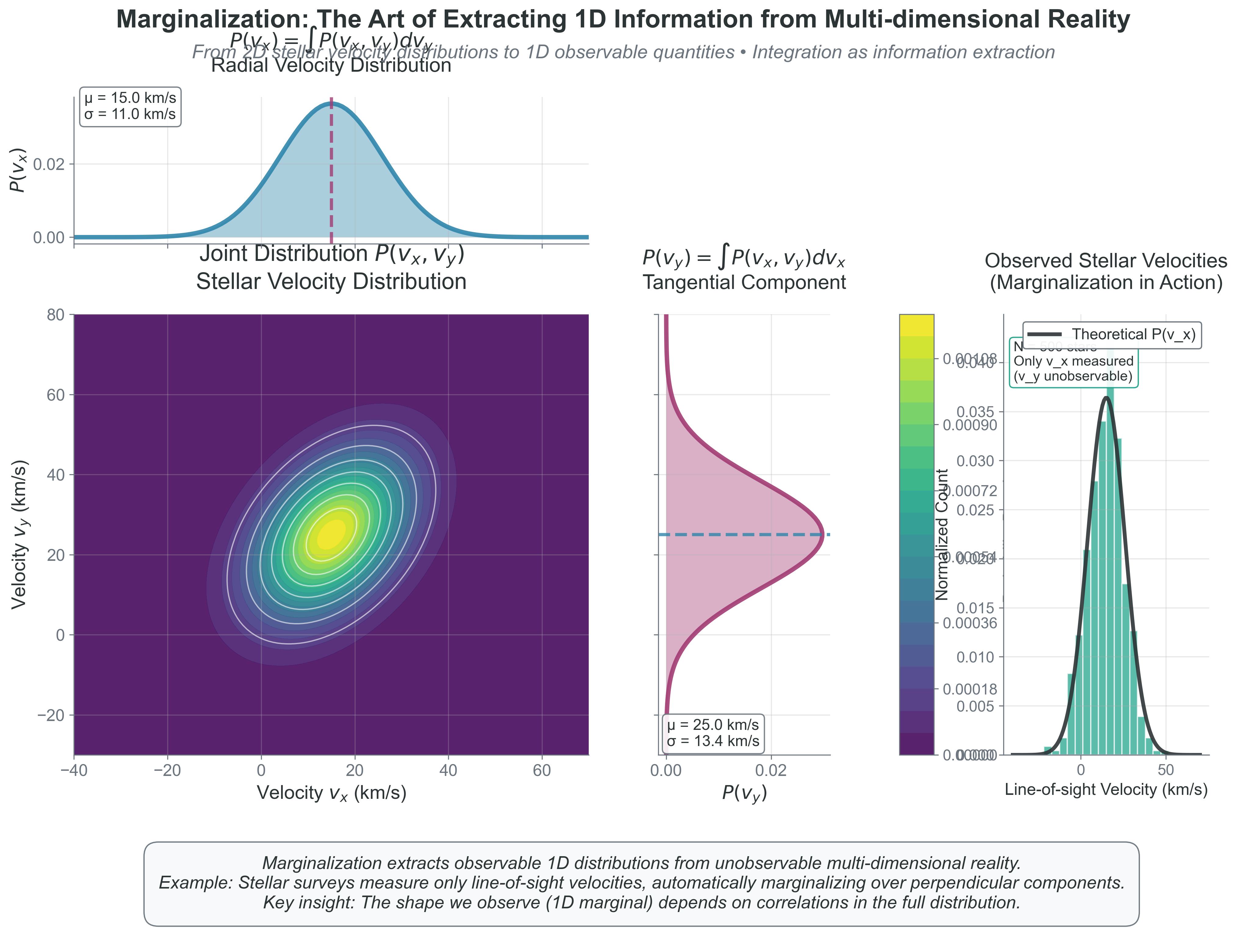
Figure 2:Marginalization: The Art of Extracting 1D Information from Multi-dimensional Reality. This comprehensive demonstration reveals how we extract observable quantities from complex multi-dimensional distributions using integration. Center-left: Joint stellar velocity distribution shows correlated velocities (ρ = 0.41) representing streaming motion in a stellar system, with contours indicating probability density levels and realistic velocity scales (km/s). Top: Radial velocity marginal (blue) shows the distribution we’d observe through spectroscopy - extracting line-of-sight velocities by integrating over unobservable perpendicular components, with mean 15.0 km/s and dispersion 11.0 km/s. Right: Tangential velocity marginal (rose) represents proper motion measurements, showing different statistics (mean 25.0 km/s, dispersion 13.4 km/s) due to the correlation structure. Far-right: Observational reality shows 500 synthetic stellar measurements where only line-of-sight velocities are observable (teal histogram), perfectly matching the theoretical marginal (dark curve), demonstrating that what we measure is mathematically the marginal of what actually exists. This illustrates the profound principle underlying all astrophysics: observations are marginalizations of higher-dimensional reality, and understanding the relationship between the full distribution and its marginals is essential for interpreting data correctly.
2.3 Ergodicity: When Time Equals Ensemble
Priority: 🔴 Essential
Physical intuition: Drop a blob of cream into your coffee. At first, it stays localized. But as you stir (or just wait), the cream explores the entire cup. Eventually, any small region has the same cream concentration as the time-average. This is ergodicity—one particle’s journey through time tells you about all possible states.
You measure the pressure of a gas over time. You also calculate the ensemble average over all possible microstates. Remarkably, these give the same answer. This is ergodicity — one of the deepest principles in statistical mechanics.
💻 Computational Demo: Ergodic vs Non-Ergodic Systems
See the difference between ergodic and non-ergodic behavior:
import numpy as np
import matplotlib.pyplot as plt

# Simulate two systems: ergodic and non-ergodic
fig, axes = plt.subplots(2, 3, figsize=(14, 8))

# System 1: Ergodic (particle explores all of phase space)
t = np.linspace(0, 100, 10000)
# Quasi-periodic motion that fills phase space
x_ergodic = np.sin(t) + 0.3*np.sin(np.sqrt(2)*t) + 0.2*np.sin(np.sqrt(5)*t)
v_ergodic = np.cos(t) + 0.3*np.cos(np.sqrt(2)*t) + 0.2*np.cos(np.sqrt(5)*t)

# System 2: Non-ergodic (particle stuck in one region)
x_nonergodic = np.sin(t)
v_nonergodic = np.cos(t)

# Plot trajectories in phase space
axes[0, 0].plot(x_ergodic[:1000], v_ergodic[:1000], 'b-', alpha=0.5, lw=0.5)
axes[0, 0].set_title('Ergodic: Early time (t<10)')
axes[0, 0].set_xlabel('Position')
axes[0, 0].set_ylabel('Velocity')

axes[0, 1].plot(x_ergodic[:5000], v_ergodic[:5000], 'b-', alpha=0.3, lw=0.5)
axes[0, 1].set_title('Ergodic: Medium time (t<50)')
axes[0, 1].set_xlabel('Position')

axes[0, 2].plot(x_ergodic, v_ergodic, 'b-', alpha=0.2, lw=0.5)
axes[0, 2].set_title('Ergodic: Long time (t<100)\nFills phase space!')
axes[0, 2].set_xlabel('Position')

# Non-ergodic
axes[1, 0].plot(x_nonergodic[:1000], v_nonergodic[:1000], 'r-', alpha=0.5, lw=0.5)
axes[1, 0].set_title('Non-ergodic: Early time')
axes[1, 0].set_xlabel('Position')
axes[1, 0].set_ylabel('Velocity')

axes[1, 1].plot(x_nonergodic[:5000], v_nonergodic[:5000], 'r-', alpha=0.5, lw=0.5)
axes[1, 1].set_title('Non-ergodic: Medium time')
axes[1, 1].set_xlabel('Position')

axes[1, 2].plot(x_nonergodic, v_nonergodic, 'r-', alpha=0.5, lw=0.5)
axes[1, 2].set_title('Non-ergodic: Long time\nStuck on one trajectory!')
axes[1, 2].set_xlabel('Position')

# Set consistent axes
for ax in axes.flat:
    ax.set_xlim(-2, 2)
    ax.set_ylim(-2, 2)
    ax.grid(True, alpha=0.3)
    ax.set_aspect('equal')

plt.suptitle('Ergodic vs Non-Ergodic Systems in Phase Space', fontsize=14)
plt.tight_layout()
plt.show()

# Demonstrate time average = ensemble average for ergodic system
print("Checking ergodicity: Time average vs Ensemble average")
print("-" * 50)

# Time average of x^2
time_avg = np.mean(x_ergodic**2)

# "Ensemble" average (sample many initial conditions)
np.random.seed(42)
ensemble_values = []
for i in range(1000):
    phase = np.random.uniform(0, 2*np.pi)
    x_sample = np.sin(t[0] + phase) + 0.3*np.sin(np.sqrt(2)*t[0] + phase) + 0.2*np.sin(np.sqrt(5)*t[0] + phase)
    ensemble_values.append(x_sample**2)
ensemble_avg = np.mean(ensemble_values)

print(f"Ergodic system:")
print(f"  Time average of x²: {time_avg:.3f}")
print(f"  Ensemble average of x²: {ensemble_avg:.3f}")
print(f"  Difference: {abs(time_avg - ensemble_avg):.4f} ← Should be small!")

# For non-ergodic, they differ
time_avg_non = np.mean(x_nonergodic**2)
print(f"\nNon-ergodic system:")
print(f"  Time average of x²: {time_avg_non:.3f}")
print(f"  Would need multiple trajectories to get true ensemble average")
Why ergodicity matters:
For physics: We can’t measure ensemble averages directly (need all possible microstates). But we can measure time averages! Ergodicity says they’re the same.
For MCMC (Project 4): Your Markov chain explores parameter space over “time” (iterations). Ergodicity guarantees:
Chain average → true posterior expectation
One long chain equivalent to many independent samples
Burn-in = waiting for ergodic exploration to begin
For molecular dynamics: Simulate one system over time instead of many systems at once
When ergodicity fails:
Glasses: Stuck in local configuration (non-ergodic)
Broken symmetry: System can’t access all states
Isolated systems: No mixing between regions
The profound connection: Ergodicity links:
Theoretical (ensemble averages)
Computational (time evolution)
Experimental (time measurements)
All give the same answer for ergodic systems!
When Can We Assume Ergodicity?
Key diagnostic questions:
Mixing time vs. observation time: Is τ_mix << τ_obs?
Phase space connectivity: Can the system reach all allowed states?
Energy barriers: Are there insurmountable barriers between regions?
Practical examples:
Gas molecules: τ_mix ~ 10⁻⁹ s, τ_obs ~ seconds → ERGODIC
Protein folding: τ_mix ~ milliseconds, but can get stuck in local minima → SOMETIMES NON-ERGODIC
MCMC chains: Must run long enough that τ_mix << chain length → BECOMES ERGODIC AFTER BURN-IN
The MCMC connection (crucial for Project 4): Your Markov chain starts non-ergodic (stuck near initial guess) and becomes ergodic after burn-in. The autocorrelation time τ tells you how many steps needed between independent samples. This is why we:
Discard burn-in samples (pre-ergodic)
Thin chains by τ (ensure independence)
Run multiple chains (test ergodicity via R̂ statistic)
2.4 The Law of Large Numbers: Why Statistics Works
Priority: 🔴 Essential
All these statistical principles work because of a mathematical miracle: as , randomness vanishes.
The Law of Large Numbers (LLN): For independent random variables, the relative fluctuation scales as:
💻 Computational Demo: Watching Fluctuations Vanish
See how increasing N makes averages more stable:
import numpy as np
import matplotlib.pyplot as plt

# Demonstrate convergence with increasing N
fig, axes = plt.subplots(2, 2, figsize=(12, 8))

# Different N values to test
N_values = [10, 100, 1000, 10000, 100000]
colors = ['red', 'orange', 'yellow', 'green', 'blue']

# Top left: Show sample averages for different N
ax = axes[0, 0]
for N, color in zip(N_values, colors):
    # Generate many realizations
    n_realizations = 1000
    averages = []
    for _ in range(n_realizations):
        sample = np.random.normal(0, 1, N)
        averages.append(np.mean(sample))

    # Plot distribution of averages
    bins = np.linspace(-1, 1, 50)
    ax.hist(averages, bins=bins, alpha=0.5, label=f'N={N}', color=color, density=True)

ax.set_xlabel('Sample Average')
ax.set_ylabel('Probability Density')
ax.set_title('Distribution of Averages Narrows with N')
ax.legend()
ax.set_xlim(-1, 1)

# Top right: Log-log plot of standard deviation vs N
ax = axes[0, 1]
N_range = np.logspace(1, 6, 50, dtype=int)
std_devs = []

for N in N_range:
    # Calculate standard deviation of the mean
    n_trials = 100
    means = [np.mean(np.random.normal(0, 1, N)) for _ in range(n_trials)]
    std_devs.append(np.std(means))

ax.loglog(N_range, std_devs, 'bo-', alpha=0.5, label='Measured')
ax.loglog(N_range, 1/np.sqrt(N_range), 'r--', lw=2, label=r'$1/\sqrt{N}$ theory')
ax.set_xlabel('Number of Samples (N)')
ax.set_ylabel('Standard Deviation of Mean')
ax.set_title(r'Universal $1/\sqrt{N}$ Scaling')
ax.legend()
ax.grid(True, alpha=0.3)

# Bottom left: Convergence visualization
ax = axes[1, 0]
N_max = 10000
running_avg = np.cumsum(np.random.normal(0, 1, N_max)) / np.arange(1, N_max+1)
running_std = 1/np.sqrt(np.arange(1, N_max+1))

ax.plot(running_avg, 'b-', alpha=0.7, label='Running average')
ax.fill_between(range(N_max), running_std, -running_std, alpha=0.3, color='red', label='±1σ bounds')
ax.set_xlabel('Number of Samples')
ax.set_ylabel('Running Average')
ax.set_title('Convergence to True Mean (0)')
ax.set_xlim(0, N_max)
ax.legend()

# Bottom right: Physical scales
ax = axes[1, 1]
scales = ['Small box\n(N~100)', 'Room\n(N~10²⁶)', 'Star\n(N~10⁵⁷)', 'Galaxy\n(N~10⁶⁸)']
N_phys = [100, 1e26, 1e57, 1e68]
fluctuations = [1/np.sqrt(N) for N in N_phys]

bars = ax.bar(scales, fluctuations, color=['red', 'orange', 'green', 'blue'])
ax.set_ylabel('Relative Fluctuation')
ax.set_yscale('log')
ax.set_title('Why Macroscopic Physics is Stable')
ax.set_ylim(1e-35, 1)

# Add annotations
for bar, fluct in zip(bars, fluctuations):
    height = bar.get_height()
    ax.text(bar.get_x() + bar.get_width()/2., height*2,
            f'{fluct:.1e}', ha='center', va='bottom')

plt.suptitle('The Law of Large Numbers: How N Conquers Randomness', fontsize=14)
plt.tight_layout()
plt.show()

# Quantitative analysis
print("Fluctuation scaling with N:")
print("-" * 50)
for N in [100, 1e6, 1e23, 1e57]:
    fluct = 1/np.sqrt(N)
    print(f"N = {N:.0e}: Fluctuations ~ {fluct:.2e} ({fluct*100:.2e}%)")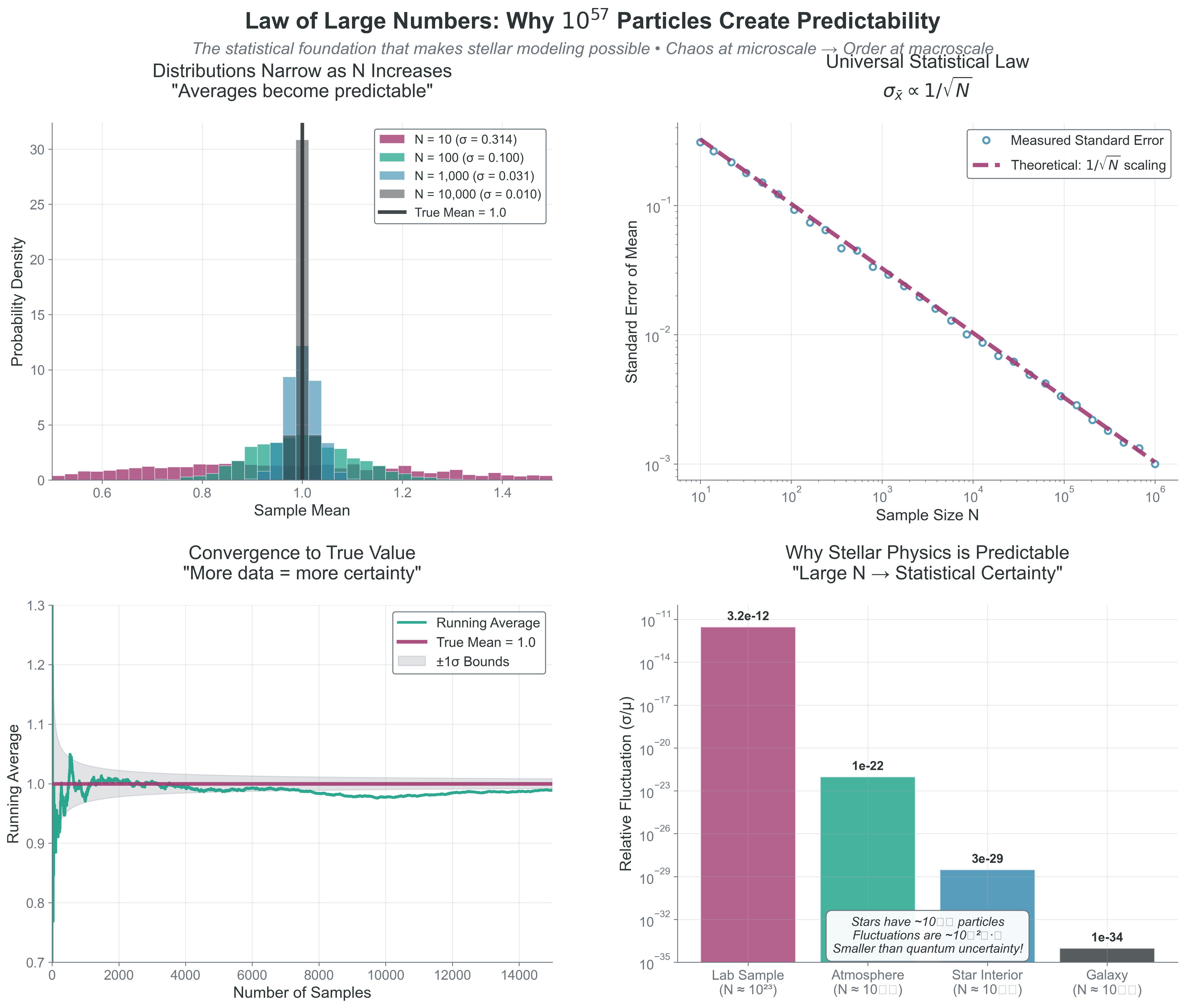
Figure 3:Law of Large Numbers: Why 1057 Particles Create Predictability. This comprehensive demonstration reveals the statistical foundation that makes stellar modeling possible - how enormous particle numbers transform microscopic chaos into macroscopic order. Top-left: Distribution narrowing shows how sample means cluster more tightly around the true value (1.0) as sample size N increases from 10 to 10,000, with standard errors σ decreasing systematically. The exponential distribution represents stellar energies, demonstrating that even highly skewed microscopic distributions produce stable macroscopic averages. Top-right: Universal scaling law confirms the fundamental relationship between measurement precision and sample size across 6 orders of magnitude, comparing measured standard errors (blue circles) against theoretical scaling (dashed rose line). Bottom-left: Real-time convergence visualization shows a running average of 15,000 stellar energy measurements converging to the true mean (1.0, rose line) with confidence bounds (gray) that narrow as . Bottom-right: Physical scale comparison demonstrates why stellar physics is predictable - laboratory samples () have measurable 10-12 fluctuations, while stellar cores () have utterly negligible 10-29 fluctuations smaller than quantum uncertainty. This explains why we can model 1057 particles with just 4 differential equations: large numbers don’t create complexity, they create statistical certainty that makes the impossible become inevitable.
**What this means**:

- $N = 100$: ~10% fluctuations
- $N = 10^6$: ~0.1% fluctuations
- $N = 10^{23}$: ~$10^{-11}$% fluctuations
- $N = 10^{57}$ (Sun): ~$10^{-28}$% fluctuations

At stellar scales, fluctuations are smaller than quantum uncertainty!

**This is why**:

- Pressure is steady despite chaotic collisions
- Stars shine steadily despite random fusion events
- Thermodynamics works despite molecular chaos
- Monte Carlo methods converge despite using random numbers

This $\sqrt{N}$ scaling has profound implications for how errors propagate through calculations, which we'll explore next.

(error-propagation)=
## 2.5 Error Propagation: The Universal $\sqrt{N}$ Scaling

**Priority: 🟡 Standard Path**

:::{margin}
**Effective sample size** ($N_{\text{eff}}$): The equivalent number of independent samples when dealing with correlated data. For MCMC: $N_{\text{eff}} = N/(1 + 2\tau)$ where τ is the autocorrelation time.
Every measurement has uncertainty. Every calculation propagates these uncertainties. Understanding error propagation is crucial for both physics and computation. The Law of Large Numbers tells us fluctuations scale as —now let’s see how this propagates through calculations.
💻 Computational Demo: Error Propagation in Action
See how errors propagate through calculations:
import numpy as np
import matplotlib.pyplot as plt

# Example: Calculate stellar luminosity from radius and temperature
# L = 4π R² σ T⁴ (Stefan-Boltzmann law)

# "Measurements" with uncertainties
R_mean = 1.0  # Solar radii
R_sigma = 0.05  # 5% uncertainty
T_mean = 5778  # K (solar temperature)
T_sigma = 50  # K uncertainty

# Method 1: Error propagation formula
# L = 4π R² σ T⁴, so:
# ∂L/∂R = 8π R σ T⁴
# ∂L/∂T = 16π R² σ T³

sigma_SB = 5.67e-8  # Stefan-Boltzmann constant
L_mean = 4 * np.pi * R_mean**2 * sigma_SB * T_mean**4

dL_dR = 8 * np.pi * R_mean * sigma_SB * T_mean**4
dL_dT = 16 * np.pi * R_mean**2 * sigma_SB * T_mean**3

L_sigma_formula = np.sqrt((dL_dR * R_sigma)**2 + (dL_dT * T_sigma)**2)
L_relative_error_formula = L_sigma_formula / L_mean

# Method 2: Monte Carlo error propagation
n_samples = 10000
R_samples = np.random.normal(R_mean, R_sigma, n_samples)
T_samples = np.random.normal(T_mean, T_sigma, n_samples)
L_samples = 4 * np.pi * R_samples**2 * sigma_SB * T_samples**4

L_mean_MC = np.mean(L_samples)
L_sigma_MC = np.std(L_samples)
L_relative_error_MC = L_sigma_MC / L_mean_MC

# Visualization
fig, axes = plt.subplots(2, 2, figsize=(12, 10))

# Top left: Input distributions
ax = axes[0, 0]
ax.hist(R_samples/R_mean, bins=50, alpha=0.5, density=True, label='R/R☉')
ax.hist(T_samples/T_mean, bins=50, alpha=0.5, density=True, label='T/T☉')
ax.set_xlabel('Normalized Value')
ax.set_ylabel('Probability Density')
ax.set_title('Input Distributions')
ax.legend()

# Top right: Output distribution
ax = axes[0, 1]
ax.hist(L_samples/L_mean, bins=50, density=True, alpha=0.7, color='green')
ax.axvline(1, color='red', linestyle='--', label='True value')
ax.set_xlabel('L/L☉')
ax.set_ylabel('Probability Density')
ax.set_title(f'Luminosity Distribution\nσ_L/L = {L_relative_error_MC:.1%}')
ax.legend()

# Bottom left: Error contributions
ax = axes[1, 0]
# Calculate individual contributions
L_from_R_only = 4 * np.pi * R_samples**2 * sigma_SB * T_mean**4
L_from_T_only = 4 * np.pi * R_mean**2 * sigma_SB * T_samples**4
R_contribution = np.std(L_from_R_only) / L_mean
T_contribution = np.std(L_from_T_only) / L_mean

contributions = [R_contribution*100, T_contribution*100, L_relative_error_MC*100]
labels = ['R uncertainty\nalone', 'T uncertainty\nalone', 'Total\n(combined)']
colors = ['blue', 'red', 'green']

bars = ax.bar(labels, contributions, color=colors, alpha=0.7)
ax.set_ylabel('Relative Error (%)')
ax.set_title('Error Contributions')

# Add values on bars
for bar, val in zip(bars, contributions):
    ax.text(bar.get_x() + bar.get_width()/2, bar.get_height()*1.05,
            f'{val:.1f}%', ha='center', fontsize=10)

# Bottom right: Comparison of methods
ax = axes[1, 1]
ax.text(0.1, 0.8, 'Error Propagation Comparison:', fontsize=12, weight='bold')
ax.text(0.1, 0.6, f'Formula method: σ_L/L = {L_relative_error_formula:.2%}', fontsize=11)
ax.text(0.1, 0.5, f'Monte Carlo method: σ_L/L = {L_relative_error_MC:.2%}', fontsize=11)
ax.text(0.1, 0.3, 'Key insight:', fontsize=11, style='italic')
ax.text(0.1, 0.2, 'T⁴ dependence means T errors dominate!', fontsize=11)
ax.text(0.1, 0.1, f'(T contrib: {T_contribution/L_relative_error_MC:.1%} of total)', fontsize=10)
ax.axis('off')

plt.suptitle('Error Propagation: From Input Uncertainties to Output', fontsize=14)
plt.tight_layout()
plt.show()

print("Error Propagation Analysis:")
print("-" * 50)
print(f"Input uncertainties:")
print(f"  R: {R_sigma/R_mean:.1%}")
print(f"  T: {T_sigma/T_mean:.1%}")
print(f"\nOutput uncertainty in L:")
print(f"  Formula method: {L_relative_error_formula:.2%}")
print(f"  Monte Carlo: {L_relative_error_MC:.2%}")
print(f"\nError contributions:")
print(f"  From R uncertainty: {R_contribution:.2%}")
print(f"  From T uncertainty: {T_contribution:.2%}")
print(f"  Ratio T/R contribution: {T_contribution/R_contribution:.1f}x")
Key insights from this example:
T⁴ dependence means temperature errors dominate luminosity uncertainty
Formula and Monte Carlo methods agree (validating both)
Understanding error propagation helps identify which measurements need improvement
Monte Carlo error scaling:
For samples, the error in the mean scales as:
This scaling is universal:
Want 10× better accuracy? Need 100× more samples
Diminishing returns as increases
Why Monte Carlo can be slow but always converges
Application to your projects:
Project 2: Energy conservation error accumulates as
Project 3: Monte Carlo photon error decreases as
Project 4: MCMC error includes autocorrelation:
Here is the autocorrelation time.
2.6 Variance and Standard Deviation: Measuring Spread
Priority: 🔴 Essential
While the mean tells us where a distribution is centered, variance and standard deviation tell us how spread out it is — crucial for understanding everything from temperature to measurement uncertainty.
Definitions: Variance: The average squared deviation from the mean
Standard Deviation: The square root of variance
Why square root? It puts the measure back in the same units as the original data.
Physical Interpretation
Remember from Part 1: Temperature IS proportional to velocity variance
This isn’t an analogy—it’s an identity. Higher temperature literally means larger variance in molecular velocities.
Key Properties
Variance of a sum (independent variables):
Variance of a scaled variable:
Standard error of the mean:
This is why averaging reduces uncertainty!
Why This Matters for Your Projects
Project 2: Velocity dispersion in star clusters is literally the standard deviation of stellar velocities
Project 3: Photon count uncertainty follows Poisson statistics where variance equals the mean
Project 4: MCMC convergence diagnosed by monitoring variance between chains
Project 5: Gaussian Process variance gives uncertainty bands on predictions
The takeaway: Variance isn’t just a statistical concept — it’s often the physical quantity we’re measuring (temperature, pressure, velocity dispersion).
2.7 Bayesian Thinking: Learning from Data
Priority: 🔴 Essential Physical intuition: You observe a star with a reddish color. Is it red because it’s an intrinsically cool M-dwarf, or is it a hotter star reddened by interstellar dust? Your prior knowledge (most nearby stars aren’t heavily reddened) combines with the observation (the color) to give you a posterior belief about the star’s true nature. This is Bayesian inference—using prior knowledge plus new data to update beliefs.
Bayes’ Theorem: The Learning Equation
At its heart, Bayesian inference is about updating beliefs with data:
Or in the notation you’ll use constantly:
where:
Prior : What you believed about parameters before seeing data
Likelihood : How probable the data is if parameters are
Posterior : Updated belief after incorporating data
Evidence : Normalization ensuring probabilities sum to 1
💻 Computational Demo: Bayesian Learning in Action
See how prior beliefs update with data to give posterior knowledge:
import numpy as np
import matplotlib.pyplot as plt
from scipy import stats

# Example: Inferring a star's temperature from its color
# Color index B-V is related to temperature, but with uncertainty

fig, axes = plt.subplots(2, 3, figsize=(14, 8))

# True stellar temperature (unknown to us)
T_true = 5800  # K (Sun-like)

# Prior: Based on stellar population studies
# Most stars are cool (M-dwarfs), fewer hot stars
T_range = np.linspace(3000, 10000, 1000)

# Prior: Log-normal distribution (more cool stars)
prior_mean = np.log(4500)
prior_std = 0.4
prior = stats.lognorm.pdf(T_range, s=prior_std, scale=np.exp(prior_mean))
prior = prior / np.trapz(prior, T_range)  # Normalize

# Observation: Color measurement with uncertainty
# Simplified relation: B-V ≈ 5000/T (very approximate!)
observed_color = 5000/T_true + np.random.normal(0, 0.1)
color_uncertainty = 0.1

# Likelihood: P(data|temperature)
def likelihood(T, observed_color, uncertainty):
    expected_color = 5000/T  # Our model
    return stats.norm.pdf(observed_color, expected_color, uncertainty)

like = np.array([likelihood(T, observed_color, color_uncertainty) for T in T_range])
like = like / np.trapz(like, T_range)  # Normalize for visualization

# Posterior: Prior × Likelihood (then normalize)
posterior_unnorm = prior * like
posterior = posterior_unnorm / np.trapz(posterior_unnorm, T_range)

# Visualization
# Row 1: Single observation
axes[0, 0].plot(T_range, prior, 'b-', lw=2)
axes[0, 0].fill_between(T_range, prior, alpha=0.3)
axes[0, 0].axvline(T_true, color='red', linestyle='--', alpha=0.5, label='True T')
axes[0, 0].set_title('Prior\n(Population knowledge)')
axes[0, 0].set_xlabel('Temperature (K)')
axes[0, 0].set_ylabel('Probability Density')
axes[0, 0].legend()

axes[0, 1].plot(T_range, like, 'g-', lw=2)
axes[0, 1].fill_between(T_range, like, alpha=0.3, color='green')
axes[0, 1].axvline(T_true, color='red', linestyle='--', alpha=0.5)
axes[0, 1].set_title(f'Likelihood\n(Color = {observed_color:.2f})')
axes[0, 1].set_xlabel('Temperature (K)')

axes[0, 2].plot(T_range, posterior, 'purple', lw=2)
axes[0, 2].fill_between(T_range, posterior, alpha=0.3, color='purple')
axes[0, 2].axvline(T_true, color='red', linestyle='--', alpha=0.5)
axes[0, 2].set_title('Posterior\n(Updated belief)')
axes[0, 2].set_xlabel('Temperature (K)')

# Row 2: Multiple observations (sequential updating)
n_obs = 5
colors = plt.cm.viridis(np.linspace(0, 1, n_obs))

# Start with prior
current_posterior = prior.copy()

axes[1, 0].plot(T_range, prior, 'k-', lw=2, label='Initial prior')

for i in range(n_obs):
    # New observation
    new_color = 5000/T_true + np.random.normal(0, 0.1)

    # Likelihood for this observation
    new_like = np.array([likelihood(T, new_color, color_uncertainty) for T in T_range])

    # Update: posterior becomes new prior
    current_posterior = current_posterior * new_like
    current_posterior = current_posterior / np.trapz(current_posterior, T_range)

    axes[1, 0].plot(T_range, current_posterior, color=colors[i],
                    alpha=0.7, label=f'After obs {i+1}')

axes[1, 0].axvline(T_true, color='red', linestyle='--', alpha=0.5, label='True T')
axes[1, 0].set_title('Sequential Updating')
axes[1, 0].set_xlabel('Temperature (K)')
axes[1, 0].set_ylabel('Probability Density')
axes[1, 0].legend(fontsize=8)

# Show uncertainty reduction
axes[1, 1].set_title('Posterior Uncertainty vs N')
uncertainties = []
n_obs_range = range(0, 21)

current_posterior = prior.copy()
for n in n_obs_range:
    # Calculate standard deviation
    mean = np.trapz(T_range * current_posterior, T_range)
    std = np.sqrt(np.trapz((T_range - mean)**2 * current_posterior, T_range))
    uncertainties.append(std)

    if n < 20:  # Get one more observation
        new_color = 5000/T_true + np.random.normal(0, 0.1)
        new_like = np.array([likelihood(T, new_color, color_uncertainty) for T in T_range])
        current_posterior = current_posterior * new_like
        current_posterior = current_posterior / np.trapz(current_posterior, T_range)

axes[1, 1].plot(n_obs_range, uncertainties, 'bo-')
axes[1, 1].set_xlabel('Number of Observations')
axes[1, 1].set_ylabel('Posterior Std Dev (K)')
axes[1, 1].grid(True, alpha=0.3)

# Compare Bayesian vs Frequentist
axes[1, 2].text(0.1, 0.9, 'Bayesian vs Frequentist', fontsize=12, weight='bold',
                transform=axes[1, 2].transAxes)
axes[1, 2].text(0.1, 0.75, 'Bayesian:', fontsize=11, weight='bold',
                transform=axes[1, 2].transAxes)
axes[1, 2].text(0.1, 0.65, '• Probability of parameters given data', fontsize=10,
                transform=axes[1, 2].transAxes)
axes[1, 2].text(0.1, 0.55, '• Incorporates prior knowledge', fontsize=10,
                transform=axes[1, 2].transAxes)
axes[1, 2].text(0.1, 0.45, '• Updates with each observation', fontsize=10,
                transform=axes[1, 2].transAxes)

axes[1, 2].text(0.1, 0.30, 'Frequentist:', fontsize=11, weight='bold',
                transform=axes[1, 2].transAxes)
axes[1, 2].text(0.1, 0.20, '• Probability of data given parameters', fontsize=10,
                transform=axes[1, 2].transAxes)
axes[1, 2].text(0.1, 0.10, '• No prior (or uniform prior)', fontsize=10,
                transform=axes[1, 2].transAxes)
axes[1, 2].text(0.1, 0.00, '• Focus on long-run frequencies', fontsize=10,
                transform=axes[1, 2].transAxes)
axes[1, 2].axis('off')

plt.suptitle('Bayesian Inference: Learning from Data', fontsize=14)
plt.tight_layout()
plt.show()

print("Bayesian Learning Summary:")
print("-" * 50)
print(f"True temperature: {T_true} K")
print(f"Prior peak: {T_range[np.argmax(prior)]:.0f} K")
print(f"Prior std: {np.sqrt(np.trapz((T_range - np.trapz(T_range*prior, T_range))**2 * prior, T_range)):.0f} K")
print(f"Posterior peak (1 obs): {T_range[np.argmax(posterior)]:.0f} K")
print(f"Posterior std (1 obs): {np.sqrt(np.trapz((T_range - np.trapz(T_range*posterior, T_range))**2 * posterior, T_range)):.0f} K")
print(f"Posterior std (5 obs): {uncertainties[5]:.0f} K")
print(f"Posterior std (20 obs): {uncertainties[20]:.0f} K")The Power and Peril of Priors
The Power: Priors incorporate previous knowledge
Stellar IMF tells us most stars are low-mass
Dust extinction is positive (can’t have negative absorption)
Velocities are limited by escape velocity
The Peril: Priors can bias results
Too narrow: May exclude truth
Too broad: Lose constraining power
Wrong shape: Systematic bias
Best Practice:
Use physically motivated priors when possible
Test sensitivity to prior choice
Report both prior and posterior
Use uninformative priors when truly ignorant
Connection to Frequentist Statistics
Bayesian and frequentist approaches answer different questions:
| Approach | Question | Answer |
|---|---|---|
| Frequentist | “If I repeated this experiment many times, what would happen?” | Confidence intervals, p-values |
| Bayesian | “Given this data, what do I believe about the parameters?” | Posterior distributions, credible intervals |
Both are valid! Frequentist is about long-run frequencies. Bayesian is about updating beliefs with data.
🌟 The More You Know: Thomas Bayes and the Posthumous Discovery That Powers Modern AI
Thomas Bayes (1701-1761) was a Presbyterian minister and mathematician who never published the famous theorem that bears his name. During his lifetime, he published only one mathematical work — a defense of Newton’s calculus against philosophical criticisms.
As a minister, Bayes was interested in using mathematics to explore theological questions. He developed his theorem while working on problems of inverse probability: given observed effects, what can we infer about causes? Specifically, he was exploring whether the apparent order and design in the universe (the observed effects) could be used to mathematically infer the existence of a divine creator (the cause). He derived the mathematical framework for inverse inference but never published it — possibly because he wasn’t satisfied with his theological conclusions, or perhaps because he recognized the philosophical challenges in assigning prior probabilities to metaphysical questions.
After Bayes died in 1761, his friend Richard Price found the manuscript in his papers. Price, also a minister and himself interested in natural theology, recognized its mathematical importance beyond the theological applications. He edited it and presented it to the Royal Society in 1763 as “An Essay towards solving a Problem in the Doctrine of Chances.” Despite this presentation, it remained largely unnoticed.
The theorem gained prominence when Pierre-Simon Laplace independently rediscovered and extensively developed it in his 1812 Théorie analytique des probabilités. Laplace applied it to numerous problems: calculating planetary masses, population statistics, and jury decision reliability. He developed what’s now called “Laplace’s succession rule” for predicting future events from past observations.
For most of the 19th and 20th centuries, Bayesian methods were marginalized in statistics. The frequentist approach dominated, viewing probability as long-run frequencies rather than degrees of belief. Leading statisticians - like Ronald Fisher - were strongly opposed to Bayesian methods, preferring techniques based on sampling distributions.
The resurrection began during World War II. At Bletchley Park, Alan Turing and I.J. Good used Bayesian methods to help crack the Enigma code, updating beliefs about message content based on intercepted fragments. This work remained classified for decades.
The real revolution came with computers. Bayesian calculations require integrating over all possible parameter values — often impossible by hand. But by the 1990s, Markov Chain Monte Carlo algorithms made these calculations feasible. Problems unsolvable for centuries suddenly became tractable.
Today, Bayesian inference powers modern science:
Spam filters (prior: most unknown senders are spam + likelihood: message characteristics = posterior: probability of spam)
The Event Horizon Telescope’s black hole image reconstruction
Exoplanet detection from wobbling stars
Machine learning and neural networks
Clinical trial design and drug approval
The framework Bayes developed for reasoning about uncertainty now underlies everything from weather prediction to self-driving cars. Not bad for an unpublished manuscript found in a deceased minister’s desk drawer.
The key insight Bayes gave us: we can mathematically update our beliefs as new evidence arrives. For example, every time astronomers combine prior knowledge about stellar populations with new spectroscopic data, they’re using the framework that Thomas Bayes quietly developed over 260 years ago!
Part 2 Synthesis: The Statistical Foundation
Bridge to Part 3: From Tools to Information Extraction
You now have the statistical tools. Next, we’ll see how to extract meaningful information from distributions using moments—the mathematical bridge between microscopic chaos and macroscopic order.