NumPy & Matplotlib

Scientific Computing Foundations

Dr. Anna Rosen

2026-04-22

Learning Objectives

By the end of this lecture, you will be able to:

  1. Create NumPy arrays and perform vectorized operations
  2. Filter data using boolean masking
  3. Apply broadcasting for elegant array operations
  4. Build publication-quality plots with Matplotlib
  5. Choose appropriate scales and colormaps

Why should you care about NumPy?

The Problem: Python Loops Are Slow

In astronomy, we routinely work with millions of data points — galaxy catalogs, time series, images. Standard Python loops can’t keep up.

# 100,000 stellar magnitude measurements
magnitudes_list = [12.3, 12.5, 12.4, 12.7, 12.6] * 20000

start = time.perf_counter()
fluxes = []
for mag in magnitudes_list:
    flux = 10**(-mag/2.5)
    fluxes.append(flux)
loop_time = time.perf_counter() - start

print(f"Python loop: {loop_time*1000:.1f} ms")
Python loop: 15.9 ms

The Solution: NumPy Vectorization

NumPy replaces slow Python loops with optimized C code that operates on entire arrays at once — this is called vectorization.

magnitudes_np = np.array([12.3, 12.5, 12.4, 12.7, 12.6] * 20000)

start = time.perf_counter()
fluxes_np = 10**(-magnitudes_np/2.5)  # No loop needed!
numpy_time = time.perf_counter() - start

print(f"NumPy: {numpy_time*1000:.2f} ms")
print(f"Speedup: {loop_time/numpy_time:.0f}x faster!")
NumPy: 14.26 ms
Speedup: 1x faster!

🎯 Key insight: NumPy isn’t just faster — it’s cleaner code too!

Today’s Roadmap

NumPy (25 min)

  • Array creation
  • Vectorized operations
  • Boolean masking
  • Broadcasting
  • ⚠️ Views vs Copies

Matplotlib (25 min)

  • OO interface: fig, ax
  • Figure anatomy
  • Choosing scales
  • Plot types
  • Colormaps

Part 1: NumPy Essentials

What is NumPy?

NumPy (Numerical Python) is the foundation of the entire scientific Python ecosystem.

  • Provides the ndarray: a fast, memory-efficient N-dimensional array
  • Written in C — operations are 10-100x faster than pure Python
  • Powers everything: Matplotlib, SciPy, Pandas, Astropy, scikit-learn
import numpy as np  # The universal convention — you'll type this thousands of times!

Why So Fast? Memory Layout

The speed difference comes from how data is stored and accessed in memory.

Python List

  • Elements scattered in memory
  • Each element is a full Python object
  • Type-checking on every operation

NumPy Array

  • Contiguous memory block
  • Fixed data type (dtype)
  • Optimized C loops
arr = np.array([1.0, 2.0, 3.0])
print(f"dtype: {arr.dtype}, nbytes: {arr.nbytes}")
dtype: float64, nbytes: 24

The array knows its type upfront, so operations skip type-checking entirely.

Array Creation: From Lists

The most common way to create an array is from an existing Python list.

# From Python lists
measurements = [23.5, 24.1, 23.8, 24.3]
arr = np.array(measurements)
print(f"1D array: {arr}")
1D array: [23.5 24.1 23.8 24.3]

For 2D data (like images), nest the lists:

# 2D array (matrix) — like a small image
image_data = np.array([[10, 20, 30],
                       [40, 50, 60]])
print(f"Shape: {image_data.shape}")  # (rows, columns)
Shape: (2, 3)

Scientific Array Creation

For scientific work, we rarely type out values. Instead, we generate arrays:

# linspace: specify NUMBER of points (includes endpoint)
wavelengths = np.linspace(400, 700, 5)
print(f"linspace: {wavelengths}")
linspace: [400. 475. 550. 625. 700.]
# logspace: logarithmically spaced (great for stellar masses!)
masses = np.logspace(-1, 2, 4)  # 10^-1 to 10^2
print(f"logspace: {masses}")
logspace: [  0.1   1.   10.  100. ]
# arange: specify STEP size (excludes endpoint — like Python's range)
times = np.arange(0, 1, 0.25)
print(f"arange: {times}")
arange: [0.   0.25 0.5  0.75]

Concept Check

Which creates exactly 100 evenly-spaced points from 0 to 10, inclusive?

Takeaway: Use linspace when you need an exact count and want to include both endpoints.

Initializing Arrays

For image processing and numerical methods, we often need arrays initialized to specific values:

dark_frame = np.zeros((3, 3))     # All zeros (e.g., bias subtraction)
flat_field = np.ones((3, 3))      # All ones (e.g., normalization)
bias_level = np.full((3, 3), 500) # All 500s (e.g., known bias)

print(f"Zeros:\n{dark_frame}")
Zeros:
[[0. 0. 0.]
 [0. 0. 0.]
 [0. 0. 0.]]

💡 Tip: np.empty() is faster but contains garbage values — only use when you’ll immediately overwrite everything!

Vectorized Operations: The Magic

NumPy’s power comes from vectorized operations — mathematical operations that automatically apply to every element.

a = np.array([1, 2, 3, 4])
b = np.array([10, 20, 30, 40])

print(f"a + b = {a + b}")      # Element-wise addition
print(f"a * b = {a * b}")      # Element-wise multiplication
print(f"a ** 2 = {a ** 2}")    # Element-wise power
a + b = [11 22 33 44]
a * b = [ 10  40  90 160]
a ** 2 = [ 1  4  9 16]

🎯 This is vectorization: operate on entire arrays at once — no Python loops needed!

Universal Functions (ufuncs)

NumPy provides universal functions (ufuncs) — optimized C implementations of common mathematical operations that work element-wise on arrays.

angles_deg = np.array([0, 30, 45, 60, 90])
angles_rad = np.deg2rad(angles_deg)  # Convert to radians

print(f"sin: {np.round(np.sin(angles_rad), 3)}")
print(f"cos: {np.round(np.cos(angles_rad), 3)}")
sin: [0.    0.5   0.707 0.866 1.   ]
cos: [1.    0.866 0.707 0.5   0.   ]

💡 Important: Use np.sin() for arrays, not math.sin() which only works on single numbers!

Common ufuncs: np.sin, np.cos, np.exp, np.log, np.log10, np.sqrt, np.abs

Astronomy Example: Magnitude to Flux

Let’s apply vectorization to a real astronomy problem — converting magnitudes to flux ratios using Pogson’s equation:

\[F_1/F_2 = 10^{(m_2 - m_1)/2.5}\]

magnitudes = np.array([8.2, 12.5, 6.1, 15.3, 9.7])

# Pogson's equation (relative to m=0)
flux_ratios = 10**(-magnitudes/2.5)

print(f"Mags:   {magnitudes}")
print(f"Fluxes: {np.round(flux_ratios, 6)}")
Mags:   [ 8.2 12.5  6.1 15.3  9.7]
Fluxes: [5.250e-04 1.000e-05 3.631e-03 1.000e-06 1.320e-04]
ratio = flux_ratios.max() / flux_ratios.min()
print(f"Brightest is {ratio:.0f}x brighter than dimmest")
Brightest is 4786x brighter than dimmest

Array Statistics

NumPy arrays have built-in methods for common statistical calculations:

data = rng.normal(1000, 50, 1000)  # 1000 flux measurements

print(f"Mean: {data.mean():.1f}")
print(f"Std:  {data.std():.1f}")
print(f"Min:  {data.min():.1f}, Max: {data.max():.1f}")
Mean: 998.6
Std:  49.4
Min:  817.6, Max: 1158.9

Other useful methods: .sum(), .argmax() (index of max), .argmin(), np.median(arr)

Both syntaxes work: arr.mean() is equivalent to np.mean(arr)

Boolean Masking: Filter Your Data

Boolean masking is one of NumPy’s most powerful features — it lets you filter arrays based on conditions without writing loops.

mags = np.array([8.2, 12.5, 6.1, 15.3, 9.7, 11.2])
colors = np.array([0.5, 1.2, 0.3, 1.8, 0.7, 1.0])

# Create a boolean mask (True where condition is met)
bright = mags < 10
print(f"Mask: {bright}")
Mask: [ True False  True False  True False]
# Apply the mask to filter BOTH arrays consistently
print(f"Bright mags: {mags[bright]}")
print(f"Their colors: {colors[bright]}")
Bright mags: [8.2 6.1 9.7]
Their colors: [0.5 0.3 0.7]

Combining Conditions

For complex filters, combine conditions with bitwise operators:

# ⚠️ Use & (not 'and'), | (not 'or'), ~ (not 'not')
bright_and_blue = (mags < 10) & (colors < 0.6)
print(f"Bright AND blue: {mags[bright_and_blue]}")
Bright AND blue: [8.2 6.1]
# Count matches by summing the boolean array (True = 1)
n_matches = bright_and_blue.sum()
print(f"Number of matches: {n_matches}")
Number of matches: 2

⚠️ Common Bug: Using Python’s and/or instead of &/| will cause an error!

⚠️ Parentheses are REQUIRED due to operator precedence rules.

Example: Finding Exoplanet Transits

This is exactly how Kepler found exoplanets — detect brightness dips using boolean masking:

time_days = np.linspace(0, 30, 500)  # 30 days of observations
flux = np.ones_like(time_days) + rng.normal(0, 0.001, 500)  # Baseline + noise

# Add transits every 3.5 days (0.1 day duration)
period = 3.5
in_transit = (time_days % period) < 0.1
flux[in_transit] -= 0.01  # 1% brightness dip

# Detect transits: find points below 3-sigma threshold
baseline = np.median(flux)
threshold = baseline - 3 * flux.std()
candidates = flux < threshold
print(f"Found {candidates.sum()} potential transit points")
Found 15 potential transit points

Think-Pair-Share: Boolean Masking

Problem: You have stellar masses and luminosities. Find stars with:

  • Mass > 1 solar mass AND
  • Luminosity > 10 solar luminosities
masses = np.array([0.5, 1.2, 2.0, 0.8, 5.0])
lums = np.array([0.1, 2.0, 15.0, 0.5, 500.0])

1 min: Write the mask on your own 1 min: Compare with your neighbor

Solution:

mask = (masses > 1) & (lums > 10)  # [F, F, T, F, T] → indices 2 and 4

Broadcasting: NumPy’s Superpower

Broadcasting allows NumPy to perform operations on arrays of different shapes by automatically “stretching” smaller arrays.

# Scalar broadcasts to entire array
arr = np.array([1, 2, 3, 4])
print(f"arr + 10 = {arr + 10}")  # 10 "broadcasts" to [10, 10, 10, 10]
arr + 10 = [11 12 13 14]
# Row + Column = Matrix!
row = np.array([[1, 2, 3]])       # Shape (1, 3)
col = np.array([[10], [20]])      # Shape (2, 1)
result = row + col                # Shape (2, 3)
print(f"Result:\n{result}")
Result:
[[11 12 13]
 [21 22 23]]

Broadcasting Rules

When operating on two arrays, NumPy compares shapes right-to-left:

Array A: (3, 1)     Array B: (1, 4)
   [10]                [1, 2, 3, 4]
   [20]    +    ───────────┘
   [30]
         ↓
Result: (3, 4)  ← each dimension is max of inputs
  • Rule 1: Dimensions must be equal, OR one of them must be 1
  • Rule 2: Size-1 dimensions “stretch” to match the other array
  • Rule 3: Missing dimensions are treated as 1

Concept Check: Broadcasting

What shape is the result?

a = np.array([1, 2, 3])      # Shape: (3,)
b = np.array([[10], [20]])   # Shape: (2, 1)
result = a + b               # Shape: ???

Answer: (2, 3)

  • a with shape (3,) broadcasts as (1, 3)
  • Combine (2, 1) + (1, 3) → (2, 3)
[[11, 12, 13],
 [21, 22, 23]]

⚠️ Danger: Views vs Copies

Critical gotcha: Slicing creates a view, not a copy. Modifying the view changes the original!

original = np.array([1, 2, 3, 4, 5])
slice_view = original[1:4]  # This is a VIEW, not a copy!

slice_view[0] = 99  # Modifying the view...
print(f"Original: {original}")  # ← Original changed too!
Original: [ 1 99  3  4  5]

Solution: Use .copy() when you need an independent array:

safe_copy = original[1:4].copy()  # Now modifications won't affect original

Views vs Copies Reference

Operation Result Why
arr[1:4] View Basic slicing shares memory
arr[[1, 2, 3]] Copy Fancy indexing always copies
arr.reshape() View (usually) Same data, different shape
arr.flatten() Copy Always makes a copy
arr.copy() Copy Explicit copy

💡 When in doubt: Check with np.shares_memory(a, b)

NumPy Summary

Array Creation

  • np.array() — from lists
  • np.linspace() — specify count
  • np.arange() — specify step
  • np.zeros(), np.ones(), np.full()

Key Operations

  • Vectorized math: +, *, **
  • Ufuncs: np.sin(), np.exp()
  • Boolean masks: arr[arr > 0]
  • Broadcasting: (3,1)+(1,4)→(3,4)
  • ⚠️ Slices are views!

Part 2: Matplotlib Essentials

Why Visualization Matters

“Data without visualization is like a telescope without an eyepiece”

Throughout history, plots have changed how we understand the universe:

  • Hubble (1929): Velocity vs. distance diagram → expanding universe
  • Hertzsprung-Russell: Color vs. magnitude → stellar evolution
  • WMAP/Planck: CMB power spectrum → confirmed inflation theory

Two Interfaces: Choose Wisely

Matplotlib offers two ways to create plots. Choose based on your needs:

pyplot (Quick Exploration)

plt.plot(x, y)
plt.xlabel('Time')
plt.show()

✅ Fast for exploration ❌ Less control over details

Object-Oriented (Research)

fig, ax = plt.subplots()
ax.plot(x, y)
ax.set_xlabel('Time')

✅ Full control ✅ Multi-panel figures ✅ Reproducible, scriptable

🎯 We use the OO interface — it’s what you need for publications and reproducibility

The Golden Pattern

This pattern will become muscle memory. Memorize it!

fig, ax = plt.subplots(figsize=(10, 3.5))  # Create figure and axes

x = np.linspace(0, 10, 100)
y = np.sin(x)

ax.plot(x, y)                    # Plot on the axes
ax.set_xlabel('Time (s)')        # Always include units!
ax.set_ylabel('Amplitude')
ax.set_title('Sine Wave')
plt.tight_layout()               # Prevent label clipping
plt.show()

Anatomy of a Figure

Understanding Matplotlib’s hierarchy is key to customizing plots. This annotated figure (from Nicolas Rougier) shows every component:

Show the complete Anatomy of a Figure code (Rougier 2016)
# Copyright 2016 Nicolas P. Rougier - MIT License
# https://github.com/rougier/matplotlib-tutorial

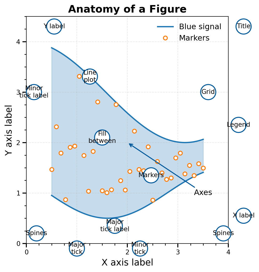
fig = plt.figure(figsize=(10, 7))
ax = fig.add_axes([0.2, 0.17, 0.68, 0.7], aspect=1)

# Main data
X = np.linspace(0.5, 3.5, 100)
Y1 = 3 + np.cos(X)
Y2 = 1 + np.cos(1 + X / 0.75) / 2
Y3 = np.random.uniform(Y1, Y2, len(X))

ax.fill_between(X, Y1, Y2, color="C0", alpha=0.25)
ax.plot(X, Y1, c="C0", label="Blue signal", linewidth=2)
ax.plot(X, Y2, c="C0", linewidth=2)
ax.plot(X[::3], Y3[::3], linewidth=0, marker='o', markerfacecolor="w",
        markeredgecolor="C1", markeredgewidth=1.5, label="Markers")

# Setup axes
ax.set_xlim(0, 4); ax.set_ylim(0, 4.5)
ax.tick_params(which="major", width=1.5, length=6)
ax.tick_params(which="minor", width=1.0, length=3)
ax.xaxis.set_major_locator(plt.MultipleLocator(1.0))
ax.xaxis.set_minor_locator(plt.MultipleLocator(0.25))
ax.yaxis.set_major_locator(plt.MultipleLocator(1.0))
ax.yaxis.set_minor_locator(plt.MultipleLocator(0.25))
ax.grid(True, linestyle='--', alpha=0.3)
ax.set_xlabel("X axis label", fontsize=14)
ax.set_ylabel("Y axis label", fontsize=14)
ax.set_title("Anatomy of a Figure", fontsize=16, fontweight="bold")
ax.legend(loc="upper right", frameon=False, fontsize=12)

# Annotation helper
def circle(x, y, radius=0.15):
    from matplotlib.patches import Circle as C
    c = C((x, y), radius, clip_on=False, zorder=10, lw=1.5,
          ec="#005A9C", fc="white")
    ax.add_artist(c)
def text(x, y, t):
    ax.text(x, y, t, ha="center", va="center", size=10,
            zorder=20, family="Source Sans Pro")

# All annotations
circle(X[25], Y1[25]); text(X[25], Y1[25], "Line\nplot")
circle(X[65], Y3[65]); text(X[65], Y3[65], "Markers")
circle(1.5, 2.1); text(1.5, 2.1, "Fill\nbetween")
circle(4.3, 4.3); text(4.3, 4.3, "Title")
circle(4.3, 0.55); text(4.3, 0.55, "X label")
circle(0.55, 4.3); text(0.55, 4.3, "Y label")
circle(4.2, 2.35); text(4.2, 2.35, "Legend")
circle(1.75, 0.35); text(1.75, 0.35, "Major\ntick label")
circle(2.25, -0.1); text(2.25, -0.1, "Minor\ntick")
circle(1.0, -0.1); text(1.0, -0.1, "Major\ntick")
circle(0.15, 3.0); text(0.15, 3.0, "Minor\ntick label")
circle(3.6, 3.0); text(3.6, 3.0, "Grid")
circle(3.9, 0.2); text(3.9, 0.2, "Spines")
circle(0.2, 0.2); text(0.2, 0.2, "Spines")

ax.annotate("Axes", xy=(2.0, 2.0), xycoords="data", xytext=(3.5, 1.0),
            fontsize=12, ha="center", va="center",
            arrowprops=dict(arrowstyle="->", color="#005A9C", lw=1.5))
ax.annotate("Figure", xy=(4.85, 4.7), xycoords="data", xytext=(4.1, 4.7),
            fontsize=12, ha="left", va="center",
            arrowprops=dict(arrowstyle="->", color="#005A9C", lw=1.5))

plt.show()

The Matplotlib Hierarchy

Figure (the canvas/container)
├── Axes (the actual plot area)
│   ├── Title
│   ├── X-axis (label, ticks, limits)
│   ├── Y-axis (label, ticks, limits)
│   ├── Plot elements (lines, scatter, bars...)
│   ├── Legend
│   └── Grid
└── More Axes... (for multi-panel figures)

Key insight: The fig is the container; the ax is where you actually plot data.

All customization happens through the ax object (or fig for figure-level properties).

Multi-Panel Figures

For comparing related plots, create multiple axes in one figure:

fig, axes = plt.subplots(1, 3, figsize=(12, 3.5))  # 1 row, 3 columns

x = np.linspace(0, 10, 100)
axes[0].plot(x, np.sin(x)); axes[0].set_title('Sine')
axes[1].plot(x, np.cos(x), 'r-'); axes[1].set_title('Cosine')
axes[2].plot(x, np.tan(x), 'g-'); axes[2].set_ylim(-5, 5); axes[2].set_title('Tangent')

plt.tight_layout()  # Prevents overlapping labels
plt.show()

Note: axes is now an array — access each panel with axes[0], axes[1], etc.

Choosing the Right Scale

The scale you choose can reveal or hide patterns in your data:

x = np.logspace(0, 3, 50)  # 1 to 1000
y = x**2.5  # Power law relationship

fig, axes = plt.subplots(1, 3, figsize=(12, 3.5))
axes[0].plot(x, y, 'b.'); axes[0].set_title('Linear: Pattern Hidden')
axes[1].loglog(x, y, 'b.'); axes[1].set_title('Log-Log: Power Law Revealed!')
axes[2].semilogy(x, y, 'b.'); axes[2].set_title('Semilog-Y: Wrong Choice')
plt.tight_layout()
plt.show()

Scale Decision Guide

Data Relationship Best Scale Why It Works
Power law: \(y \propto x^n\) Log-log Becomes straight line with slope \(n\)
Exponential: \(y \propto e^{\lambda x}\) Semilog-Y Becomes straight line with slope \(\lambda\)
Data spans orders of magnitude Log Spreads out clustered data
Linear relationship Linear The obvious choice

Rule of thumb: When in doubt, try multiple scales and see which reveals patterns.

Concept Check: Which Scale?

You’re plotting radioactive decay (counts vs time). Which scale reveals the half-life as a straight line?

Math: \(N(t) = N_0 e^{-\lambda t}\) → Taking log: \(\log N = \log N_0 - \lambda t\) (linear in \(t\)!)

Essential Plot Types

These four plot types cover ~90% of scientific visualization needs:

fig, axes = plt.subplots(1, 4, figsize=(14, 4))

t = np.linspace(0, 10, 100)
axes[0].plot(t, np.sin(t) + rng.normal(0, 0.1, 100)); axes[0].set_title('plot() - Time Series')
axes[1].scatter(rng.normal(0, 1, 50), rng.normal(0, 1, 50), alpha=0.7); axes[1].set_title('scatter() - Correlations')
axes[2].errorbar([0,1,2,3], [2.3, 3.1, 2.8, 3.5], yerr=0.3, fmt='o', capsize=4); axes[2].set_title('errorbar() - Measurements')
axes[3].hist(rng.normal(0, 1, 500), bins=25, alpha=0.7, edgecolor='black'); axes[3].set_title('hist() - Distributions')
plt.tight_layout()
plt.show()

Images with imshow

For 2D data like astronomical images, use imshow():

x = np.linspace(-3, 3, 100)
X, Y = np.meshgrid(x, x)
galaxy = np.exp(-np.sqrt(X**2 + Y**2)) + 0.05*rng.standard_normal((100, 100))

fig, axes = plt.subplots(1, 2, figsize=(10, 4))
im1 = axes[0].imshow(galaxy, cmap='gray', origin='lower'); axes[0].set_title('Linear Scale')
from matplotlib.colors import LogNorm
im2 = axes[1].imshow(galaxy - galaxy.min() + 0.01, cmap='gray', norm=LogNorm(), origin='lower')
axes[1].set_title('Log Scale (shows faint features)')
plt.colorbar(im1, ax=axes[0]); plt.colorbar(im2, ax=axes[1])
plt.tight_layout(); plt.show()

💡 Always use origin='lower' for astronomical images (y increases upward)

Example: Color-Magnitude Diagram

The Color-Magnitude Diagram (CMD) is astronomy’s most important plot — it reveals stellar evolution:

n = 300
color_ms = rng.uniform(-0.3, 2.0, n)  # B-V color
mag_ms = 4*color_ms + rng.normal(0, 0.5, n) + 4  # Main sequence
color_rg = rng.uniform(0.8, 2.0, 80)  # Red giants
mag_rg = rng.normal(0, 0.5, 80)

fig, ax = plt.subplots(figsize=(7, 6))
ax.scatter(color_ms, mag_ms, s=10, alpha=0.6, label='Main Sequence')
ax.scatter(color_rg, mag_rg, s=30, c='red', alpha=0.7, label='Red Giants')
ax.invert_yaxis()  # ← Astronomical convention: brighter = smaller magnitude = UP
ax.set_xlabel('B - V Color'); ax.set_ylabel('Absolute Magnitude')
ax.legend(); plt.show()

Colormaps: Choose Wisely

The colormap you choose can create or hide false features in your data:

Why Jet is Bad

The jet colormap has serious scientific problems:

  • Not perceptually uniform — equal data steps ≠ equal visual brightness changes
  • Creates false boundaries — the yellow band looks like a real feature
  • Fails in grayscale — cannot print in B&W journals
  • Colorblind-unfriendly — red-green confusion affects 8% of males

The fix is simple: Use viridis (default), plasma, cividis, or magma

For diverging data (positive/negative): use coolwarm or RdBu

Think-Pair-Share: Plot Critique

What’s wrong with this plot? (1 min think, 1 min share with neighbor)

Problems: (1) Line plot for scattered data — should use scatter(), (2) No axis labels, (3) No units specified, (4) No title or context

Publication Checklist ✅

Before submitting any figure, verify:

Use LaTeX for Math in Labels

Never use Unicode symbols — use LaTeX math notation in all axis labels, titles, and legends:

# WRONG — Unicode symbols look unprofessional
ax.set_xlabel('Mass (M☉)')
ax.set_ylabel('Temperature (×10³ K)')

# CORRECT — LaTeX renders beautifully
ax.set_xlabel(r'Mass ($M_\odot$)')
ax.set_ylabel(r'Temperature ($\times 10^3$ K)')
ax.set_title(r'$L \propto M^{3.5}$')
Symbol Wrong Correct LaTeX
Solar mass M☉ r'$M_\odot$'
Proportional r'$\propto$'
Multiply × r'$\times$'
Subscript T_eff r'$T_\mathrm{eff}$'

💡 The r'' prefix makes it a raw string — required for backslashes in LaTeX!

Saving Figures

Different formats for different purposes:

# Publication quality (vector format, infinite resolution)
fig.savefig('figure.pdf', dpi=300, bbox_inches='tight')

# Web/slides (raster format, fixed resolution)
fig.savefig('figure.png', dpi=150, bbox_inches='tight')
Format Use Case Notes
PDF Publications, posters Vector — scales perfectly
PNG Web, slides, email Raster — 150 DPI usually sufficient
SVG Web, editing Vector — editable in Illustrator

💡 bbox_inches='tight' removes excess whitespace around the figure

⚠️ Memory Leak Warning

Creating many figures without closing them will crash your program:

# BAD: Memory leak in loops!
for i in range(100):
    plt.figure()
    plt.plot(data[i])
    plt.savefig(f'plot_{i}.png')
    # Figure stays in memory → eventually crashes!

# GOOD: Close figures explicitly
for i in range(100):
    fig, ax = plt.subplots()
    ax.plot(data[i])
    fig.savefig(f'plot_{i}.png')
    plt.close(fig)  # ← Free the memory!

💡 Diagnostic: len(plt.get_fignums()) should stay small

Matplotlib Summary

The Core Pattern

fig, ax = plt.subplots()
ax.plot(x, y)
ax.set_xlabel('X (units)')
ax.set_ylabel('Y (units)')
fig.savefig('fig.pdf', dpi=300,
            bbox_inches='tight')
plt.close(fig)

Key Takeaways

  • Use OO interface for control
  • invert_yaxis() for CMDs
  • viridis, never jet!
  • 300 DPI for publications
  • Close figures in loops

Synthesis

NumPy + Matplotlib = Power

Combining NumPy’s data manipulation with Matplotlib’s visualization:

masses = 10**rng.uniform(-1, 2, 500)  # 0.1 to 100 solar masses
luminosities = masses**3.5 * 10**rng.normal(0, 0.1, 500)  # Mass-luminosity relation

# Boolean masks to categorize stars
massive = masses > 10; low_mass = masses < 1

fig, ax = plt.subplots(figsize=(10, 4))
ax.loglog(masses[~massive & ~low_mass], luminosities[~massive & ~low_mass], '.', alpha=0.5, label=r'1-10 $M_\odot$')
ax.loglog(masses[massive], luminosities[massive], 'r.', alpha=0.7, label=r'>10 $M_\odot$')
ax.loglog(masses[low_mass], luminosities[low_mass], 'b.', alpha=0.3, label=r'<1 $M_\odot$')
ax.set_xlabel(r'Mass ($M_\odot$)'); ax.set_ylabel(r'Luminosity ($L_\odot$)'); ax.legend()
plt.tight_layout(); plt.show()

Key Takeaways

If you remember nothing else from today, remember these:

  1. Vectorization eliminates Python loops → faster AND cleaner code
  2. Boolean masking is your data filtering superpower
  3. Broadcasting lets arrays of different shapes work together
  4. Views vs copies — when in doubt, use .copy()
  5. OO interface (fig, ax) gives you publication control
  6. Scale choice (linear vs. log) reveals or hides patterns
  7. Colormaps matter — viridis is your friend, jet is your enemy

Common Mistakes to Avoid

  1. Using and/or instead of &/| in NumPy masks
  2. Forgetting parentheses: (a > 0) & (b < 10) not a > 0 & b < 10
  3. Modifying array slices and accidentally changing the original
  4. Using jet colormap (please don’t!)
  5. Missing axis labels and units
  6. Not closing figures in loops → memory leak → crash

Questions?

Today We Covered

  • NumPy array creation & vectorization
  • Boolean masking & broadcasting
  • The views vs copies gotcha
  • Matplotlib OO interface
  • Scale selection & colormaps

Resources

  • numpy.org/doc
  • matplotlib.org/gallery
  • Chapters 7-8 readings

Cheat Sheet

# NumPy Essentials
import numpy as np
arr = np.array([1, 2, 3])             # From list
arr = np.linspace(0, 10, 100)         # 100 evenly-spaced points
arr = np.arange(0, 10, 0.1)           # Step of 0.1 (excludes endpoint!)
mask = arr > 0; filtered = arr[mask]  # Boolean masking
safe = arr.copy()                     # Explicit copy (not a view!)

# Matplotlib Essentials
import matplotlib.pyplot as plt
fig, ax = plt.subplots(figsize=(8, 6))
ax.plot(x, y, 'b-', label='data')
ax.scatter(x, y, c=colors, cmap='viridis')  # NOT jet!
ax.set_xlabel('X (units)'); ax.set_ylabel('Y (units)')
ax.legend()
fig.savefig('fig.pdf', dpi=300, bbox_inches='tight')
plt.close(fig)  # Don't forget in loops!