The HR Diagram
Section 2 of 6
The Observer's HR Diagram
Part 2: The Observer’s HR Diagram — Patterns from Data
A Radical Idea: Plot Everything
By the early 1900s, astronomers had measured apparent magnitudes and spectral types for thousands of stars, and parallaxes were giving absolute magnitudes. The obvious question: what happens if you plot absolute magnitude against spectral type? Ejnar Hertzsprung (1911) and Henry Norris Russell (1913) independently did exactly this. Every star has a different mass, age, and composition — so the natural expectation was noise, a random spray of dots. There was no theoretical reason in 1911 to expect anything else.
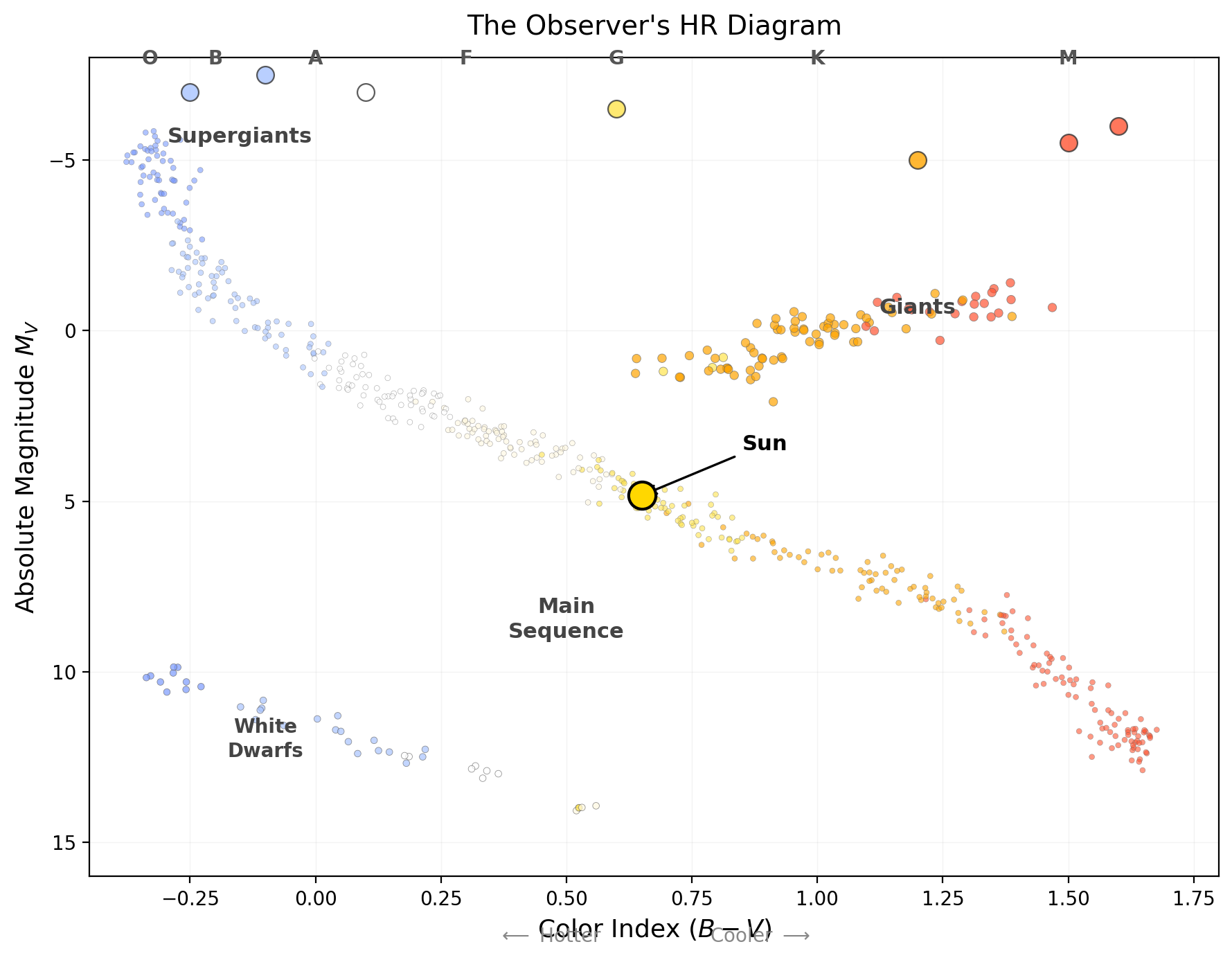
What they found instead was one of the most stunning patterns in science. The rice didn’t scatter — it fell along a narrow highway (a single diagonal band) with a few outlying clusters. This plot is the
Hertzsprung-Russell diagram
A plot of stellar luminosity (or absolute magnitude) against effective temperature (or spectral type) that organizes stars into the main sequence, giant branch, and white dwarf sequence. The single most important diagram in astrophysics — a classification chart, a mass map, and an evolution diagram at once.
Quick check
If spectral type primarily tracked composition rather than temperature, what would you expect the HR diagram to look like?
You would not get a tight, temperature-ordered main-sequence band. Stars of similar composition but very different thermal states would smear the diagram into much larger scatter, instead of a narrow diagonal sequence.
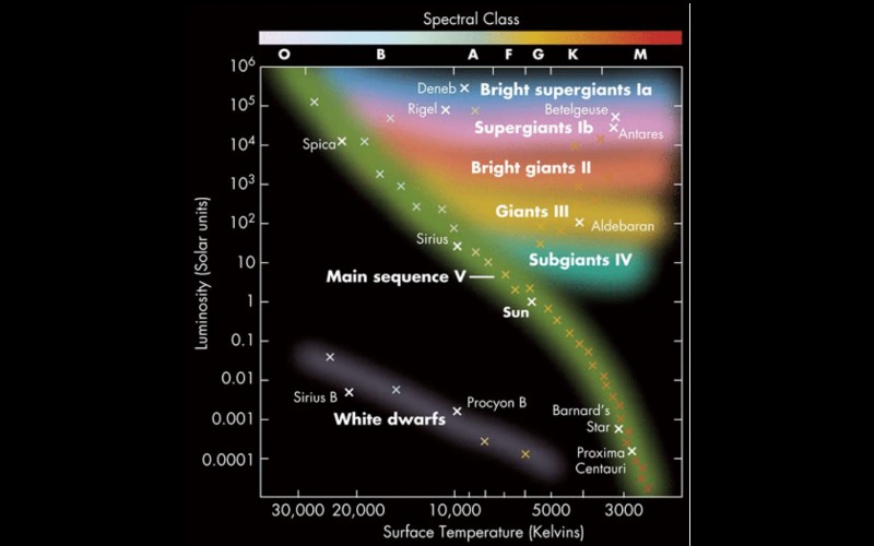
If the observer’s HR diagram still feels abstract, orient yourself with a more old-school map first. The classic version below labels familiar stars directly, so you can see the geography before translating it into the stripped-down data view.
Building the Diagram
The
Color-magnitude diagram
The observer’s form of the HR diagram: absolute magnitude versus color index (or spectral type), built from photometry and distance alone — no physical theory required.
Crucially: neither axis requires theory. Spectral type is a direct classification from line patterns; absolute magnitude comes from apparent magnitude and parallax distance. This diagram is pure measurement — Observable → Model → Inference: we measure and spectral type, use the distance modulus to model , then infer structure from how stars populate the diagram.
What the Diagram Shows
1. The Main Sequence — a narrow diagonal band from upper-left (hot, bright) to lower-right (cool, faint). About 90% of all stars fall on it, the Sun roughly in the middle. As you learned in Lecture 4, mass determines luminosity () and temperature for main-sequence stars, so the
Main sequence
The diagonal band on the HR diagram where hydrogen-core-burning stars spend ~90% of their lives, ordered by mass: high-mass stars are hot and luminous (upper left), low-mass stars cool and faint (lower right). It is the mass-luminosity relation made visible.
2. The Giant and Supergiant Region — a cluster in the upper-right: cool () but very luminous (). These are
Red giant
An evolved star that has exhausted core hydrogen and expanded enormously (typically ), becoming cool but very luminous — the upper-right region of the HR diagram.
Supergiant
The most luminous evolved stars, with radii reaching (luminosity class I) — e.g. Betelgeuse. They occupy the very top of the HR diagram across a wide temperature range.
3. The White Dwarf Sequence — a scattering in the lower-left: hot () but very faint (). By the same logic — hot but faint means small — these are
White dwarf
The Earth-sized () remnant core of a low- or intermediate-mass star — hot but faint, in the lower-left of the HR diagram, cooling slowly with no ongoing fusion.
Luminosity Classes: Vertical Structure
Even at the same spectral type, stars differ enormously in luminosity. A K2 star could be a dwarf () or a giant () — same temperature, 500 times more luminous. Observers tell them apart through spectral line widths: higher surface gravity (compact dwarfs) raises atmospheric pressure and broadens lines; lower gravity (extended giants) gives narrower lines. This is the
Luminosity class
The Roman-numeral part of a stellar classification (I supergiant, III giant, V dwarf, …), read from spectral line widths (surface gravity). It distinguishes stars of equal temperature but very different size and luminosity.
| Luminosity Class | Name | Example |
|---|---|---|
| I | Supergiant | Betelgeuse (α Ori) |
| II | Bright giant | — |
| III | Giant | Arcturus (α Boo) |
| IV | Subgiant | Procyon (α CMi) |
| V | Main-sequence dwarf | Sun, Sirius A |
A complete classification includes both: the Sun is G2 V (G2 temperature , class V dwarf); Betelgeuse is M1 I (, class I supergiant).
Quick check
- Which corner of the observer’s HR diagram holds the hottest, most luminous stars? The coolest, faintest?
- A star is spectral type K5, luminosity class III. Dwarf, giant, or supergiant? Hotter or cooler than the Sun?
- Two stars are both G2. Star A is class V; Star B is class III. Which is more luminous, and why?
- Why does spectral line width distinguish giants from dwarfs?
- Upper-left = hot + luminous (O/B supergiants); lower-right = cool + faint (M dwarfs).
- K5 III = giant, cooler than the Sun (K is cooler than G).
- Star B (class III, giant) is more luminous — same , but a much larger radius, so is far higher.
- Surface gravity: dwarfs are compact (small , high ), so high atmospheric pressure broadens lines; giants are extended (large , low ), so lines are narrow.