The HR Diagram
Section 5 of 6
An Evolution Diagram
Part 5: An Evolution Diagram — Why Patterns Need Physics
Stars Move on the HR Diagram
The most profound reading of the HR diagram is not as a static chart but as a map of stellar evolution. A star does not stay put — it moves, slowly on the main sequence, then dramatically as it evolves. That motion is the response of a self-gravitating thermodynamic system to changing fuel: when core hydrogen is exhausted, the same fusion source can no longer support hydrostatic equilibrium, so the core contracts, releasing gravitational energy that heats deeper layers; the envelope expands, lowering surface temperature even as total luminosity rises. HR-diagram tracks are the visible footprint of gravity, thermodynamics, and nuclear burning acting together.
Axis convention reminder: luminosity up; temperature decreases to the right (hot left, cool right). This schematic is a map-reading aid, not a precision plot — follow each arrow as a phase transition.
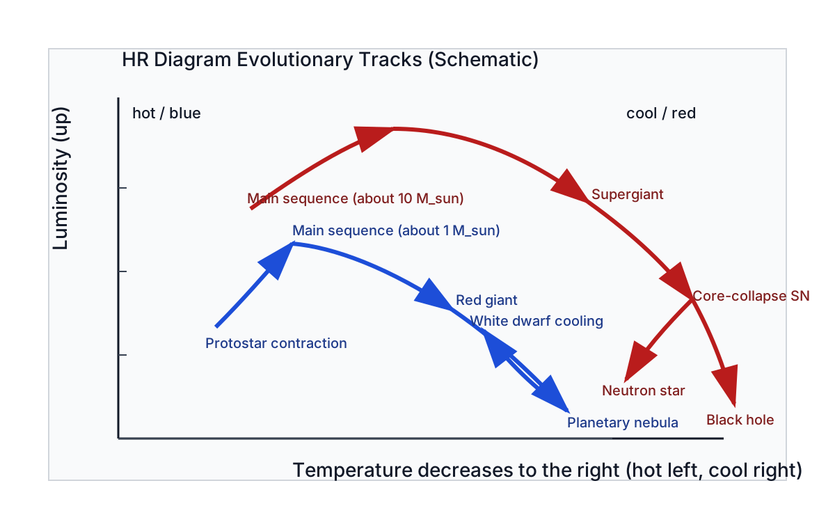
The life story of a Sun-like star, traced on the diagram:
- Birth: forms from a collapsing cloud and contracts toward the main sequence — starts cool and luminous (upper right), moving down and to the left.
- Main sequence (): settles into hydrogen-burning equilibrium as a G2 V star, staying put for billion years. This is why most stars are on the main sequence — that’s where they spend most of their lives.
- Red giant phase: core hydrogen exhausted, core contracts, envelope expands — cooler but much more luminous, moving to the upper right.
- Death: sheds its outer layers (planetary nebula); the core is left as a white dwarf — hot but tiny, in the lower left, then slowly cooling and fading down-and-right over billions of years.
Core contraction heats the interior (gravitational energy → thermal energy); envelope expansion lowers surface temperature even as luminosity rises. Motion on the diagram is the surface trace of that interior redistribution. A massive star () follows a similar but faster, more dramatic path — only on the main sequence, then supergiant, then likely a core-collapse supernova. Increasing mass changes the entire route through the upper diagram, not just the final remnant.
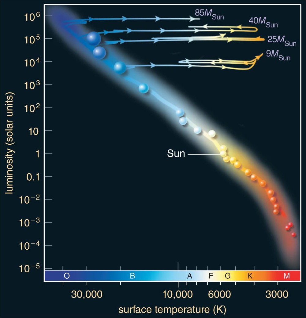
The key insight: mass determines the path — and the timescale. A low-mass star evolves slowly along one track; a high-mass star races along a different, more dramatic one. The HR diagram is a map of where stars go as they age, with mass as the control parameter.
What the HR Diagram Does Not Encode
The HR diagram is a projection: two coordinates ( and ) cannot uniquely encode the full stellar state. Hidden coordinates include metallicity, rotation, magnetic fields, and binarity; age is also not uniquely encoded once stars leave the main sequence. Different combinations can place stars in similar regions while implying different structures and futures. Read it as a structured projection of higher-dimensional stellar physics — excellent for pattern recognition, but not a complete state description.
What the HR Diagram Cannot Explain
The diagram reveals patterns but does not, by itself, explain them. The questions it raises:
- Why does the main sequence exist at all? What creates a stable equilibrium where a star radiates at constant luminosity for billions of years?
- Why does mass determine position on the main sequence? What connects core mass to surface temperature and luminosity?
- Why do stars become giants? What changes internally when hydrogen is exhausted, and why expand rather than simply turn off?
- Why is there a maximum mass for white dwarfs? (There is — , the Chandrasekhar limit.) What happens to more massive cores?
- Why is there a minimum mass for stars? (Below , objects never ignite hydrogen — brown dwarfs.) What sets this threshold?
None of these can be answered by measurement alone. They require models — physical theories of stellar interiors, nuclear fusion, and the balance between gravity and pressure. That is the subject of Module 3: Stellar Structure and Evolution.