The HR Diagram
Complete lesson
The Magnitude System
By the end of this reading, you will be able to:
When Ejnar Hertzsprung and Henry Norris Russell independently plotted stellar luminosity against temperature in the early 1900s, they expected scatter — a random spray of points. Instead, they found structure. Stars cluster into distinct regions: a long diagonal band (the main sequence), a clump of cool luminous stars (giants), and a scattering of hot dim stars (white dwarfs). This pattern was the first evidence that stars are organized by physics. Understanding that physics is the work of Module 3. This reading is about the pattern itself.
Part 1: The Magnitude System — The Astronomer’s Brightness Scale
The Problem: Stars Span a Ridiculous Range
Try the naive thing first: a linear brightness plot with Proxima, Betelgeuse, and the Sun on the same axis. Set Proxima near the bottom and scale upward by equal flux steps. Betelgeuse jumps to tens of millions of Proximas, and the Sun jumps tens of billions beyond that. Proxima and Betelgeuse collapse against zero while the Sun runs off-scale. On a linear axis, the plot is scientifically unusable.
We need a logarithmic ruler: the magnitude system — the last measurement tool before we can build the HR diagram.
Why Not Just Use Luminosity?
You already know how to measure a star’s luminosity in physical units: in , or in . So why do astronomers still use magnitudes — logarithmic, inverted (brighter = smaller number), and historically odd? Three reasons:
- Dynamic range. Stellar brightnesses span ten orders of magnitude (). Logarithmic scales compress this into manageable numbers (roughly to ).
- What detectors measure. Eyes, photographic plates, and CCDs respond to flux — energy per unit area per unit time — not luminosity. Magnitudes are tied directly to flux ratios.
- Historical inertia. Hipparchus ranked stars from “first magnitude” (brightest) to “sixth magnitude” (faintest visible). Modern astronomy formalized this into a precise logarithmic system but kept brighter = smaller magnitude.
Apparent Magnitude: How Bright It Looks
The
Here and are the fluxes and , the apparent magnitudes. Because the scale is logarithmic, multiplicative flux changes become additive magnitude shifts.
Apparent magnitude
A logarithmic measure of how bright a star appears from Earth (), set by both luminosity and distance. Smaller (more negative) means brighter; 5 magnitudes correspond to a factor of 100 in flux.
Key numbers to remember:
| Magnitude difference | Flux ratio |
|---|---|
The anchor: 5 magnitudes = a factor of 100 in flux (by definition — Pogson’s ratio).
Multiple choice
If Star A is 5 magnitudes smaller (i.e. a smaller number) than Star B, is Star A’s flux smaller or larger than Star B’s, and by what factor?
Smaller magnitude means brighter, so Star A has the larger flux. A difference is exactly a factor of in flux.
Problem
Star A has apparent magnitude and Star B has . How many times brighter is Star A than Star B?
StepMagnitude difference, then flux ratio
Dimensional check
is dimensionless (a magnitude difference); is a pure flux ratio ✓.
Result
Star A is brighter than Star B in apparent flux. Sanity check: Star A has the smaller magnitude (, smaller than ), so it is indeed brighter ✓.
Absolute Magnitude: How Bright It Actually Is
Apparent magnitude mixes intrinsic luminosity with distance — a nearby dim star can look brighter than a distant luminous one. To compare stars fairly, remove the distance factor. The
Absolute magnitude
The apparent magnitude a star would have if placed at the standard distance of (). It expresses intrinsic luminosity in the magnitude system, removing the distance dependence.
| Star | (apparent) | Distance | (absolute) | Luminosity |
|---|---|---|---|---|
| Sun | ||||
| Sirius | ||||
| Betelgeuse | ||||
| Proxima Cen |
The Sun looks blindingly bright only because it’s close; at it would be a modest . Betelgeuse looks unremarkable despite being intrinsically times more luminous because it’s far away.
The Distance Modulus: Connecting , , and
The relationship between apparent magnitude, absolute magnitude, and distance is the
is apparent magnitude, absolute magnitude, the distance in parsecs; the quantity is the distance modulus. Where does it come from? It is the inverse-square law from Lecture 1 () rewritten in logarithmic language — the flux dependence becomes a term. Same physics, different packaging.
Distance modulus
The difference between apparent and absolute magnitude — a logarithmic readout of distance. Zero at ; the inverse-square law in magnitude form.
Sanity checks: at , , so ✓. At , — the star appears (i.e. ) fainter ✓. At , — the star is fainter ✓.
Problem
A Cepheid has apparent magnitude and absolute magnitude . How far away is it?
StepDistance modulus
StepSolve for distance
Dimensional check
The log argument is the dimensionless ratio ; solving returns in parsecs ✓.
Result
A modulus of gives , a plausible distance for a luminous Cepheid ✓.
Problem
- A star has and . How far away is it?
- A star at has . What is its absolute magnitude?
- The Sun has . What would its apparent magnitude be at ? At ?
- Tricky: Two stars have the same . Star A is farther than Star B. What is the difference in their apparent magnitudes?
- (by definition, where ).
- .
- At , . At , — fainter than the naked-eye limit (), so invisible without binoculars.
- — Star A appears dimmer, consistent with .
The Observer's HR Diagram
Part 2: The Observer’s HR Diagram — Patterns from Data
A Radical Idea: Plot Everything
By the early 1900s, astronomers had measured apparent magnitudes and spectral types for thousands of stars, and parallaxes were giving absolute magnitudes. The obvious question: what happens if you plot absolute magnitude against spectral type? Ejnar Hertzsprung (1911) and Henry Norris Russell (1913) independently did exactly this. Every star has a different mass, age, and composition — so the natural expectation was noise, a random spray of dots. There was no theoretical reason in 1911 to expect anything else.
What they found instead was one of the most stunning patterns in science. The rice didn’t scatter — it fell along a narrow highway (a single diagonal band) with a few outlying clusters. This plot is the
Hertzsprung-Russell diagram
A plot of stellar luminosity (or absolute magnitude) against effective temperature (or spectral type) that organizes stars into the main sequence, giant branch, and white dwarf sequence. The single most important diagram in astrophysics — a classification chart, a mass map, and an evolution diagram at once.
Quick check
If spectral type primarily tracked composition rather than temperature, what would you expect the HR diagram to look like?
You would not get a tight, temperature-ordered main-sequence band. Stars of similar composition but very different thermal states would smear the diagram into much larger scatter, instead of a narrow diagonal sequence.
If the observer’s HR diagram still feels abstract, orient yourself with a more old-school map first. The classic version below labels familiar stars directly, so you can see the geography before translating it into the stripped-down data view.
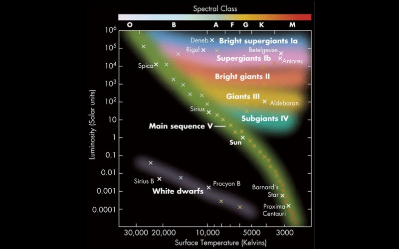
Building the Diagram
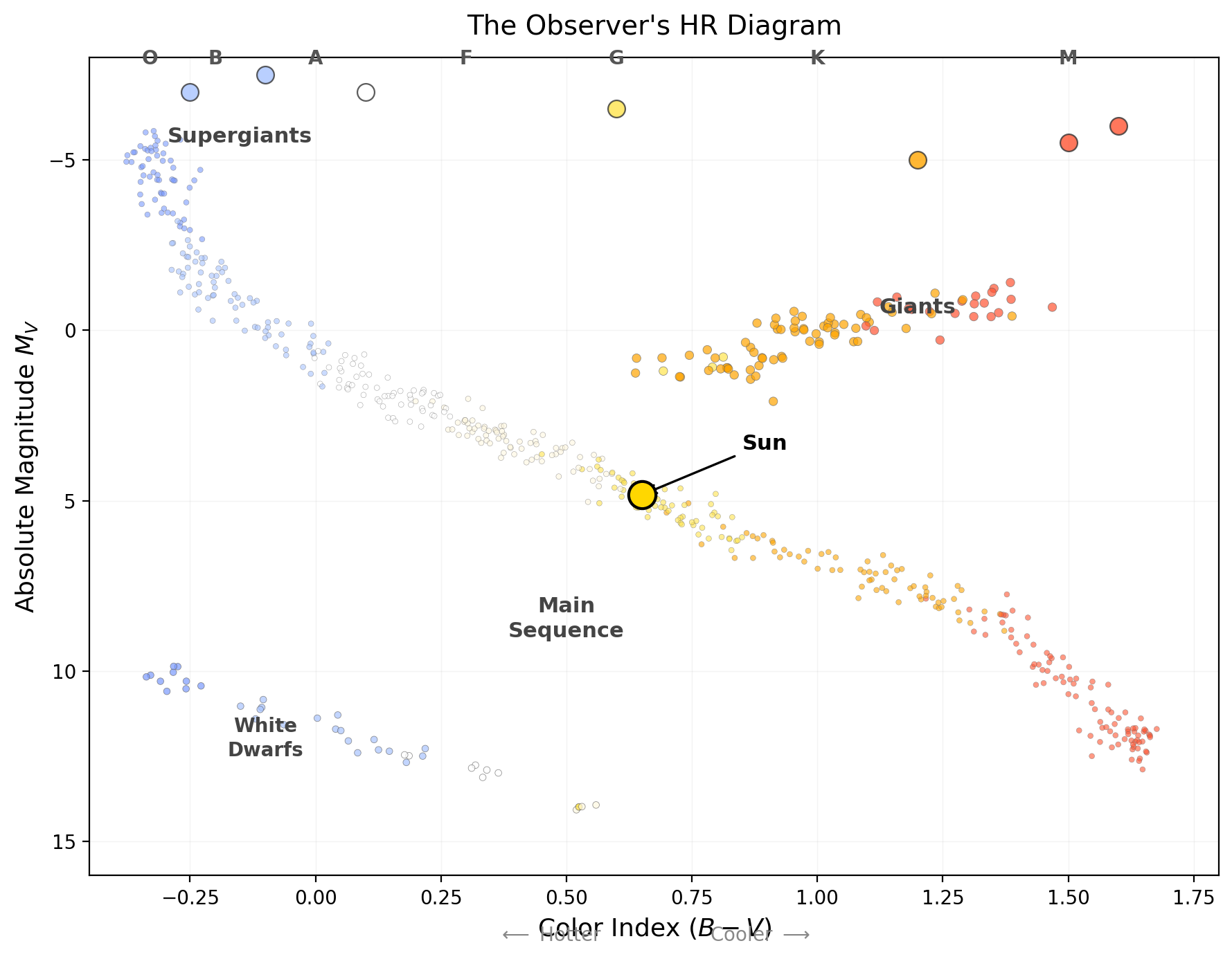
The
Color-magnitude diagram
The observer’s form of the HR diagram: absolute magnitude versus color index (or spectral type), built from photometry and distance alone — no physical theory required.
Crucially: neither axis requires theory. Spectral type is a direct classification from line patterns; absolute magnitude comes from apparent magnitude and parallax distance. This diagram is pure measurement — Observable → Model → Inference: we measure and spectral type, use the distance modulus to model , then infer structure from how stars populate the diagram.
What the Diagram Shows
1. The Main Sequence — a narrow diagonal band from upper-left (hot, bright) to lower-right (cool, faint). About 90% of all stars fall on it, the Sun roughly in the middle. As you learned in Lecture 4, mass determines luminosity () and temperature for main-sequence stars, so the
Main sequence
The diagonal band on the HR diagram where hydrogen-core-burning stars spend ~90% of their lives, ordered by mass: high-mass stars are hot and luminous (upper left), low-mass stars cool and faint (lower right). It is the mass-luminosity relation made visible.
2. The Giant and Supergiant Region — a cluster in the upper-right: cool () but very luminous (). These are
Red giant
An evolved star that has exhausted core hydrogen and expanded enormously (typically ), becoming cool but very luminous — the upper-right region of the HR diagram.
Supergiant
The most luminous evolved stars, with radii reaching (luminosity class I) — e.g. Betelgeuse. They occupy the very top of the HR diagram across a wide temperature range.
3. The White Dwarf Sequence — a scattering in the lower-left: hot () but very faint (). By the same logic — hot but faint means small — these are
White dwarf
The Earth-sized () remnant core of a low- or intermediate-mass star — hot but faint, in the lower-left of the HR diagram, cooling slowly with no ongoing fusion.
Luminosity Classes: Vertical Structure
Even at the same spectral type, stars differ enormously in luminosity. A K2 star could be a dwarf () or a giant () — same temperature, 500 times more luminous. Observers tell them apart through spectral line widths: higher surface gravity (compact dwarfs) raises atmospheric pressure and broadens lines; lower gravity (extended giants) gives narrower lines. This is the
Luminosity class
The Roman-numeral part of a stellar classification (I supergiant, III giant, V dwarf, …), read from spectral line widths (surface gravity). It distinguishes stars of equal temperature but very different size and luminosity.
| Luminosity Class | Name | Example |
|---|---|---|
| I | Supergiant | Betelgeuse (α Ori) |
| II | Bright giant | — |
| III | Giant | Arcturus (α Boo) |
| IV | Subgiant | Procyon (α CMi) |
| V | Main-sequence dwarf | Sun, Sirius A |
A complete classification includes both: the Sun is G2 V (G2 temperature , class V dwarf); Betelgeuse is M1 I (, class I supergiant).
Quick check
- Which corner of the observer’s HR diagram holds the hottest, most luminous stars? The coolest, faintest?
- A star is spectral type K5, luminosity class III. Dwarf, giant, or supergiant? Hotter or cooler than the Sun?
- Two stars are both G2. Star A is class V; Star B is class III. Which is more luminous, and why?
- Why does spectral line width distinguish giants from dwarfs?
- Upper-left = hot + luminous (O/B supergiants); lower-right = cool + faint (M dwarfs).
- K5 III = giant, cooler than the Sun (K is cooler than G).
- Star B (class III, giant) is more luminous — same , but a much larger radius, so is far higher.
- Surface gravity: dwarfs are compact (small , high ), so high atmospheric pressure broadens lines; giants are extended (large , low ), so lines are narrow.
The Theorist's HR Diagram
Part 3: The Theorist’s HR Diagram — Overlaying Physics
Same Patterns, Physical Axes
The observer’s diagram uses and spectral type. Theorists prefer physical quantities: luminosity (in ) and effective temperature (in K), related through calibrations — via the magnitude-luminosity relation, spectral type (e.g. G2 → ). The conversion is:
(treating the -band as a proxy for bolometric here). The theorist’s HR diagram plots against , temperature decreasing rightward. The remarkable fact: the same patterns appear on both versions — so they are real features of stellar physics, not artifacts of the measurement system.
Lines of Constant Radius
The theorist’s diagram lets you overlay theoretical relationships, the most important from the Stefan-Boltzmann law:
This connects , , and . On the HR diagram and are the axes, so fixing defines a line: (at fixed ).
These lines of constant radius are diagonals on the theorist’s HR diagram — each represents all combinations of and for a star of a given radius.
Numeric answer
At fixed radius, if a star’s temperature doubles, by what factor does its luminosity change?
Luminosity increases steeply: at fixed , so doubling gives . Same radius, much hotter surface, dramatically brighter.
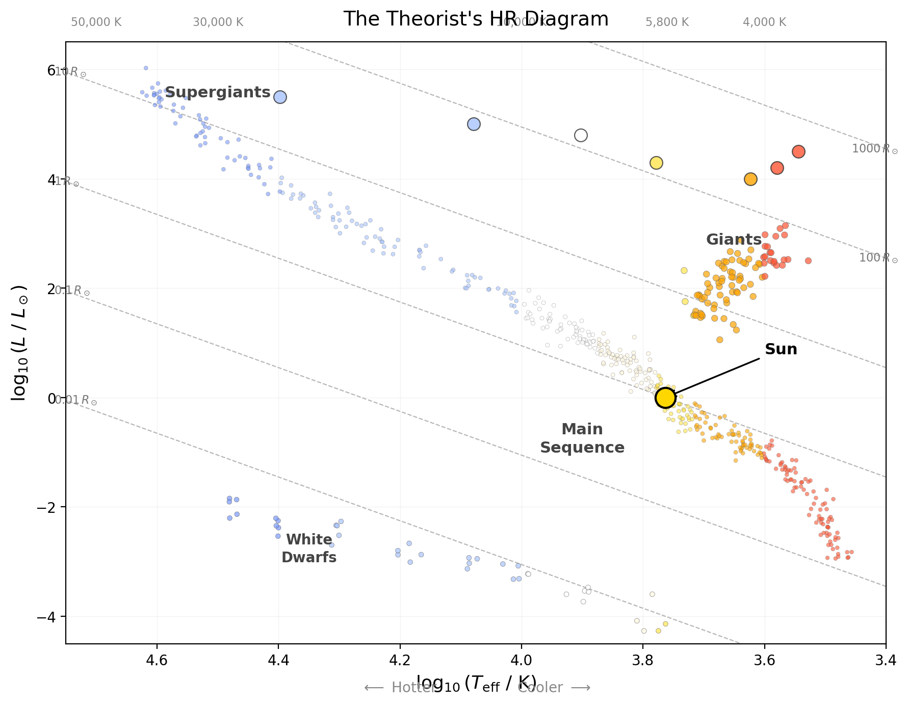
Reading the diagram with radius lines: main-sequence stars span (M dwarfs) to (O stars); giants sit on lines (luminous despite being cool); supergiants reach ; white dwarfs sit on lines (faint despite being hot).
Problem
A red giant has and . What is its radius compared to the Sun ()?
StepUse the ratio form (no CGS constants)
StepEvaluate
Dimensional check
All quantities are solar ratios — units cancel; the answer is in solar radii ✓.
Result
The red giant has — typical for the red giant branch. Placed at the Sun’s center it would reach about halfway to Mercury ✓.
Problem
- On the theorist’s HR diagram, which way do lines of constant radius slope?
- A white dwarf has and . Estimate its radius in .
- Where would a star with and appear? Is such a star observed?
- at fixed , so constant- lines slope upward to the left (hotter = more luminous, with the reversed temperature axis).
- — roughly Earth-sized ✓.
- — hot and moderately luminous, above and left of the Sun. Real B-type stars there are usually more luminous (larger radii), so this is a useful thought experiment.
Part 2 built a map from measurements alone; Part 3 added radius. But neither tells us what orders stars along the main sequence. To explain that, we need the hidden parameter that sets both luminosity and temperature: mass.
Mass: The Hidden Organizer
Part 4: Mass — The Hidden Organizer
The Main Sequence Is a Mass Sequence
Here is the payoff from Lecture 4. Label main-sequence stars by their mass (from binary measurements) and a beautiful pattern appears: mass increases monotonically from lower-right to upper-left.
| Position on MS | Spectral Type | Mass () | () | (K) |
|---|---|---|---|---|
| Lower right | M5 | |||
| M0 | ||||
| Middle | G2 (Sun) | |||
| F0 | ||||
| Upper left | A0 | |||
| B0 | ||||
| O5 |
Read this as a syllogism. Premise 1: along the main sequence, luminosity and temperature change monotonically from lower-right to upper-left. Premise 2: for hydrogen-burning stars, both luminosity and temperature scale systematically with mass (Lecture 4). Conclusion: ordering main-sequence stars by luminosity/temperature is ordering them by mass — the sequence is a one-parameter family whose hidden coordinate is mass.
The main sequence is the locus of hydrogen-burning stars ordered by mass. The mass-luminosity relation () explains the ordering: mass sets core temperature, which sets the burning rate, which sets luminosity and surface temperature. But note what’s remarkable: mass appears on neither axis — yet it organizes the entire structure. The HR diagram is a projection of a higher-dimensional stellar-structure space onto two observable axes; mass is the hidden coordinate that orders the projection.
Spectroscopic parallax
A distance method (despite the name, unrelated to parallax): a main-sequence star’s spectral type fixes its absolute magnitude, and the distance modulus then yields the distance from the apparent magnitude.
What About Giants and White Dwarfs?
Giants and supergiants have left the main sequence — they exhausted core hydrogen and expanded; their HR position depends on mass, age, and evolutionary state. White dwarfs are remnants — no longer burning, simply cooling; their position depends on mass and cooling age. In short: the main sequence is where stars live; giants are where they go when they age; white dwarfs are where they end up when they die.
An Evolution Diagram
Part 5: An Evolution Diagram — Why Patterns Need Physics
Stars Move on the HR Diagram
The most profound reading of the HR diagram is not as a static chart but as a map of stellar evolution. A star does not stay put — it moves, slowly on the main sequence, then dramatically as it evolves. That motion is the response of a self-gravitating thermodynamic system to changing fuel: when core hydrogen is exhausted, the same fusion source can no longer support hydrostatic equilibrium, so the core contracts, releasing gravitational energy that heats deeper layers; the envelope expands, lowering surface temperature even as total luminosity rises. HR-diagram tracks are the visible footprint of gravity, thermodynamics, and nuclear burning acting together.
Axis convention reminder: luminosity up; temperature decreases to the right (hot left, cool right). This schematic is a map-reading aid, not a precision plot — follow each arrow as a phase transition.
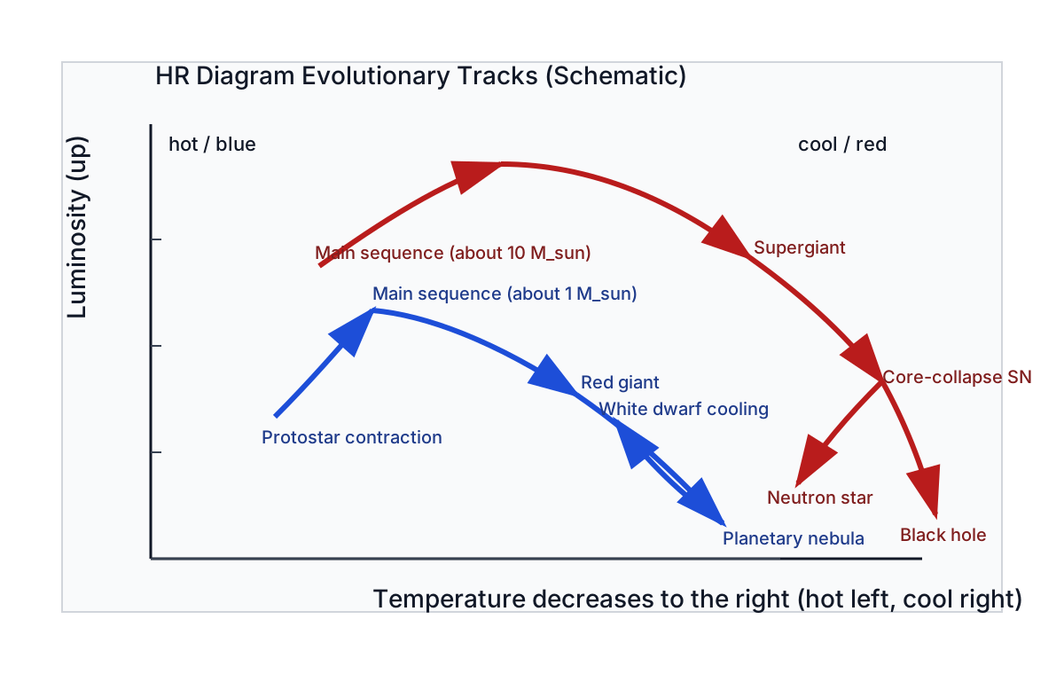
The life story of a Sun-like star, traced on the diagram:
- Birth: forms from a collapsing cloud and contracts toward the main sequence — starts cool and luminous (upper right), moving down and to the left.
- Main sequence (): settles into hydrogen-burning equilibrium as a G2 V star, staying put for billion years. This is why most stars are on the main sequence — that’s where they spend most of their lives.
- Red giant phase: core hydrogen exhausted, core contracts, envelope expands — cooler but much more luminous, moving to the upper right.
- Death: sheds its outer layers (planetary nebula); the core is left as a white dwarf — hot but tiny, in the lower left, then slowly cooling and fading down-and-right over billions of years.
Core contraction heats the interior (gravitational energy → thermal energy); envelope expansion lowers surface temperature even as luminosity rises. Motion on the diagram is the surface trace of that interior redistribution. A massive star () follows a similar but faster, more dramatic path — only on the main sequence, then supergiant, then likely a core-collapse supernova. Increasing mass changes the entire route through the upper diagram, not just the final remnant.
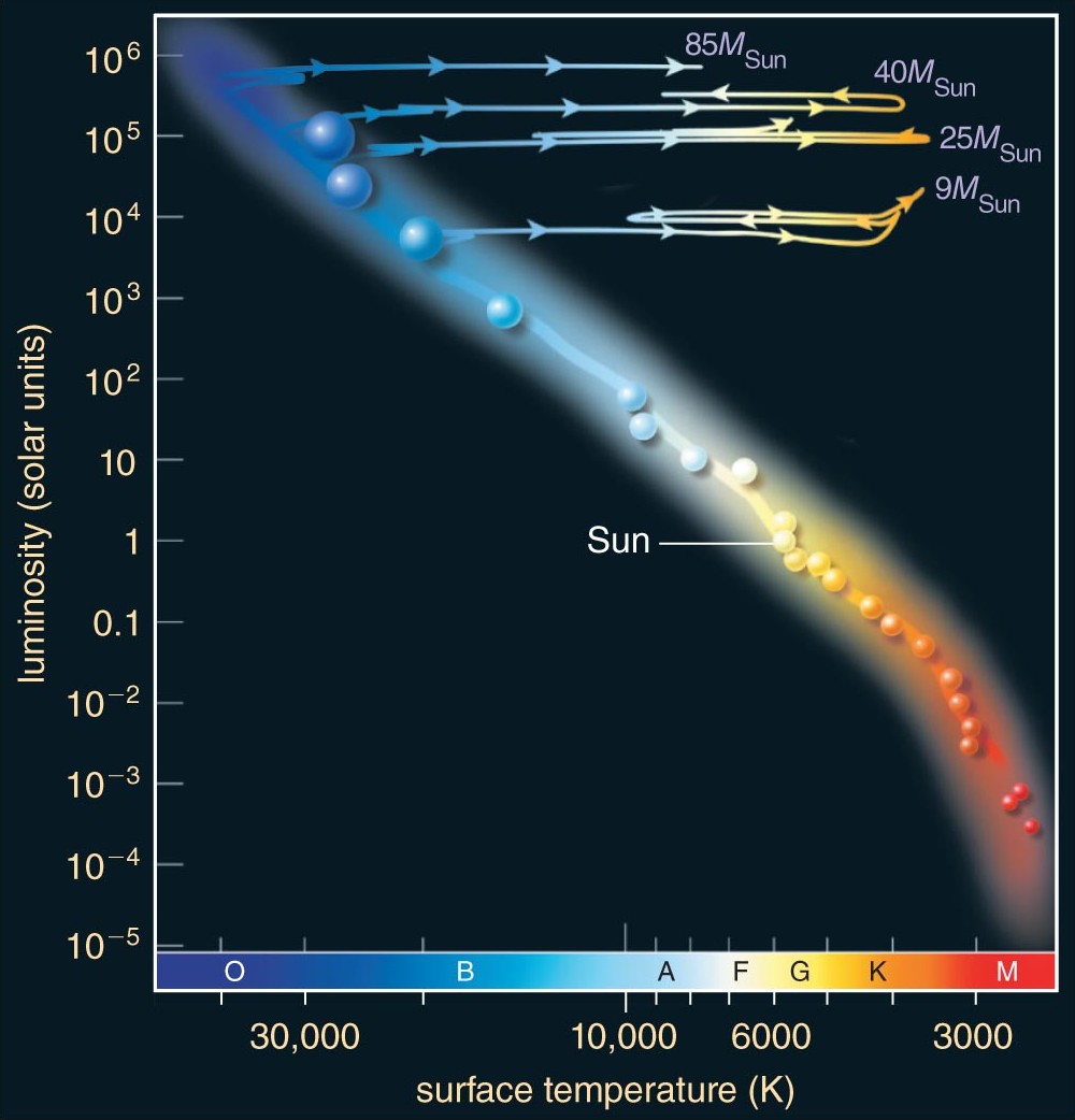
The key insight: mass determines the path — and the timescale. A low-mass star evolves slowly along one track; a high-mass star races along a different, more dramatic one. The HR diagram is a map of where stars go as they age, with mass as the control parameter.
What the HR Diagram Does Not Encode
The HR diagram is a projection: two coordinates ( and ) cannot uniquely encode the full stellar state. Hidden coordinates include metallicity, rotation, magnetic fields, and binarity; age is also not uniquely encoded once stars leave the main sequence. Different combinations can place stars in similar regions while implying different structures and futures. Read it as a structured projection of higher-dimensional stellar physics — excellent for pattern recognition, but not a complete state description.
What the HR Diagram Cannot Explain
The diagram reveals patterns but does not, by itself, explain them. The questions it raises:
- Why does the main sequence exist at all? What creates a stable equilibrium where a star radiates at constant luminosity for billions of years?
- Why does mass determine position on the main sequence? What connects core mass to surface temperature and luminosity?
- Why do stars become giants? What changes internally when hydrogen is exhausted, and why expand rather than simply turn off?
- Why is there a maximum mass for white dwarfs? (There is — , the Chandrasekhar limit.) What happens to more massive cores?
- Why is there a minimum mass for stars? (Below , objects never ignite hydrogen — brown dwarfs.) What sets this threshold?
None of these can be answered by measurement alone. They require models — physical theories of stellar interiors, nuclear fusion, and the balance between gravity and pressure. That is the subject of Module 3: Stellar Structure and Evolution.
Reference and Synthesis
Reference Tables
The Magnitude Scale: Key Values
| Object | Apparent Magnitude | Absolute Magnitude |
|---|---|---|
| Sun | ||
| Full Moon | — | |
| Venus (brightest) | — | |
| Sirius (brightest star) | ||
| Vega | ||
| Naked-eye limit | — | |
| Hubble Space Telescope limit | — |
Main-Sequence Properties by Spectral Type
| Spectral Type | (K) | Mass () | Radius () | () | Main-Seq Lifetime | |
|---|---|---|---|---|---|---|
| O5 | ||||||
| B0 | ||||||
| A0 | ||||||
| F0 | ||||||
| G2 (Sun) | ||||||
| K0 | ||||||
| M0 | ||||||
| M5 | over |
Order-of-magnitude only; values depend on metallicity, rotation, and mass loss.
Summary: Finding Patterns, Needing Models
- The magnitude system is a logarithmic brightness scale where 5 magnitudes = a factor of 100 in flux. Absolute magnitude removes distance, placing all stars at a standard .
- The distance modulus () connects observed brightness, intrinsic brightness, and distance — the inverse-square law in logarithmic form.
- The observer’s HR diagram ( vs. spectral type) is pure measurement, revealing the main sequence, giant branch, and white dwarf sequence.
- The theorist’s HR diagram ( vs. ) overlays lines of constant radius from Stefan-Boltzmann — giants are enormous, white dwarfs tiny.
- The main sequence is a mass sequence — (lower right) to (upper left). The mass-luminosity relation made visible.
- The HR diagram is an evolution diagram. Stars move as they age; mass determines the path. The main sequence is where stars live; the giant branch where they age; the white dwarf sequence where they end up.
- Patterns demand physics. Why does the main sequence exist? Why do stars become giants? What sets the maximum white dwarf mass? Module 3 answers these.
Observable → Model → Inference: The HR Diagram Chain
Apparent brightness and color of many stars, plus parallax distances
Photometry and spectroscopy give apparent magnitude and spectral type (color); parallax gives distance — together yielding absolute magnitudes and color indices for each star.
The magnitude / distance-modulus / Stefan-Boltzmann calibration stack
The magnitude system converts flux ratios to a log scale; the distance modulus (inverse-square law) connects apparent and absolute magnitude; Wien’s law connects color to temperature; Stefan-Boltzmann connects and to radius; structure models connect and to mass and evolutionary state.
HR structure — a mass-ordered main sequence, giants, and white dwarfs
Stars cluster into a main sequence (a mass sequence), a giant branch (evolved, bloated envelopes), and a white dwarf sequence (dead cores). Mass, on neither axis, organizes the whole pattern — and the patterns become the questions Module 3 must answer.
Two stars have the same absolute magnitude, but one appears 5 magnitudes fainter than the other. What does that tell you, and what’s the ratio of their distances?
Same means same intrinsic luminosity, so the brightness difference is pure distance. A difference is in flux, and flux scales as , so the fainter star is farther away (its distance modulus is larger).
Glossary
- Absolute magnitude
The apparent magnitude a star would have if placed at the standard distance of (). It expresses intrinsic luminosity in the magnitude system, removing the distance dependence.
- Apparent magnitude
A logarithmic measure of how bright a star appears from Earth (), set by both luminosity and distance. Smaller (more negative) means brighter; 5 magnitudes correspond to a factor of 100 in flux.
- Color-magnitude diagram
The observer’s form of the HR diagram: absolute magnitude versus color index (or spectral type), built from photometry and distance alone — no physical theory required.
- Distance modulus
The difference between apparent and absolute magnitude — a logarithmic readout of distance. Zero at ; the inverse-square law in magnitude form.
- Hertzsprung-Russell diagram
A plot of stellar luminosity (or absolute magnitude) against effective temperature (or spectral type) that organizes stars into the main sequence, giant branch, and white dwarf sequence. The single most important diagram in astrophysics — a classification chart, a mass map, and an evolution diagram at once.
- Luminosity class
The Roman-numeral part of a stellar classification (I supergiant, III giant, V dwarf, …), read from spectral line widths (surface gravity). It distinguishes stars of equal temperature but very different size and luminosity.
- Main sequence
The diagonal band on the HR diagram where hydrogen-core-burning stars spend ~90% of their lives, ordered by mass: high-mass stars are hot and luminous (upper left), low-mass stars cool and faint (lower right). It is the mass-luminosity relation made visible.
- Red giant
An evolved star that has exhausted core hydrogen and expanded enormously (typically ), becoming cool but very luminous — the upper-right region of the HR diagram.
- Spectroscopic parallax
A distance method (despite the name, unrelated to parallax): a main-sequence star’s spectral type fixes its absolute magnitude, and the distance modulus then yields the distance from the apparent magnitude.
- Supergiant
The most luminous evolved stars, with radii reaching (luminosity class I) — e.g. Betelgeuse. They occupy the very top of the HR diagram across a wide temperature range.
- White dwarf
The Earth-sized () remnant core of a low- or intermediate-mass star — hot but faint, in the lower-left of the HR diagram, cooling slowly with no ongoing fusion.