Test your readiness by predicting the outputs and identifying any issues:
import numpy as np# Question 1: What shape will this array have?x = np.linspace(0, 10, 100)y = np.sin(x)# Shape of y: _______# Question 2: What will this boolean mask select?data = np.array([1, 5, 3, 8, 2, 9])mask = data >5selected = data[mask]# selected contains: _______# Question 3: What's wrong with this code?# matrix = np.array([[1, 2], [3, 4]])# result = matrix + [10, 20, 30] # Will this work?# Your answer: _______# Question 4: What will this create?X, Y = np.meshgrid(np.arange(5), np.arange(3))# Shape of X and Y: _______
NoteSelf-Assessment Answers
Shape of y: (100,) - 1D array with 100 elements
selected contains: [8, 9] - values greater than 5
Broadcasting error - shapes (2,2) and (3,) are incompatible
Shape of X and Y: Both are (3, 5) - 2D grids
If you got all four correct, you’re ready for Matplotlib! If not, review Chapter 7.
Chapter Overview
Data without visualization is like a telescope without an eyepiece – you might have collected photons from distant galaxies, but you can’t see the universe they reveal. Every major scientific discovery of the past century has been communicated through carefully crafted visualizations: Hubble’s plot showing the expanding universe (Hubble 1929), Hertzsprung and Russell’s diagram revealing stellar evolution, the power spectrum of the cosmic microwave background proving inflation theory. These weren’t just pretty pictures; they were visual arguments that changed our understanding of the cosmos. Matplotlib (Hunter 2007), the foundational plotting library for scientific Python, gives you the power to create these kinds of transformative visualizations, turning your NumPy arrays into insights that can be shared, published, and understood.
But here’s what many tutorials won’t tell you: Matplotlib isn’t just a plotting library – it’s an artist’s studio. Like an artist selecting brushes, canvases, and colors, you’ll learn to choose plot types, figure sizes, and colormaps that best express your data’s story. Creating a great visualization isn’t about following rigid rules; it’s about experimentation, iteration, and developing an aesthetic sense for what works. You’ll discover that the difference between a confusing plot and a revealing one often comes down to trying different scales – linear versus logarithmic, different color mappings, or simply adjusting the aspect ratio. This chapter embraces that experimental nature, teaching you not just the mechanics of plotting but the art of visual exploration. You’ll learn to approach each dataset as a unique challenge, trying multiple visualizations until you find the one that makes the patterns jump off the page.
This chapter introduces Matplotlib’s two main interfaces – pyplot for quick exploration and the object-oriented API for full control – but focuses on the latter because it’s what you’ll use for research. You’ll master the anatomy of a figure, understanding how figures contain axes, how axes contain plots, and how every element can be customized. You’ll learn the visualization canon: light curves that reveal exoplanets, spectra that encode stellar chemistry, color-magnitude diagrams that map stellar populations, and images that capture the structure of galaxies. Most crucially, you’ll develop visualization taste – the ability to choose the right plot type, scale, and layout to honestly and effectively communicate your scientific findings. By the chapter’s end, you won’t just make plots; you’ll craft visual narratives that can stand alongside those historic diagrams that revolutionized science. And you’ll have built your own library of plotting functions, turning common visualizations into single function calls that encode your hard-won knowledge about what works.
Matplotlib is vast, and this chapter covers the essential ~20% you’ll use 80% of the time. The official documentation at https://matplotlib.org/ is your comprehensive reference for:
Gallery of examples: https://matplotlib.org/stable/gallery/index.html
Detailed API reference: https://matplotlib.org/stable/api/index.html
Pro tip: The Matplotlib gallery is incredibly valuable – find a plot similar to what you want, then adapt its code. Every plot in the gallery includes complete, downloadable source code. When you see a beautiful plot in a paper and wonder “How did they do that?”, the gallery often has the answer.
Essential bookmark: The “Anatomy of a Figure” guide at https://matplotlib.org/stable/tutorials/introductory/usage.html – keep this open while learning!
Matplotlib evolves quickly — check the release notes for your installed version before upgrading or relying on new defaults.
8.1 Matplotlib as Your Artistic Medium
pyplot Matplotlib’s MATLAB-like procedural interface for quick plotting.
Object-Oriented API Matplotlib’s powerful interface providing full control over every plot element.
Figure The overall container for all plot elements, like a canvas.
Axes The plotting area within a figure where data is visualized.
Experimentation The iterative process of trying different visualizations to find the most revealing representation.
Before we dive into technical details, let’s establish a fundamental principle: creating visualizations is an inherently creative act. You’re not just displaying data; you’re making countless aesthetic choices that affect how your message is received. Consider these two philosophies:
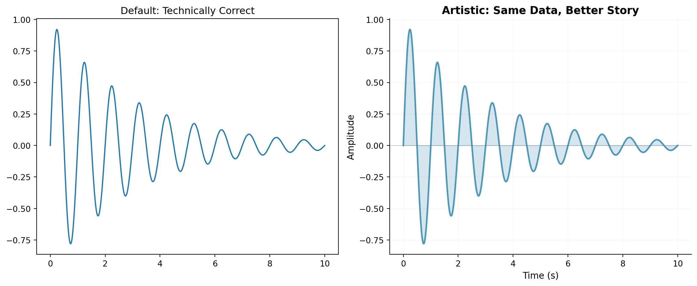
import numpy as npimport matplotlib.pyplot as plt# Generate some data - a damped oscillationtime = np.linspace(0, 10, 1000)signal = np.exp(-time/3) * np.sin(2* np.pi * time)# Approach 1: The Default Plot (technically correct but uninspiring)fig, (ax1, ax2) = plt.subplots(1, 2, figsize=(12, 5))ax1.plot(time, signal)ax1.set_title('Default: Technically Correct')# Approach 2: The Artistic Plot (same data, different choices)ax2.plot(time, signal, color='#2E86AB', linewidth=2, alpha=0.8)ax2.fill_between(time, signal, alpha=0.2, color='#2E86AB')ax2.axhline(y=0, color='#A23B72', linestyle='-', linewidth=0.5, alpha=0.5)ax2.set_xlabel('Time (s)', fontsize=11, fontweight='light')ax2.set_ylabel('Amplitude', fontsize=11, fontweight='light')ax2.set_title('Artistic: Same Data, Better Story', fontsize=13, fontweight='bold')ax2.grid(True, alpha=0.15, linestyle='-', linewidth=0.5)ax2.spines['top'].set_visible(False)ax2.spines['right'].set_visible(False)plt.tight_layout()plt.show()
Comparison of default vs artistic plotting approaches
Both plots show the same data, but the second one makes deliberate choices about color, transparency, and styling that make it more engaging. This is what we mean by being an artist with Matplotlib – every element is under your control, and those choices matter.
The Experimentation Mindset
Creating effective visualizations requires experimentation. You rarely get it right on the first try. Here’s a realistic workflow:
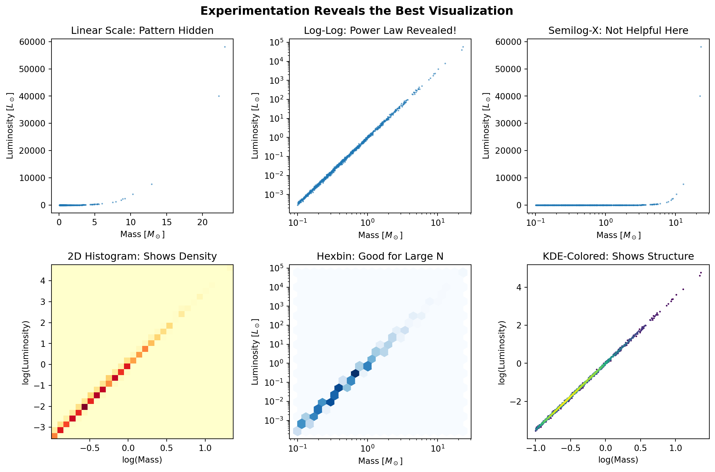
import numpy as npimport matplotlib.pyplot as plt# Real data: stellar magnitudes with a power-law distributionrng = np.random.default_rng(42)masses = rng.pareto(2.35, 1000) +0.1# Stellar IMF (Salpeter 1955)luminosities = masses **3.5# Mass-luminosity relationluminosities += rng.normal(0, 0.1* luminosities) # Add scatter# Try different visualizations to find what reveals the pattern bestfig, axes = plt.subplots(2, 3, figsize=(12, 8))# Attempt 1: Simple scatteraxes[0, 0].scatter(masses, luminosities, s=1, alpha=0.5)axes[0, 0].set_title('Linear Scale: Pattern Hidden')axes[0, 0].set_xlabel(r'Mass [$M_\odot$]')axes[0, 0].set_ylabel(r'Luminosity [$L_\odot$]')# Attempt 2: Log-log reveals power law!axes[0, 1].loglog(masses, luminosities, '.', markersize=2, alpha=0.5)axes[0, 1].set_title('Log-Log: Power Law Revealed!')axes[0, 1].set_xlabel(r'Mass [$M_\odot$]')axes[0, 1].set_ylabel(r'Luminosity [$L_\odot$]')# Attempt 3: Semilog-x (wrong choice for this data)axes[0, 2].semilogx(masses, luminosities, '.', markersize=2, alpha=0.5)axes[0, 2].set_title('Semilog-X: Not Helpful Here')axes[0, 2].set_xlabel(r'Mass [$M_\odot$]')axes[0, 2].set_ylabel(r'Luminosity [$L_\odot$]')# Attempt 4: 2D histogram for densityh = axes[1, 0].hist2d(np.log10(masses), np.log10(luminosities), bins=30, cmap='YlOrRd')axes[1, 0].set_title('2D Histogram: Shows Density')axes[1, 0].set_xlabel('log(Mass)')axes[1, 0].set_ylabel('log(Luminosity)')# Attempt 5: Hexbin for large datasetsaxes[1, 1].hexbin(masses, luminosities, gridsize=20, xscale='log', yscale='log', cmap='Blues')axes[1, 1].set_title('Hexbin: Good for Large N')axes[1, 1].set_xlabel(r'Mass [$M_\odot$]')axes[1, 1].set_ylabel(r'Luminosity [$L_\odot$]')# Attempt 6: Contours with scatter overlay# Optional: requires SciPy (skip if not installed)try:from scipy.stats import gaussian_kde xy = np.vstack([np.log10(masses), np.log10(luminosities)]) z = gaussian_kde(xy)(xy) idx = z.argsort() x, y, z = np.log10(masses)[idx], np.log10(luminosities)[idx], z[idx] axes[1, 2].scatter(x, y, c=z, s=1, cmap='viridis') axes[1, 2].set_title('KDE-Colored: Shows Structure')exceptImportError: axes[1, 2].text(0.5, 0.5, 'SciPy required', ha='center', va='center', transform=axes[1, 2].transAxes) axes[1, 2].set_title('KDE (requires SciPy)')axes[1, 2].set_xlabel('log(Mass)')axes[1, 2].set_ylabel('log(Luminosity)')plt.suptitle('Experimentation Reveals the Best Visualization', fontsize=14, fontweight='bold')plt.tight_layout()plt.show()print("Key Lesson: The log-log plot immediately reveals the power-law relationship")print("that was completely hidden in the linear plot. Always experiment!")
Experimenting with different visualizations reveals hidden patterns
Key Lesson: The log-log plot immediately reveals the power-law relationship
that was completely hidden in the linear plot. Always experiment!
NoteThe More You Know: How a Plot Saved Dark Energy
In 1998, two teams were racing to measure the universe’s deceleration by observing Type Ia supernovae – “standard candles” whose known brightness reveals their distance. The Supernova Cosmology Project, led by Saul Perlmutter, and the High-Z Supernova Search Team, led by Brian Schmidt and Adam Riess, expected to find the expansion slowing down due to gravity.
The critical moment came not from sophisticated analysis but from visualization choices. The teams tried dozens of ways to plot their data: magnitude versus redshift, distance versus redshift, logarithmic scales, linear scales. Nothing showed a clear pattern. Then Adam Riess had an idea: instead of plotting raw magnitudes, plot the residuals – the difference between observed and expected magnitudes for a matter-only universe (Riess et al. 1998).
# Simplified version of the Nobel Prize-winning plotz = np.array([0.01, 0.1, 0.3, 0.5, 0.7, 0.9]) # Redshift# Expected magnitudes for matter-only universem_expected =5* np.log10(z *3000) +25# Simplified# Observed magnitudes (dimmer than expected!)m_observed = m_expected +0.25* z # Supernovae are dimmer!fig, (ax1, ax2) = plt.subplots(1, 2, figsize=(12, 5))# Original plot - pattern not obviousax1.plot(z, m_observed, 'ro', markersize=8)ax1.plot(z, m_expected, 'b--', label='Expected (matter only)')ax1.set_xlabel('Redshift (z)')ax1.set_ylabel('Magnitude')ax1.set_title('Original Plot: Hard to See')ax1.legend()# Residual plot - acceleration jumps out!ax2.plot(z, m_observed - m_expected, 'ro', markersize=8)ax2.axhline(y=0, color='k', linestyle='--', label='No acceleration')ax2.set_xlabel('Redshift (z)')ax2.set_ylabel('Deltam (observed - expected)')ax2.set_title('Residual Plot: Universe Accelerating!')ax2.legend()
The residual plot made it obvious: supernovae were consistently dimmer than expected. The universe wasn’t just expanding; it was accelerating! This visualization choice – the result of experimentation and artistic judgment – led to a Nobel Prize (Perlmutter et al. 1999). Sometimes the difference between confusion and clarity is how you choose to plot your data.
8.2 Anatomy of a Figure
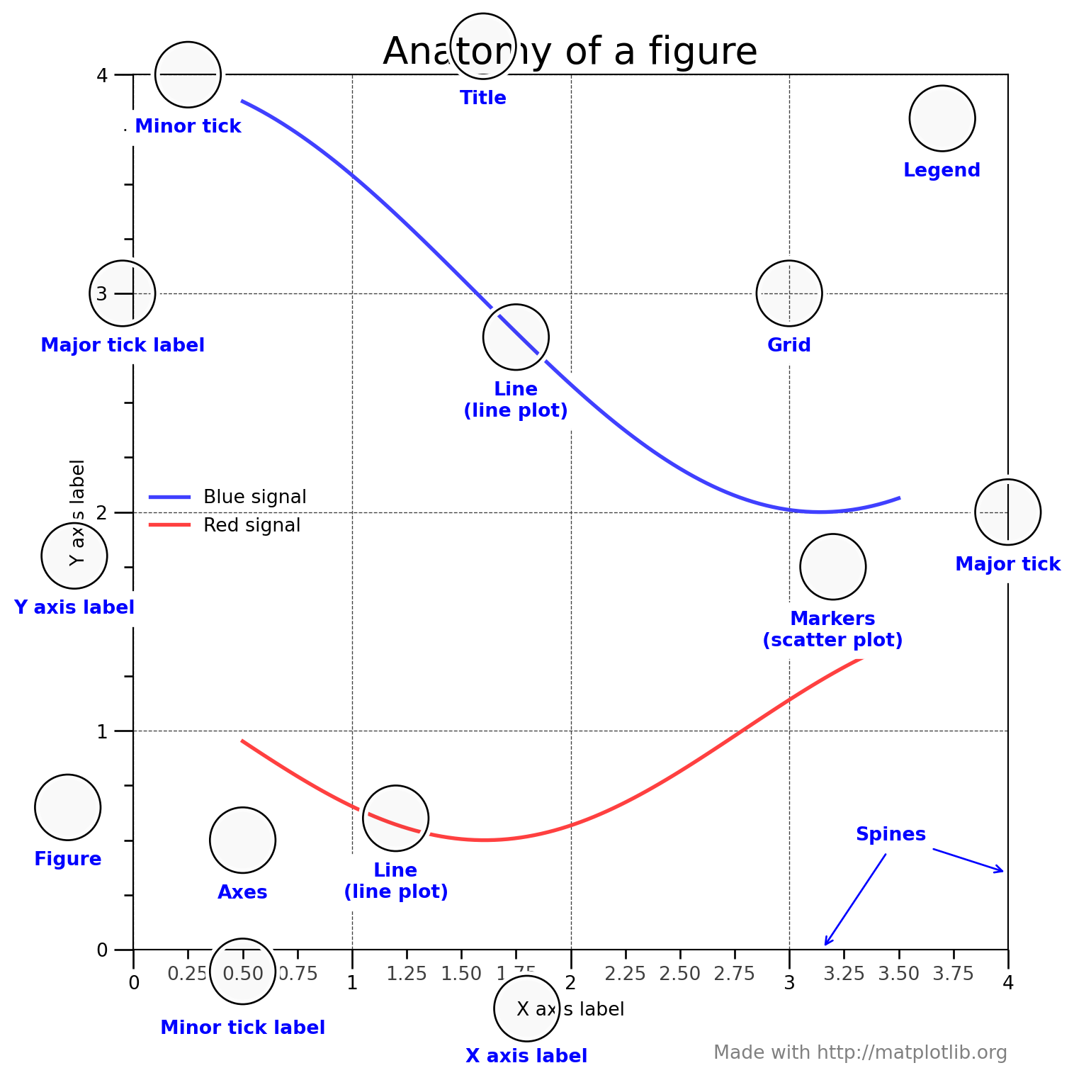
Understanding Matplotlib’s hierarchy is crucial for controlling your visualizations. Nicolas P. Rougier created the definitive visualization of this anatomy (Rougier 2016), which has become the standard reference for the Matplotlib community.
Show the complete Anatomy of a Figure code (Rougier 2016)
# =============================================================================# Anatomy of a Matplotlib Figure# =============================================================================# Copyright (c) 2016 Nicolas P. Rougier - MIT License# Source: http://github.com/rougier/figure-anatomy# This figure shows the name of several matplotlib elements composing a figureimport numpy as npimport matplotlib.pyplot as pltfrom matplotlib.ticker import MultipleLocator, FuncFormatternp.random.seed(123)X = np.linspace(0.5, 3.5, 100)Y1 =3+ np.cos(X)Y2 =1+ np.cos(1+ X/0.75)/2Y3 = np.random.uniform(Y1, Y2, len(X))fig = plt.figure(figsize=(8, 8), facecolor="w")ax = fig.add_subplot(1, 1, 1, aspect=1)def minor_tick(x, pos):ifnot x %1.0:return""return"%.2f"% xax.xaxis.set_major_locator(MultipleLocator(1.000))ax.xaxis.set_minor_locator(MultipleLocator(0.250))ax.yaxis.set_major_locator(MultipleLocator(1.000))ax.yaxis.set_minor_locator(MultipleLocator(0.250))ax.xaxis.set_minor_formatter(FuncFormatter(minor_tick))ax.set_xlim(0, 4)ax.set_ylim(0, 4)ax.tick_params(which='major', width=1.0)ax.tick_params(which='major', length=10)ax.tick_params(which='minor', width=1.0, labelsize=10)ax.tick_params(which='minor', length=5, labelsize=10, labelcolor='0.25')ax.grid(linestyle="--", linewidth=0.5, color='.25', zorder=-10)ax.plot(X, Y1, c=(0.25, 0.25, 1.00), lw=2, label="Blue signal", zorder=10)ax.plot(X, Y2, c=(1.00, 0.25, 0.25), lw=2, label="Red signal")ax.scatter(X, Y3, c='w')ax.set_title("Anatomy of a figure", fontsize=20)ax.set_xlabel("X axis label")ax.set_ylabel("Y axis label")ax.legend(frameon=False)def circle(x, y, radius=0.15):from matplotlib.patches import Circlefrom matplotlib.patheffects import withStroke circle = Circle((x, y), radius, clip_on=False, zorder=10, linewidth=1, edgecolor='black', facecolor=(0, 0, 0, .0125), path_effects=[withStroke(linewidth=5, foreground='w')]) ax.add_artist(circle)def text(x, y, text): ax.text(x, y, text, backgroundcolor="white", ha='center', va='top', weight='bold', color='blue')# Minor tick labelcircle(0.50, -0.10)text(0.50, -0.32, "Minor tick label")# Major tickcircle(4.00, 2.00)text(4.00, 1.80, "Major tick")# Minor tickcircle(0.25, 4.00)text(0.25, 3.80, "Minor tick")# Major tick labelcircle(-0.05, 3.00)text(-0.05, 2.80, "Major tick label")# X Labelcircle(1.80, -0.27)text(1.80, -0.45, "X axis label")# Y Labelcircle(-0.27, 1.80)text(-0.27, 1.6, "Y axis label")# Titlecircle(1.60, 4.13)text(1.60, 3.93, "Title")# Blue plotcircle(1.75, 2.80)text(1.75, 2.60, "Line\n(line plot)")# Red plotcircle(1.20, 0.60)text(1.20, 0.40, "Line\n(line plot)")# Scatter plotcircle(3.20, 1.75)text(3.20, 1.55, "Markers\n(scatter plot)")# Gridcircle(3.00, 3.00)text(3.00, 2.80, "Grid")# Legendcircle(3.70, 3.80)text(3.70, 3.60, "Legend")# Axescircle(0.5, 0.5)text(0.5, 0.3, "Axes")# Figurecircle(-0.3, 0.65)text(-0.3, 0.45, "Figure")color ='blue'ax.annotate('Spines', xy=(4.0, 0.35), xycoords='data', xytext=(3.3, 0.5), textcoords='data', weight='bold', color=color, arrowprops=dict(arrowstyle='->', connectionstyle="arc3", color=color))ax.annotate('', xy=(3.15, 0.0), xycoords='data', xytext=(3.45, 0.45), textcoords='data', weight='bold', color=color, arrowprops=dict(arrowstyle='->', connectionstyle="arc3", color=color))ax.text(4.0, -0.5, "Made with http://matplotlib.org", fontsize=10, ha="right", color='.5')plt.tight_layout()plt.show()
The complete anatomy of a Matplotlib figure, showing all components. Credit: Nicolas P. Rougier (MIT License)
This visualization by Rougier (2016) shows how every element – from the figure container down to individual tick labels – forms part of Matplotlib’s hierarchical structure. Understanding these relationships is what gives you the power to customize every aspect of your plots.
TipKey Components to Remember
Figure: The overall container (like a canvas)
Axes: The plotting area where data is drawn (a figure can have multiple axes)
Spines: The lines forming the border of the axes
Ticks: The marks on the axes showing scale (major and minor)
Labels: Text identifying axes and the plot title
Legend: Key explaining what different plot elements represent
Grid: Reference lines to help read values
Working with the Object-Oriented Interface
Backend The rendering engine Matplotlib uses to create and display figures.
Now that you understand the anatomy, let’s see how to manipulate these elements:
# Create a figure with explicit control over componentsfig = plt.figure(figsize=(10, 6))# Add axes manually to see the structure# [left, bottom, width, height] in figure coordinates (0-1)ax_main = fig.add_axes([0.1, 0.3, 0.7, 0.6]) # Main plotax_zoom = fig.add_axes([0.65, 0.6, 0.2, 0.2]) # Inset zoomax_residual = fig.add_axes([0.1, 0.05, 0.7, 0.2]) # Residual panel# Generate datax = np.linspace(0, 10, 100)y = np.sin(x) * np.exp(-x/10)y_model = np.sin(x) * np.exp(-x/10.5) # Slightly different model# Main plotax_main.plot(x, y, 'ko', markersize=3, alpha=0.5, label='Data')ax_main.plot(x, y_model, 'r-', linewidth=2, label='Model')ax_main.set_ylabel('Signal', fontsize=12)ax_main.legend(loc='upper right')ax_main.grid(True, alpha=0.3)# Zoom insetzoom_mask = (x >3) & (x <5)ax_zoom.plot(x[zoom_mask], y[zoom_mask], 'ko', markersize=2)ax_zoom.plot(x[zoom_mask], y_model[zoom_mask], 'r-', linewidth=1)ax_zoom.set_xlim(3, 5)ax_zoom.grid(True, alpha=0.3)ax_zoom.set_title('Zoom', fontsize=9)# Residualsresiduals = y - y_modelax_residual.scatter(x, residuals, s=5, alpha=0.5, color='blue')ax_residual.axhline(y=0, color='red', linestyle='--', linewidth=1)ax_residual.set_xlabel('Time', fontsize=12)ax_residual.set_ylabel('Residuals', fontsize=10)ax_residual.grid(True, alpha=0.3)fig.suptitle('Explicit Control Over Figure Components', fontsize=14, fontweight='bold')plt.show()
When creating many figures in a loop (common when processing large surveys), memory usage can explode if not managed properly:
In Python, a context manager is the with ... pattern that guarantees cleanup after a block runs. It’s commonly used for files (auto‑close) and other resources, but Matplotlib’s plt.subplots() is not a context manager — so you must close figures manually.
# BAD: Memory leak - figures accumulate!for i inrange(100): plt.figure() plt.plot(data[i]) plt.savefig(f'plot_{i}.png')# Figure stays in memory!# GOOD: Explicitly close figuresfor i inrange(100): fig, ax = plt.subplots() ax.plot(data[i]) fig.savefig(f'plot_{i}.png') plt.close(fig) # Free memory!# BETTER: Explicit close (Matplotlib is not a context manager)for i inrange(100): fig, ax = plt.subplots() ax.plot(data[i]) fig.savefig(f'plot_{i}.png') plt.close(fig) # Releases memory
For large surveys processing thousands of objects, this difference between memory leak and proper management can mean the difference between success and crashing!
Quick diagnostic: If you suspect memory issues, check how many figures are open:
print(f"Open figures: {len(plt.get_fignums())}") # Should be small!plt.close('all') # Nuclear option: close everything
This pattern connects to Chapter 6’s file handling context managers – same principle, different resource.
Sharing Axes with GridSpec
When plotting multi-wavelength data, you often want aligned time axes:
from matplotlib.gridspec import GridSpec# Create figure with shared x-axes using GridSpecfig = plt.figure(figsize=(10, 8))gs = GridSpec(3, 1, hspace=0.05)# Create subplots with shared x-axisax1 = fig.add_subplot(gs[0])ax2 = fig.add_subplot(gs[1], sharex=ax1)ax3 = fig.add_subplot(gs[2], sharex=ax1)# Generate multi-wavelength datatime = np.linspace(0, 10, 200)rng = np.random.default_rng(42)optical = np.sin(2* np.pi * time /3) + rng.normal(0, 0.1, 200)xray =2* np.sin(2* np.pi * time /3+0.5) + rng.normal(0, 0.2, 200)radio =0.5* np.sin(2* np.pi * time /3-0.3) + rng.normal(0, 0.05, 200)# Plot with shared axesax1.plot(time, optical, 'b-', alpha=0.7)ax1.set_ylabel('Optical')ax1.tick_params(labelbottom=False) # Hide x labels except bottomax2.plot(time, xray, 'r-', alpha=0.7)ax2.set_ylabel('X-ray')ax2.tick_params(labelbottom=False)ax3.plot(time, radio, 'g-', alpha=0.7)ax3.set_ylabel('Radio')ax3.set_xlabel('Time (days)')fig.suptitle('Multi-wavelength Observations with Shared Time Axis')plt.show()
8.3 Choosing the Right Scale: Linear, Log, and Everything Between
Linear Scale Equal steps in data correspond to equal distances on the plot.
Logarithmic Scale Equal multiplicative factors correspond to equal distances on the plot.
Power Law A relationship where \(y \propto x^n\) appears as a straight line with slope \(n\) on a log-log plot.
One of the most important skills in data visualization is choosing the right scale for your axes. The wrong scale can hide patterns; the right scale makes them obvious:
# Generate different types of relationshipsx = np.logspace(-1, 3, 100) # 0.1 to 1000# Different mathematical relationshipslinear =2* x +5quadratic =0.5* x**2exponential = np.exp(x/100)power_law =10* x**(-1.5)logarithmic =50* np.log10(x) +10# Create a comprehensive comparisonfig, axes = plt.subplots(5, 4, figsize=(14, 16))datasets = [ (linear, 'Linear: y = 2x + 5'), (quadratic, 'Quadratic: y = 0.5x^2'), (exponential, 'Exponential: y = e^(x/100)'), (power_law, 'Power Law: y = 10x^(-1.5)'), (logarithmic, 'Logarithmic: y = 50log(x) + 10')]for i, (data, title) inenumerate(datasets):# Linear-linear axes[i, 0].plot(x, data, 'b-', linewidth=2) axes[i, 0].set_title(f'{title}\nLinear-Linear') axes[i, 0].grid(True, alpha=0.3)# Log-log axes[i, 1].loglog(x, np.abs(data), 'r-', linewidth=2) axes[i, 1].set_title('Log-Log') axes[i, 1].grid(True, alpha=0.3, which='both')# Semilog-x axes[i, 2].semilogx(x, data, 'g-', linewidth=2) axes[i, 2].set_title('Semilog-X') axes[i, 2].grid(True, alpha=0.3)# Semilog-y axes[i, 3].semilogy(x, np.abs(data), 'm-', linewidth=2) axes[i, 3].set_title('Semilog-Y') axes[i, 3].grid(True, alpha=0.3)# Highlight which scale reveals linearityaxes[0, 0].set_facecolor('#E8F4F8') # Linear shows linearaxes[2, 3].set_facecolor('#F8E8E8') # Semilogy shows exponentialaxes[3, 1].set_facecolor('#F8F8E8') # Loglog shows power lawaxes[4, 2].set_facecolor('#E8F8E8') # Semilogx shows logarithmicfig.suptitle('Choose the Scale that Reveals Your Data\'s Nature', fontsize=16, fontweight='bold')plt.tight_layout()plt.show()print("Key insight: The 'right' scale makes relationships linear!")print("- Power laws -> log-log")print("- Exponential growth -> semilog-y")print("- Logarithmic growth -> semilog-x")
You have data showing radioactive decay: counts versus time. Which scale would best reveal the half-life?
NoteAnswer
Semilog-y (linear time, log counts) is the best choice.
Radioactive decay follows \(N(t) = N_{0} e^{-\lambda t}\), where \(t\) is time (seconds, days, or whatever your data use) and \(\lambda\) has units of \(1/\mathrm{time}\). Taking logs gives: \[ \log(N) = \log(N_{0}) - \lambda t \]
On a semilog-y plot, this appears as a straight line with slope -\(\lambda\). The half-life is clearly visible as the time for the counts to drop by half (constant vertical distance on the log scale).
t = np.linspace(0, 5, 100)N0 =1000half_life =1.5decay_rate = np.log(2) / half_lifecounts = N0 * np.exp(-decay_rate * t)fig, (ax1, ax2) = plt.subplots(1, 2, figsize=(10, 4))# Linear - curve makes half-life hard to readax1.plot(t, counts)ax1.set_title('Linear: Half-life unclear')# Semilog-y - straight line, half-life obviousax2.semilogy(t, counts)ax2.axhline(y=N0/2, color='r', linestyle='--', label=rf'$t_{{1/2}}$ = {half_life}')ax2.set_title('Semilog-y: Half-life clear!')ax2.legend()
8.4 Building Your Plotting Toolkit: Reusable Functions
As you develop as a scientific programmer, you’ll find yourself making similar plots repeatedly. Instead of copying and pasting code, build a library of plotting functions that encode your hard-won knowledge about what works:
# Example: A reusable light curve plotting functiondef plot_light_curve(time, flux, flux_err=None, period=None, title=None, figsize=(12, 8)):""" Create a publication-quality light curve plot with optional phase folding. Parameters ---------- time : array-like Time values (days) flux : array-like Flux or magnitude values flux_err : array-like, optional Flux uncertainties period : float, optional Period for phase folding (days) title : str, optional Plot title figsize : tuple, optional Figure size (width, height) Returns ------- fig, axes : matplotlib figure and axes objects """if period isnotNone: fig, axes = plt.subplots(2, 2, figsize=figsize) axes = axes.flatten()else: fig, axes = plt.subplots(1, 1, figsize=(figsize[0], figsize[1]/2)) axes = [axes] # Make it iterable# Main light curve ax = axes[0]if flux_err isnotNone: ax.errorbar(time, flux, yerr=flux_err, fmt='k.', markersize=2, alpha=0.5, elinewidth=0.5, capsize=0)else: ax.scatter(time, flux, s=1, alpha=0.5, color='black') ax.set_xlabel('Time (days)', fontsize=11) ax.set_ylabel('Relative Flux', fontsize=11) ax.set_title('Light Curve'if title isNoneelse title, fontsize=12) ax.grid(True, alpha=0.3)# If period provided, add phase-folded plotif period isnotNone: phase = (time % period) / period# Phase folded ax = axes[1]if flux_err isnotNone: ax.errorbar(phase, flux, yerr=flux_err, fmt='b.', markersize=2, alpha=0.3, elinewidth=0.5, capsize=0)else: ax.scatter(phase, flux, s=1, alpha=0.3, color='blue') ax.set_xlabel('Phase', fontsize=11) ax.set_ylabel('Relative Flux', fontsize=11) ax.set_title(f'Phase Folded (P = {period:.3f} days)', fontsize=12) ax.set_xlim(0, 1) ax.grid(True, alpha=0.3)# Double-plotted phase folded ax = axes[2] phase_double = np.concatenate([phase, phase +1]) flux_double = np.concatenate([flux, flux])if flux_err isnotNone: err_double = np.concatenate([flux_err, flux_err]) ax.errorbar(phase_double, flux_double, yerr=err_double, fmt='r.', markersize=2, alpha=0.3, elinewidth=0.5, capsize=0)else: ax.scatter(phase_double, flux_double, s=1, alpha=0.3, color='red') ax.set_xlabel('Phase', fontsize=11) ax.set_ylabel('Relative Flux', fontsize=11) ax.set_title('Double Phase Plot', fontsize=12) ax.set_xlim(0, 2) ax.grid(True, alpha=0.3)# Binned phase curve - more efficient version ax = axes[3] n_bins =50 binned_flux, bin_edges = np.histogram(phase, bins=n_bins, weights=flux) bin_counts, _ = np.histogram(phase, bins=n_bins) bin_centers = (bin_edges[:-1] + bin_edges[1:]) /2# Calculate proper error bars using standard error of the mean binned_mean = binned_flux / bin_counts# For error calculation, need variance flux_squared, _ = np.histogram(phase, bins=n_bins, weights=flux**2) variance = flux_squared / bin_counts - binned_mean**2 binned_err = np.sqrt(variance / bin_counts)# Only plot bins with data valid_bins = bin_counts >0 ax.errorbar(bin_centers[valid_bins], binned_mean[valid_bins], yerr=binned_err[valid_bins], fmt='go-', markersize=4, linewidth=1, capsize=3) ax.set_xlabel('Phase', fontsize=11) ax.set_ylabel('Relative Flux', fontsize=11) ax.set_title(f'Binned ({n_bins} bins)', fontsize=12) ax.set_xlim(0, 1) ax.grid(True, alpha=0.3) plt.tight_layout()return fig, axes# Test the function with synthetic datarng = np.random.default_rng(42)time = np.linspace(0, 30, 500)period =2.3456# daysphase =2* np.pi * time / periodflux =1.0-0.01* np.sin(phase)**2# Transit-like signalflux += rng.normal(0, 0.002, len(time)) # Add noiseflux_err = np.ones_like(flux) *0.002fig, axes = plot_light_curve(time, flux, flux_err, period=period, title='Exoplanet Transit Light Curve')plt.show()print("This reusable function encodes best practices:")print("- Automatic phase folding when period is provided")print("- Double phase plot to see continuity")print("- Binned version to see average behavior")print("- Consistent styling throughout")
Building a Personal Plotting Library
Here’s a template for organizing your plotting functions:
# my_plots.py - Your personal plotting libraryimport numpy as npimport matplotlib.pyplot as pltdef plot_spectrum(wavelength, flux, flux_err=None, lines=None, title=None, figsize=(12, 5)):"""Plot a stellar spectrum with optional line identification.""" fig, ax = plt.subplots(figsize=figsize)# Plot spectrum ax.plot(wavelength, flux, 'k-', linewidth=0.8, label='Spectrum')if flux_err isnotNone: ax.fill_between(wavelength, flux - flux_err, flux + flux_err, alpha=0.3, color='gray', label='Uncertainty')# Mark spectral linesif lines isnotNone:for wave, name in lines: ax.axvline(x=wave, color='red', linestyle=':', alpha=0.5) ax.text(wave, ax.get_ylim()[1]*0.95, name, rotation=90, va='top', ha='right', fontsize=8) ax.set_xlabel('Wavelength (Å)', fontsize=11) ax.set_ylabel('Normalized Flux', fontsize=11) ax.set_title('Spectrum'if title isNoneelse title, fontsize=12) ax.grid(True, alpha=0.3) ax.legend(loc='best')return fig, axdef plot_cmd(color, magnitude, title=None, figsize=(8, 10)):"""Create a color-magnitude diagram.""" fig, ax = plt.subplots(figsize=figsize)# 2D histogram for density h = ax.hist2d(color, magnitude, bins=50, cmap='YlOrBr', density=True) ax.set_xlabel('Color (B-V)', fontsize=11) ax.set_ylabel('Absolute Magnitude', fontsize=11) ax.invert_yaxis() # Astronomical convention ax.set_title('Color-Magnitude Diagram'if title isNoneelse title, fontsize=12) plt.colorbar(h[3], ax=ax, label='Density')return fig, axdef plot_finding_chart(ra, dec, image=None, sources=None, figsize=(10, 10)):"""Create a finding chart with marked sources.""" fig, ax = plt.subplots(figsize=figsize, subplot_kw={'projection': 'rectilinear'})if image isnotNone: im = ax.imshow(image, cmap='gray_r', origin='lower', extent=[ra.min(), ra.max(), dec.min(), dec.max()]) plt.colorbar(im, ax=ax, label='Intensity')if sources isnotNone:for source in sources: circle = plt.Circle((source['ra'], source['dec']), source.get('radius', 0.1), fill=False, color='red', linewidth=2) ax.add_patch(circle) ax.text(source['ra'], source['dec'] +0.15, source.get('name', ''), ha='center', color='red') ax.set_xlabel('RA (degrees)', fontsize=11) ax.set_ylabel('Dec (degrees)', fontsize=11) ax.set_title('Finding Chart', fontsize=12) ax.invert_xaxis() # RA increases to the leftreturn fig, ax# Example usageprint("Your personal plotting library is ready!")print("Available functions:")print(" - plot_light_curve(): For time series photometry")print(" - plot_spectrum(): For spectroscopic data")print(" - plot_cmd(): For color-magnitude diagrams")print(" - plot_finding_chart(): For sky position plots")
TipComputational Thinking Box: DRY Principle in Plotting
PATTERN: Don’t Repeat Yourself (DRY)
Every time you copy-paste plotting code, you’re creating technical debt. Instead, abstract common patterns into functions:
# BAD: Copying and modifyingfig, ax = plt.subplots()ax.plot(data1)ax.set_xlabel('Time (s)')ax.set_ylabel('Flux')ax.grid(True, alpha=0.3)# ... 50 lines later, same code with data2# GOOD: Reusable functiondef plot_time_series(data, xlabel='Time (s)', ylabel='Flux', **kwargs): fig, ax = plt.subplots(**kwargs) ax.plot(data) ax.set_xlabel(xlabel) ax.set_ylabel(ylabel) ax.grid(True, alpha=0.3)return fig, ax# Now you can customize without repetitionfig1, ax1 = plot_time_series(data1, ylabel='X-ray Flux')fig2, ax2 = plot_time_series(data2, ylabel='Optical Flux')
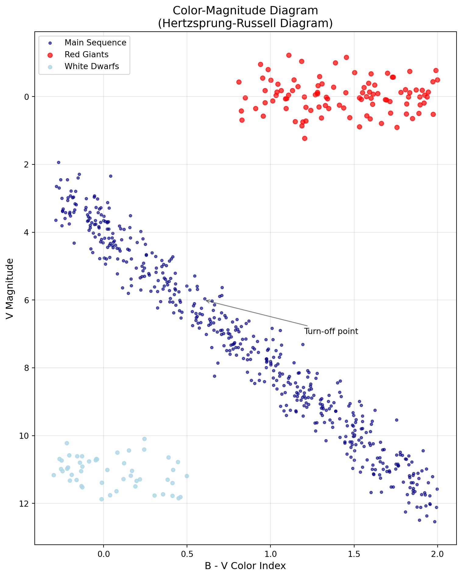
Color-Magnitude Diagram showing different stellar populations
Error Bars: Proper Uncertainty Visualization
# Demonstrating proper error bar visualizationrng = np.random.default_rng(42)# Generate data with varying uncertaintiesx = np.linspace(1, 10, 20)y =2* x +3+ rng.normal(0, 1, 20)# Heteroscedastic errors (varying with x)y_err =0.5+0.1* x + rng.uniform(0, 0.5, 20)fig, axes = plt.subplots(1, 3, figsize=(14, 5))# Standard error barsaxes[0].errorbar(x, y, yerr=y_err, fmt='o', capsize=3, capthick=1, elinewidth=1, markersize=5, label='Data')axes[0].set_title('Standard Error Bars')axes[0].set_xlabel('X')axes[0].set_ylabel('Y')axes[0].grid(True, alpha=0.3)# Error bars with confidence bandaxes[1].errorbar(x, y, yerr=y_err, fmt='o', capsize=0, elinewidth=0.5, markersize=5, alpha=0.7)# Add model with confidence bandmodel_x = np.linspace(0, 11, 100)model_y =2* model_x +3axes[1].plot(model_x, model_y, 'r-', label='Model')axes[1].fill_between(model_x, model_y -1, model_y +1, alpha=0.3, color='red', label='1sigma confidence')axes[1].set_title('Model with Confidence Band')axes[1].set_xlabel('X')axes[1].legend()axes[1].grid(True, alpha=0.3)# Weighted fit visualizationweights =1/ y_err**2# Fit weighted linear modelcoeffs = np.polyfit(x, y, 1, w=weights)fit_y = np.polyval(coeffs, x)axes[2].errorbar(x, y, yerr=y_err, fmt='o', capsize=3, elinewidth=1, markersize=5* weights/weights.max(), alpha=0.6, label='Data (size propto weight)')axes[2].plot(x, fit_y, 'g-', linewidth=2, label='Weighted fit')axes[2].set_title('Weighted Fitting')axes[2].set_xlabel('X')axes[2].legend()axes[2].grid(True, alpha=0.3)fig.suptitle('Error Bar Visualization Best Practices', fontsize=14)plt.tight_layout()plt.show()
WarningCommon Bug Alert: Histogram Binning
# DANGER: Wrong binning can hide or create features!rng = np.random.default_rng(42)data = rng.normal(0, 1, 1000)fig, axes = plt.subplots(1, 3, figsize=(12, 4))# Too few bins - loses structureaxes[0].hist(data, bins=5)axes[0].set_title('Too Few Bins (5)')# Just right - shows distributionaxes[1].hist(data, bins=30)axes[1].set_title('Appropriate Bins (30)')# Too many bins - adds noiseaxes[2].hist(data, bins=200)axes[2].set_title('Too Many Bins (200)')plt.tight_layout()plt.show()# Use Sturges' rule or Freedman-Diaconis rule for automatic binning:# bins='auto' uses the maximum of Sturges and Freedman-Diaconis
Always experiment with bin sizes or use automatic binning algorithms!
NoteCheck Your Understanding
What’s the difference between plt.plot() and ax.plot()? When would you use each?
NoteAnswer
plt.plot() uses the pyplot interface and operates on the “current” axes
ax.plot() uses the object-oriented interface and explicitly specifies which axes to use
Use plt.plot() for: - Quick, exploratory plots - Simple single-panel figures - Interactive work in Jupyter notebooks
Use ax.plot() for: - Multi-panel figures - Publication-quality plots - Any situation where you need fine control - Scripts that generate many figures
In research, always prefer ax.plot() for reproducibility and control!
8.6 Images and 2D Data Visualization
Colormap A mapping from data values to colors for visualization.
Normalization Scaling data values to a standard range for display.
Images and 2D data require special consideration for display:
When working with FITS files and World Coordinate Systems:
# Example of WCSAxes usage (simplified without actual FITS data)# This would normally use astropy.wcs and astropy.io.fits# Simulated example showing the conceptfig = plt.figure(figsize=(10, 8))# Create synthetic datara_range = np.linspace(150, 151, 100) # RA in degreesdec_range = np.linspace(2, 3, 100) # Dec in degreesRA, DEC = np.meshgrid(ra_range, dec_range)# Synthetic astronomical imageimage = np.exp(-((RA -150.5)**2+ (DEC -2.5)**2) /0.01)# Standard matplotlib plot (pixel coordinates)ax1 = fig.add_subplot(121)im1 = ax1.imshow(image, origin='lower', cmap='viridis')ax1.set_xlabel('X (pixels)')ax1.set_ylabel('Y (pixels)')ax1.set_title('Pixel Coordinates')plt.colorbar(im1, ax=ax1)# WCS-aware plot (would use WCS projection in practice)ax2 = fig.add_subplot(122)im2 = ax2.imshow(image, origin='lower', cmap='viridis', extent=[ra_range[0], ra_range[-1], dec_range[0], dec_range[-1]])ax2.set_xlabel('RA (degrees)')ax2.set_ylabel('Dec (degrees)')ax2.set_title('Sky Coordinates (WCS)')ax2.invert_xaxis() # RA increases to the leftplt.colorbar(im2, ax=ax2)plt.suptitle('Pixel vs Sky Coordinates in Astronomical Images')plt.tight_layout()plt.show()print("Note: For real WCS plotting, use:")print("from astropy.wcs import WCS")print("from astropy.io import fits")print("ax = fig.add_subplot(111, projection=wcs)")
ImportantWhy This Matters: Finding Exoplanets in Pixels
The Kepler Space Telescope (Borucki et al. 2010) discovered over 2,600 exoplanets not through pretty pictures, but through careful analysis of pixel data. Each star was just a few pixels on the CCD, and the challenge was detecting brightness changes of 0.01% buried in noise.
The key was visualization. The Kepler team developed specialized image displays showing:
The target pixel file (TPF) - raw pixel values over time
The optimal aperture - which pixels to sum for photometry
The background estimation - critical for accurate measurements
# Simplified Kepler pixel analysis# Create synthetic stellar image with transitrng = np.random.default_rng(42)time_points =50image_size =11images = np.zeros((time_points, image_size, image_size))# Add star (Gaussian PSF)x, y = np.mgrid[0:image_size, 0:image_size]star_x, star_y =5, 5for t inrange(time_points): psf =1000* np.exp(-((x - star_x)**2+ (y - star_y)**2) /4)# Add transit dipif20< t <25: psf *=0.99# 1% dip images[t] = psf + rng.normal(0, 5, (image_size, image_size))# Optimal aperture (pixels to sum)aperture = ((x - star_x)**2+ (y - star_y)**2) <6# Extract light curvelight_curve = [img[aperture].sum() for img in images]
This pixel-level visualization revealed not just transiting planets, but also asteroseismology signals, stellar rotation, and even reflected light from hot Jupiters. The ability to visualize and understand pixel data literally opened up new worlds!
8.7 Color Theory and Publication Standards
DPI Dots per inch, determining figure resolution for printing or display.
LaTeX A typesetting system commonly used for scientific publications, supported by Matplotlib for mathematical notation.
GridSpec Matplotlib’s flexible system for creating complex subplot layouts.
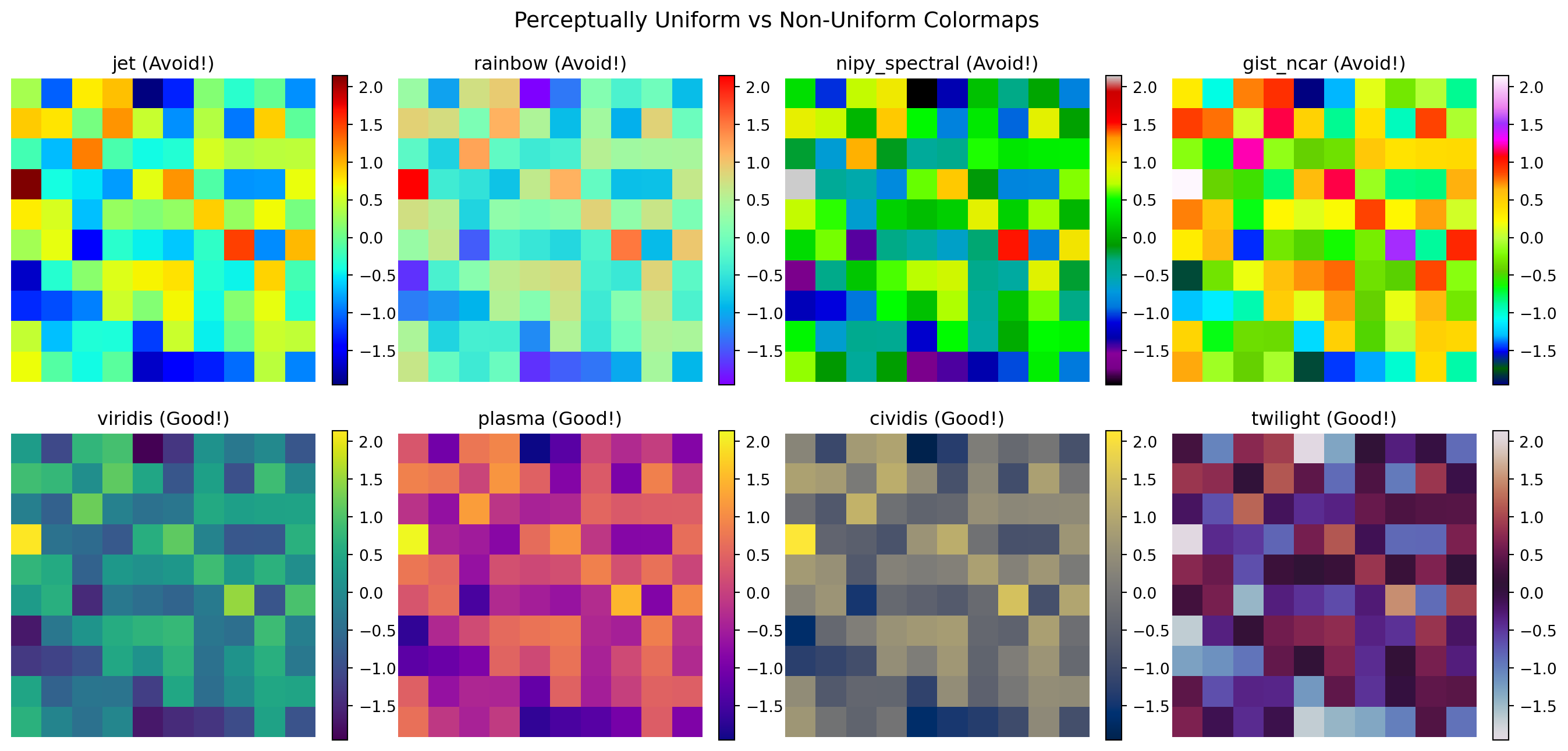
Choosing appropriate colormaps is crucial for honest data representation (Crameri et al. 2020):
Comparison of problematic vs perceptually uniform colormaps
Journal-Specific Styles with SciencePlots
For publication-ready figures with journal-specific formatting:
# Example of journal-specific styling# Note: SciencePlots package provides pre-configured styles# Manual implementation of ApJ-like styledef apply_apj_style():"""Apply Astrophysical Journal style settings.""" plt.rcParams.update({'font.size': 10,'font.family': 'serif','font.serif': ['Computer Modern Roman'],'text.usetex': False, # Set True if LaTeX is installed'figure.figsize': (3.5, 3.5), # Single column'figure.dpi': 300,'savefig.dpi': 300,'savefig.bbox': 'tight','axes.linewidth': 0.5,'lines.linewidth': 1.0,'lines.markersize': 4,'xtick.major.width': 0.5,'ytick.major.width': 0.5, })# Example plot with journal styleapply_apj_style()fig, ax = plt.subplots()x = np.linspace(0, 2*np.pi, 100)ax.plot(x, np.sin(x), label='sin(x)')ax.plot(x, np.cos(x), label='cos(x)')ax.set_xlabel('Phase')ax.set_ylabel('Amplitude')ax.legend()ax.grid(True, alpha=0.3)plt.show()# Reset to defaultsplt.rcParams.update(plt.rcParamsDefault)
WarningCommon Bug Alert: DPI and Figure Sizes
# Figure size confusion - physical vs pixel sizefig1, ax1 = plt.subplots(figsize=(6, 4), dpi=100) # 600x400 pixelsfig2, ax2 = plt.subplots(figsize=(6, 4), dpi=200) # 1200x800 pixelsax1.text(0.5, 0.5, f'Size: {fig1.get_size_inches()}\nDPI: {fig1.dpi}\n'+f'Pixels: {fig1.get_size_inches()[0]*fig1.dpi:.0f}x'+f'{fig1.get_size_inches()[1]*fig1.dpi:.0f}', transform=ax1.transAxes, ha='center', va='center')ax1.set_title('100 DPI')ax2.text(0.5, 0.5, f'Size: {fig2.get_size_inches()}\nDPI: {fig2.dpi}\n'+f'Pixels: {fig2.get_size_inches()[0]*fig2.dpi:.0f}x'+f'{fig2.get_size_inches()[1]*fig2.dpi:.0f}', transform=ax2.transAxes, ha='center', va='center')ax2.set_title('200 DPI')plt.show()# For publication: typical requirements# - ApJ: 300 DPI for print, figure width = 3.5" (single column) or 7" (full page)# - Nature: 300-600 DPI, maximum width 183mm# - Screen: 72-100 DPI is sufficient# - Note: When using LaTeX fonts, ensure LaTeX is installed on your system
NoteCheck Your Understanding
Why is the ‘jet’ colormap problematic for scientific visualization?
NoteAnswer
The ‘jet’ colormap has several serious issues (Wong 2011):
Not perceptually uniform: Equal steps in data don’t appear as equal steps in color
Creates false features: Bright bands at yellow and cyan create artificial boundaries
Not colorblind-friendly: Red-green confusion affects ~8% of males
Poor grayscale conversion: Loses information when printed in black and white
Example of the problem:
# Linear data appears to have features with jetlinear_data = np.outer(np.ones(10), np.arange(100))fig, (ax1, ax2) = plt.subplots(1, 2, figsize=(10, 4))ax1.imshow(linear_data, cmap='jet', aspect='auto')ax1.set_title('Jet: False features appear')ax2.imshow(linear_data, cmap='viridis', aspect='auto')ax2.set_title('Viridis: Smooth gradient')
Always use perceptually uniform colormaps like viridis, plasma, or cividis for scientific data!
8.8 Optional: yt for Astrophysical Simulations
Optional deep‑dive — skip this section if you are focused on the COMP 536 core requirements.
yt A Python package for analyzing and visualizing volumetric data from astrophysical simulations.
AMR Adaptive Mesh Refinement - a computational technique for solving PDEs with varying resolution.
Introduction to yt
For those working with simulation data, yt (Turk et al. 2011) is an indispensable tool that complements Matplotlib for 3D volumetric data visualization. It supports over 40 simulation codes including ENZO, FLASH, Gadget, AREPO, and many others.
# Conceptual example of yt usage (requires yt installation)"""# yt installation: pip install ytimport yt# Load simulation data (supports many formats)ds = yt.load("galaxy_simulation/output_0050")# Create a slice plot through the simulation volumeslc = yt.SlicePlot(ds, 'z', 'density')slc.set_cmap('density', 'viridis')slc.annotate_timestamp()slc.save()# Volume renderingsc = yt.create_scene(ds, 'density')sc.save()# Phase plotsplot = yt.PhasePlot(ds.all_data(), 'density', 'temperature', 'cell_mass')plot.save()"""# Demonstrate the concept with synthetic datafig, axes = plt.subplots(2, 3, figsize=(14, 9))# Simulate different yt-style visualizations# 1. Density slicex = np.linspace(-10, 10, 100)y = np.linspace(-10, 10, 100)X, Y = np.meshgrid(x, y)density = np.exp(-(X**2+ Y**2)/10) +0.5*np.exp(-((X-3)**2+ Y**2)/5)im1 = axes[0, 0].imshow(density, cmap='magma', origin='lower')axes[0, 0].set_title('Density Slice (z=0)')plt.colorbar(im1, ax=axes[0, 0], label='rho [g/cm^3]')# 2. Temperature slicerng = np.random.default_rng(42)temperature =1e4* density**0.5+ rng.normal(0, 100, density.shape)im2 = axes[0, 1].imshow(temperature, cmap='hot', origin='lower')axes[0, 1].set_title('Temperature Slice')plt.colorbar(im2, ax=axes[0, 1], label='T [K]')# 3. Velocity fieldu =-Y / np.sqrt(X**2+ Y**2+0.1)v = X / np.sqrt(X**2+ Y**2+0.1)axes[0, 2].streamplot(x, y, u, v, density=1, color='blue', alpha=0.7)axes[0, 2].set_title('Velocity Streamlines')axes[0, 2].set_xlim(-10, 10)axes[0, 2].set_ylim(-10, 10)# 4. Phase plotn_points =1000dens_sample = rng.lognormal(0, 1, n_points)temp_sample =1e4* dens_sample**0.5+ rng.normal(0, 500, n_points)h = axes[1, 0].hist2d(np.log10(dens_sample), np.log10(temp_sample), bins=30, cmap='YlOrBr')axes[1, 0].set_xlabel('log(Density)')axes[1, 0].set_ylabel('log(Temperature)')axes[1, 0].set_title('Phase Diagram')plt.colorbar(h[3], ax=axes[1, 0])# 5. Projection (column density)column_density = np.sum(np.stack([density]*20), axis=0) # Fake projectionim5 = axes[1, 1].imshow(column_density, cmap='viridis', origin='lower', norm=LogNorm())axes[1, 1].set_title('Column Density Projection')plt.colorbar(im5, ax=axes[1, 1], label='Sigma [g/cm^2]')# 6. Multi-field compositeaxes[1, 2].imshow(density, cmap='Blues', alpha=0.7, origin='lower')contour = axes[1, 2].contour(temperature, levels=5, colors='red', linewidths=2, alpha=0.8)axes[1, 2].set_title('Multi-field Visualization')axes[1, 2].clabel(contour, inline=True, fontsize=8)fig.suptitle('yt-style Visualizations for Simulation Data', fontsize=14, fontweight='bold')plt.tight_layout()plt.show()print("\nyt advantages for simulation data:")print("✓ Supports 40+ simulation codes natively")print("✓ Handles AMR and particle data seamlessly")print("✓ Unit-aware (automatic unit conversions)")print("✓ Parallel processing for large datasets")print("✓ Volume rendering capabilities")print("✓ On-the-fly derived fields")print("\nLearn more at: https://yt-project.org/")
ImportantWhy This Matters: Visualizing the Invisible Universe
Modern astrophysical simulations generate terabytes to petabytes of data, simulating everything from stellar formation to cosmic web evolution. The yt package has become the standard tool for the simulation community because it:
Unifies disparate codes: Whether you’re using ENZO for cosmology, FLASH for stellar explosions, or Gadget for galaxy formation, yt provides a common interface
Handles complexity: AMR grids, SPH particles, octree structures - yt manages them all transparently
Enables discovery: Many breakthrough discoveries in computational astrophysics were visualized first with yt, including the first simulations of Population III stars and high-resolution galaxy formation
The combination of yt for 3D data processing and Matplotlib for publication figures forms the backbone of modern computational astrophysics visualization workflows.
ImportantWhy This Matters: The Hubble Tension Revealed Through Visualization
The “Hubble tension” – the discrepancy between different measurements of the universe’s expansion rate – wasn’t discovered through complex statistics but through careful visualization of measurement uncertainties. When plotting \(H_{0}\) measurements from different methods (CMB, supernovae, gravitational lensing), the error bars don’t overlap, revealing a fundamental problem in our understanding of cosmology. Your ability to create clear, honest visualizations with proper error bars might help resolve one of science’s biggest mysteries!
8.9 When Matplotlib Isn’t Enough: Domain-Specific Tools
Seaborn Statistical visualization library built on Matplotlib with beautiful defaults.
Plotly Interactive visualization library for web-based plots.
Bokeh Interactive visualization library designed for modern web browsers.
While Matplotlib is the foundation of scientific visualization in Python, specialized libraries can dramatically accelerate common tasks. Knowing when to reach for these tools is part of becoming an efficient scientific programmer.
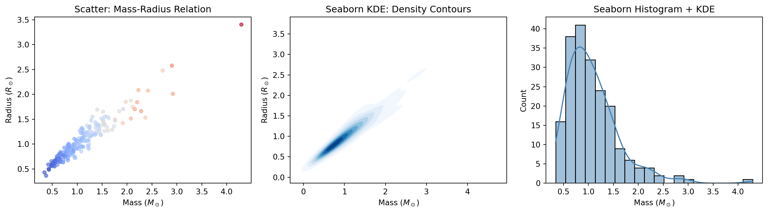
Statistical Visualization: Seaborn
Seaborn (Waskom 2021) provides a high-level interface for statistical graphics. It excels at visualizing distributions, relationships, and categorical data with minimal code:
import numpy as npimport matplotlib.pyplot as plt# Seaborn example (if installed)try:import seaborn as sns# Generate correlated data (stellar mass-radius relation) rng = np.random.default_rng(42) n =200 mass = rng.lognormal(0, 0.5, n) radius = mass**0.8* (1+ rng.normal(0, 0.1, n)) temperature =5800* mass**0.5* (1+ rng.normal(0, 0.05, n)) fig, axes = plt.subplots(1, 3, figsize=(14, 4))# Joint distribution with marginals axes[0].scatter(mass, radius, c=temperature, cmap='coolwarm', alpha=0.6, s=20) axes[0].set_xlabel(r'Mass ($M_\odot$)') axes[0].set_ylabel(r'Radius ($R_\odot$)') axes[0].set_title('Scatter: Mass-Radius Relation')# KDE plot sns.kdeplot(x=mass, y=radius, ax=axes[1], cmap='Blues', fill=True, levels=10) axes[1].set_xlabel(r'Mass ($M_\odot$)') axes[1].set_ylabel(r'Radius ($R_\odot$)') axes[1].set_title('Seaborn KDE: Density Contours')# Histogram with KDE sns.histplot(mass, kde=True, ax=axes[2], color='steelblue') axes[2].set_xlabel(r'Mass ($M_\odot$)') axes[2].set_title('Seaborn Histogram + KDE') plt.tight_layout() plt.show()print("Seaborn excels at:")print("✓ Statistical plots (violin, box, swarm)")print("✓ Distribution visualization")print("✓ Faceted plots (small multiples)")print("✓ Beautiful default themes")exceptImportError:print("Seaborn not installed. Install with: pip install seaborn")print("Seaborn provides high-level statistical visualization.")
Seaborn creates publication-quality statistical plots with minimal code
Plotly creates interactive plots ideal for exploration and web deployment:
Astronomy-Specific: Astropy Visualization
For astronomical data with coordinates, Astropy provides specialized tools:
When to Use What: Decision Guide
# Decision guide for visualization toolsprint("="*60)print("VISUALIZATION TOOL SELECTION GUIDE")print("="*60)tools = {"Matplotlib": {"use_when": ["Publication-quality static figures","Full control over every element","Custom, complex layouts","Embedding in applications" ],"examples": "Journal figures, reports, custom visualizations" },"Seaborn": {"use_when": ["Statistical analysis plots","Quick distribution visualization","Faceted plots (small multiples)","Beautiful defaults needed fast" ],"examples": "Violin plots, pair plots, heatmaps" },"Plotly": {"use_when": ["Interactive exploration","Web deployment","3D visualization","Animations and dashboards" ],"examples": "Exploratory analysis, presentations, web apps" },"yt": {"use_when": ["Simulation data (ENZO, FLASH, Gadget)","Volumetric rendering","AMR data handling","Large-scale parallel analysis" ],"examples": "Galaxy simulations, stellar formation, cosmology" },"Astropy": {"use_when": ["FITS files and WCS","Sky coordinate systems","Unit-aware calculations","Astronomical image analysis" ],"examples": "Survey data, telescope images, catalogs" }}for tool, info in tools.items():print(f"\n{tool}:")print(f" Use when: {', '.join(info['use_when'][:2])}")print(f" Examples: {info['examples']}")print("\n"+"="*60)print("TIP: Start with Matplotlib, add others as needed!")print("="*60)
============================================================
VISUALIZATION TOOL SELECTION GUIDE
============================================================

Matplotlib:
  Use when: Publication-quality static figures, Full control over every element
  Examples: Journal figures, reports, custom visualizations

Seaborn:
  Use when: Statistical analysis plots, Quick distribution visualization
  Examples: Violin plots, pair plots, heatmaps

Plotly:
  Use when: Interactive exploration, Web deployment
  Examples: Exploratory analysis, presentations, web apps

yt:
  Use when: Simulation data (ENZO, FLASH, Gadget), Volumetric rendering
  Examples: Galaxy simulations, stellar formation, cosmology

Astropy:
  Use when: FITS files and WCS, Sky coordinate systems
  Examples: Survey data, telescope images, catalogs

============================================================
TIP: Start with Matplotlib, add others as needed!
============================================================
Tip💡 Library Installation Reference
# Core visualizationpip install matplotlib seaborn# Interactive visualizationpip install plotly bokeh# Astronomy-specificpip install astropy yt# All at once (recommended for this course)pip install matplotlib seaborn plotly astropy
Performance Considerations
Different libraries have different performance characteristics:
Library
Best For
Typical Scale
Interactivity
Matplotlib
Static figures
Millions of points (with tricks)
No
Seaborn
Statistical plots
Thousands
No
Plotly
Interactive plots
~100k points
Yes
Bokeh
Streaming data
~100k points
Yes
Datashader
Big data
Billions of points
Yes (via Bokeh)
For truly massive datasets (millions to billions of points), consider Datashader, which rasterizes data before plotting—essential for large astronomical surveys.
NoteQuick Check
You have a catalog of 10 million galaxies with positions and magnitudes. You want to create a density plot showing the large-scale structure. Which tool(s) would you consider, and why?
NoteAnswer
For 10 million points, standard plotting will be too slow and create illegible results. Consider:
Datashader + Bokeh/Matplotlib: Rasterizes the data into a 2D histogram on-the-fly, displaying density as color. Can handle billions of points.
Matplotlib hist2d/hexbin: For simpler cases, these aggregate data into bins before plotting.
yt: If this is simulation output, yt’s projection capabilities are optimized for this scale.
Even experienced programmers spend time debugging plots. Here’s a quick reference for common issues:
Warning⚠️ Common Plotting Problems and Solutions
Problem: Plot appears blank or shows no data
# Check 1: Are there NaN or Inf values?print(f"NaN count: {np.isnan(data).sum()}")print(f"Inf count: {np.isinf(data).sum()}")# Check 2: Are axis limits hiding your data?print(f"Data range: [{data.min()}, {data.max()}]")ax.autoscale() # Reset to automatic limits# Check 3: Is alpha too low?ax.plot(x, y, alpha=1.0) # Make fully opaque
Problem: Colors not showing correctly
# Check 1: Is data normalized for colormap?vmin, vmax = data.min(), data.max()im = ax.imshow(data, vmin=vmin, vmax=vmax, cmap='viridis')# Check 2: Are you using a diverging colormap for non-diverging data?# Use sequential (viridis) for magnitude, diverging (coolwarm) for residuals
Problem: Figure looks pixelated or blurry
# Increase DPI for sharper outputfig.savefig('plot.png', dpi=300, bbox_inches='tight')# For vector graphics (best for publications)fig.savefig('plot.pdf', bbox_inches='tight')
Problem: Labels or legend cut off
# Use tight_layout or constrained_layoutplt.tight_layout()# or when creating figure:fig, ax = plt.subplots(layout='constrained')# Manual adjustment if neededfig.savefig('plot.png', bbox_inches='tight', pad_inches=0.1)
Problem: Logarithmic scale shows nothing
# Check for zero or negative valuesprint(f"Min value: {data.min()}") # Must be > 0 for log scaledata_positive = data[data >0] # Filter for log scale
Tip💡 Debugging Workflow
Print data shape and range: print(x.shape, y.shape, y.min(), y.max())
Start simple: Remove all customization, plot raw data
Add elements incrementally: Labels, legends, colors one at a time
Check for NaN/Inf: These silently break many plots
Use plt.show() liberally: Confirm each step works before adding complexity
Main Takeaways
You’ve now mastered the art and science of data visualization with Matplotlib, but more importantly, you’ve learned to think like a visual artist-scientist. The journey from simple plots to publication-ready figures has taught you that visualization isn’t just about displaying data – it’s about experimentation, iteration, and making deliberate aesthetic choices that enhance scientific communication. You’ve discovered that creating effective visualizations requires trying multiple approaches: different scales (linear, log, semilog), different plot types (scatter, line, histogram), and different visual encodings (color, size, transparency) until you find the combination that makes patterns jump off the page. This experimental mindset, combined with the technical skills you’ve developed, transforms you from someone who makes plots into someone who crafts visual arguments that can change how we understand the universe.
The distinction between Matplotlib’s two interfaces – pyplot and object-oriented – initially seemed like unnecessary complexity, but you now understand it’s about control and reproducibility. While pyplot suffices for quick exploration, the object-oriented approach gives you the artist’s palette you need for research-quality visualizations. You’ve seen how professional figures require attention to countless details: choosing perceptually uniform colormaps over the problematic jet (Crameri et al. 2020), using appropriate scales to reveal power laws or exponential relationships, properly labeling axes with units, and following scientific conventions like inverting magnitude axes. These aren’t arbitrary rules but hard-won practices that ensure your visualizations communicate honestly and effectively. The famous anatomy figure by Nicolas P. Rougier (2018) that you studied shows how every element – from figure to axes to individual tick marks – is under your control, waiting for your artistic vision.
Most importantly, you’ve learned to build your own plotting toolkit, creating reusable functions that encode your domain knowledge and aesthetic preferences. Instead of copy-pasting code and creating technical debt, you now write functions like plot_light_curve() or plot_spectrum() that embody best practices and can be shared with collaborators. This approach follows the DRY (Don’t Repeat Yourself) principle, ensuring consistency across all your visualizations while making it easy to update styles globally. These personal plotting libraries become more valuable over time, accumulating the wisdom of what works for different types of scientific data. Whether you’re phase-folding light curves to find exoplanets, creating color-magnitude diagrams to study stellar populations, or displaying multi-wavelength observations to understand cosmic phenomena, you have both the technical skills and the artistic sensibility to create visualizations that don’t just show data but tell stories.
For those working with simulation data, the optional introduction to yt opens up a whole new world of volumetric visualization. The yt package’s ability to handle data from over 40 different simulation codes – from ENZO’s cosmological simulations to FLASH’s stellar explosions – makes it indispensable for computational science. Combined with Matplotlib for publication figures, yt forms the backbone of modern simulation visualization workflows, enabling discoveries from the first Population III stars to the evolution of the cosmic web.
Looking ahead to robust computing, the visualization skills you’ve developed become essential debugging tools. When your code fails or produces unexpected results, a well-chosen plot can instantly reveal where things went wrong. The ability to quickly visualize intermediate results, check distributions, and compare expected versus actual outputs will make you a more effective debugger and a more reliable scientific programmer. Remember that every great scientific discovery – from the expanding universe (Hubble 1929) to dark energy (Riess et al. 1998; Perlmutter et al. 1999) to exoplanets (Borucki et al. 2010) – was communicated through a carefully crafted visualization. The skills you’ve developed here put you in that tradition, able to create the kinds of plots that don’t just illustrate findings but reveal new truths about the cosmos.
Definitions
AMR: Adaptive Mesh Refinement - a computational technique for solving PDEs with varying resolution in simulations.
Axes: The plotting area within a figure where data is visualized, including the x and y axis, tick marks, and labels.
Backend: The rendering engine Matplotlib uses to create and display figures (e.g., Agg, TkAgg, Qt5Agg).
Colormap: A mapping from data values to colors for visualization, critical for representing 2D data and images.
DPI: Dots per inch, determining figure resolution for printing or display, typically 72 for screen and 300+ for print.
Experimentation: The iterative process of trying different visualizations to find the most revealing representation.
Figure: The overall container for all plot elements, like a canvas that holds one or more axes.
GridSpec: Matplotlib’s flexible system for creating complex subplot layouts with varying sizes and positions.
LaTeX: A typesetting system commonly used for scientific publications, supported by Matplotlib for mathematical notation.
Light Curve: A plot showing how an object’s brightness varies over time.
Linear Scale: Equal steps in data correspond to equal distances on the plot.
Logarithmic Scale: Equal multiplicative factors correspond to equal distances on the plot.
Normalization: Scaling data values to a standard range for display, such as linear, logarithmic, or power scaling.
Object-Oriented API: Matplotlib’s powerful interface providing full control over every plot element through explicit objects.
Power Law: A mathematical relationship where y \(\propto\) x^n, appearing as a straight line on a log-log plot.
pyplot: Matplotlib’s MATLAB-like procedural interface for quick plotting using implicit current figure/axes.
Spectrum: A plot showing intensity as a function of wavelength or frequency, fundamental in spectroscopy.
yt: A Python package for analyzing and visualizing volumetric data from astrophysical simulations, supporting 40+ codes.
Seaborn: A statistical visualization library built on Matplotlib, providing high-level functions for attractive statistical graphics.
Plotly: An interactive visualization library that creates web-based plots with zoom, pan, and hover capabilities.
Bokeh: An interactive visualization library designed for modern web browsers, excellent for streaming and large datasets.
Datashader: A graphics pipeline for creating meaningful representations of extremely large datasets through rasterization.
Key Takeaways
✓ Matplotlib is your artistic medium – Every plot is an opportunity for creative expression and experimentation
✓ Always experiment with different scales – Linear, log-log, semilog-x, and semilog-y reveal different patterns in your data
✓ Use the object-oriented interface for research – fig, ax = plt.subplots() gives you explicit control needed for publication
✓ Build reusable plotting functions – Create your own library encoding best practices for common scientific plots
✓ Choose perceptually uniform colormaps – Use viridis, plasma, or cividis; avoid jet which creates false features
✓ Master the anatomy of figures – Understanding Rougier’s diagram empowers you to customize every element
✓ Different plots for different data – Use scatter for measurements, lines for models, histograms for distributions
✓ Save in appropriate formats – Vector (PDF, SVG) for plots, raster (PNG) for images, both for safety
✓ Follow scientific conventions – Invert magnitude axes, use proper coordinate systems, follow field standards
✓ Visualization reveals patterns – The right plot can make invisible relationships obvious, leading to discoveries
✓ Consider yt for simulation data – Essential tool for volumetric data from computational codes
✓ WCSAxes for sky coordinates – Use proper astronomical projections when working with FITS data
✓ Know when to use specialized tools – Seaborn for statistics, Plotly for interactivity, yt for simulations, Datashader for big data
Quick Reference Tables
Choosing the Right Scale
Data Type
Best Scale
Why
Power law (y \(\propto\) x^n)
log-log
Appears as straight line
Exponential (y \(\propto\) e^x)
semilog-y
Appears as straight line
Logarithmic (y \(\propto\) log(x))
semilog-x
Appears as straight line
Linear relationship
linear
Direct proportionality visible
Wide dynamic range
log
Shows all scales equally
Magnitudes
linear (inverted)
Astronomical convention
Essential Plot Types
Function
Use Case
Example
ax.plot()
Continuous data, models
ax.plot(x, y, 'b-')
ax.scatter()
Discrete measurements
ax.scatter(x, y, s=20)
ax.errorbar()
Data with uncertainties
ax.errorbar(x, y, yerr=err)
ax.loglog()
Power laws
ax.loglog(freq, power)
ax.semilogy()
Exponential growth
ax.semilogy(time, counts)
ax.semilogx()
Logarithmic relationships
ax.semilogx(mass, radius)
ax.hist()
Distributions
ax.hist(data, bins=30)
ax.imshow()
2D arrays, images
ax.imshow(image, cmap='viridis')
Common Customizations
Method
Purpose
Example
ax.set_xlabel()
Label x-axis
ax.set_xlabel('Time (days)')
ax.set_ylabel()
Label y-axis
ax.set_ylabel('Flux (Jy)')
ax.set_title()
Add title
ax.set_title('Light Curve')
ax.legend()
Add legend
ax.legend(loc='upper right')
ax.grid()
Add grid lines
ax.grid(True, alpha=0.3)
ax.set_xlim()
Set x-axis limits
ax.set_xlim(0, 10)
ax.invert_yaxis()
Flip axis
ax.invert_yaxis()
ax.tick_params()
Adjust ticks
ax.tick_params(labelsize=10)
Figure Export Settings
Format
Use Case
Typical Settings
PDF
Publication (vector)
dpi=300, bbox_inches='tight'
PNG
Web, backup (raster)
dpi=150-300, transparent=False
SVG
Vector editing
bbox_inches='tight'
EPS
Legacy journals
dpi=300, bbox_inches='tight'
References
Borucki, W. J., et al. (2010). Kepler planet-detection mission: introduction and first results. Science, 327(5968), 977-980.
Crameri, F., Shephard, G. E., & Heron, P. J. (2020). The misuse of colour in science communication. Nature Communications, 11(1), 1-10.
Garrett, J. D. (2022). SciencePlots: Matplotlib styles for scientific plotting. GitHub repository. https://github.com/garrettj403/SciencePlots
Hubble, E. (1929). A relation between distance and radial velocity among extra-galactic nebulae. Proceedings of the National Academy of Sciences, 15(3), 168-173.
Hunter, J. D. (2007). Matplotlib: A 2D graphics environment. Computing in Science & Engineering, 9(3), 90-95.
Perlmutter, S., et al. (1999). Measurements of \(\Omega\) and \(\Lambda\) from 42 high-redshift supernovae. The Astrophysical Journal, 517(2), 565-586.
Riess, A. G., et al. (1998). Observational evidence from supernovae for an accelerating universe and a cosmological constant. The Astronomical Journal, 116(3), 1009-1038.
Rougier, N. P. (2018). Scientific Visualization: Python + Matplotlib. Self-published. Available at: https://github.com/rougier/scientific-visualization-book
Rougier, N. P., et al. (2014). Ten simple rules for better figures. PLoS Computational Biology, 10(9), e1003833.
Salpeter, E. E. (1955). The luminosity function and stellar evolution. The Astrophysical Journal, 121, 161-167.
Schechter, P. (1976). An analytic expression for the luminosity function for galaxies. The Astrophysical Journal, 203, 297-306.
Tufte, E. R. (2001). The Visual Display of Quantitative Information (2nd ed.). Graphics Press.
Turk, M. J., et al. (2011). yt: A Multi-code Analysis Toolkit for Astrophysical Simulation Data. The Astrophysical Journal Supplement Series, 192(1), 9.
VanderPlas, J. (2016). Python Data Science Handbook. O’Reilly Media.
Wilke, C. O. (2019). Fundamentals of Data Visualization. O’Reilly Media.
Wong, B. (2011). Points of view: Color blindness. Nature Methods, 8(6), 441.
The Matplotlib Development Team. (2025). Matplotlib Documentation (v3.10). https://matplotlib.org/stable/index.html
The yt Project. (2025). yt Documentation. https://yt-project.org/
Waskom, M. L. (2021). seaborn: statistical data visualization. Journal of Open Source Software, 6(60), 3021.
Plotly Technologies Inc. (2025). Plotly Python Graphing Library. https://plotly.com/python/
Bokeh Development Team. (2025). Bokeh: Python library for interactive visualization. https://bokeh.org/
Hoyer, S., & Hamman, J. (2017). xarray: N-D labeled arrays and datasets in Python. Journal of Open Research Software, 5(1).
Next Chapter Preview
In Chapter 9: Robust Computing - Writing Reliable Scientific Code, you’ll learn how to transform your scripts from fragile prototypes into robust, reliable tools that can handle the messiness of real scientific data. You’ll master error handling with try-except blocks, learning to gracefully manage missing files, corrupted data, and numerical edge cases that would otherwise crash your analysis. You’ll discover defensive programming techniques that validate inputs, check assumptions, and fail informatively when something goes wrong. Most importantly, you’ll learn to write code that helps you debug problems quickly – using logging instead of print statements, creating useful error messages, and structuring your code to isolate failures. The visualization skills you’ve developed with Matplotlib will become powerful debugging tools, helping you create diagnostic plots that reveal where your code is failing and why. These skills are essential for research computing, where your code needs to process thousands of files from telescopes, handle incomplete observations, and work with data that’s often messier than textbook examples. You’ll learn that robust code isn’t about preventing all errors – it’s about failing gracefully, recovering when possible, and always giving you enough information to understand what went wrong!