Lecture 5: The HR Diagram — Finding Patterns, Needing Models
Every star has an address — and mass writes the zip code
Learning Objectives
After completing this reading, you should be able to:
- Define apparent and absolute magnitude and apply the distance modulus formula to find distances or magnitudes
- Convert between magnitude differences and flux ratios using the Pogson relation
- Construct the observer’s HR diagram (\(M_V\) vs. spectral type) and identify its major features
- Construct the theorist’s HR diagram (\(\log L\) vs. \(\log T_{\text{eff}}\)) and derive lines of constant radius from the Stefan-Boltzmann law
- Identify the main sequence, giant branch, and white dwarf sequence, and explain what places stars in each region
- Explain why the main sequence is a mass sequence and connect this to the mass-luminosity relation
- Articulate the questions the HR diagram raises — and why physics (Module 3) is needed to answer them
Concept Throughline
When Ejnar Hertzsprung and Henry Norris Russell independently plotted stellar luminosity against temperature in the early 1900s, they expected scatter — a random spray of points. Instead, they found structure. Stars cluster into distinct regions: a long diagonal band (the main sequence), a clump of cool luminous stars (giants), and a scattering of hot dim stars (white dwarfs). This pattern was the first evidence that stars are not infinitely varied — they are organized by physics. Understanding that physics is the work of Module 3. This reading is about the pattern itself.
Track A (Core, ~30 min): Read Parts 1–5 in order — the main text, worked examples, and Quick Checks. Skip any box marked Enrichment. This gives you every concept and equation you need for homework and exams.
Track B (Full, ~45 min): Read everything, including Enrichment boxes (historical context, bolometric corrections, Gaia’s revolution). Part 5 connects the HR diagram to stellar evolution — it’s conceptual and forward-looking, previewing Module 3.
Both tracks cover all core learning objectives.
The HR diagram organizes the zoo of stellar properties into a comprehensible map — and reveals that one hidden variable (mass) controls nearly everything.
You now have every measurement tool needed to characterize a star: distance (Lecture 1), luminosity and temperature (Lecture 2), composition (Lecture 3), and mass (Lecture 4). In this reading, we put all the measurements together onto one diagram. The patterns that emerge are not random — they are the fingerprints of stellar physics. And the fact that you need physics (not just measurement) to explain them is exactly what launches Module 3.
- Photometry → apparent magnitude
- Parallax → distance → absolute magnitude
- Spectroscopy → spectral type → temperature
- (\(M_V\), \(T_{\text{eff}}\)) → HR diagram pattern
- Stefan-Boltzmann → radius overlay
- Binary masses (Lecture 4) → mass labeling
- Pattern → physics required (Module 3)
Part 1: The Magnitude System — The Astronomer’s Brightness Scale
The Problem: Stars Span a Ridiculous Range
Try the naive thing first: a linear brightness plot with Proxima, Betelgeuse, and the Sun on the same axis. Set Proxima near the bottom and scale upward by equal flux steps. Betelgeuse jumps to tens of millions of Proximas, and the Sun jumps tens of billions beyond that. Proxima and Betelgeuse collapse against zero while the Sun runs off-scale. On a linear axis, the plot is scientifically unusable.
We need a logarithmic ruler: the magnitude system — the last measurement tool before we can build the HR diagram.
Log survival kit (base-10)
In this module, log means \(\log_{10}\) unless stated otherwise.
| Law | Rule | How you will use it |
|---|---|---|
| Product law | \(\log(AB) = \log A + \log B\) | Break numbers into easy factors, like \(200 = 2 \times 100\) |
| Quotient law | \(\log(A/B) = \log A - \log B\) | Convert ratios into differences (magnitude and distance modulus) |
| Power law | \(\log(A^n) = n\log A\) | Understand why squared or fourth-power scalings become coefficients |
| Inverse rule | \(\log(10^x) = x\) and \(10^{\log x} = x\) | Move between log form and exponent form when solving for distance |
Useful anchor values:
\[ \log_{10}(1)=0,\quad \log_{10}(10)=1,\quad \log_{10}(100)=2,\quad \log_{10}(0.1)=-1 \]
Common traps:
- Using \(\ln\) rules when the equation uses \(\log_{10}\).
- Forgetting that numbers between \(0\) and \(1\) have negative logs.
- Reversing ratios (which flips the sign).
Why Not Just Use Luminosity?
You already know how to measure a star’s luminosity in physical units: \(L\) in \(\text{erg}\,\text{s}^{-1}\), or in solar luminosities \(L_\odot\). So why do astronomers still use magnitudes — logarithmic, inverted (brighter = smaller number), and historically odd?
Three reasons:
- Dynamic range. Stellar brightnesses span ten orders of magnitude (\(10^{10}\)). Logarithmic scales compress this into manageable numbers (roughly \(-10\) to \(+20\)).
- What detectors measure. Eyes, photographic plates, and CCDs respond to flux — energy per unit area per unit time — not luminosity. Magnitudes are tied directly to flux ratios.
- Historical inertia. Hipparchus ranked stars from “first magnitude” (brightest) to “sixth magnitude” (faintest visible). Modern astronomy formalized this into a precise logarithmic system, but kept brighter = smaller magnitude.
This is the single most confusing convention in astronomy: brighter objects have smaller (or more negative) magnitudes. Sirius (\(m = -1.46\)) is brighter than Vega (\(m = 0.03\)), which is brighter than Polaris (\(m = 1.98\)). The Sun’s apparent magnitude is \(m = -26.74\).
There is no deep reason for this — it’s a historical accident. But it’s universal, so you must internalize it.
Apparent Magnitude: How Bright It Looks
The apparent magnitude \(m\) of a star measures how bright it appears from Earth. It depends on intrinsic brightness (luminosity) and distance. The formal definition connects magnitude differences to flux ratios:
\[ m_1 - m_2 = -2.5\,\log_{10}\!\left(\frac{F_1}{F_2}\right) \tag{1}\]
What it predicts
Given the flux ratio \(F_1/F_2\) of two sources, it predicts their magnitude difference \(m_1 - m_2\) (or vice versa).
What it depends on
A factor of 100 in flux corresponds to exactly 5 magnitudes. Brighter = smaller (more negative) magnitude.
What it’s saying
Magnitudes are a logarithmic brightness scale — each step of 1 magnitude is a factor of \(10^{0.4} \approx 2.512\) in flux.
Assumptions
- Same photometric band (same wavelength filter)
- Pogson’s definition: 5 magnitudes = factor of 100 in flux
See: the equation
Because this scale is logarithmic, multiplicative flux changes become additive magnitude shifts.
where \(F_1\) and \(F_2\) are the fluxes (energy per unit area per unit time) of two sources, and \(m_1\) and \(m_2\) are their apparent magnitudes.
Key numbers to remember:
| Magnitude difference | Flux ratio |
|---|---|
| \(1~\text{mag}\) | \(10^{0.4} \approx 2.512\) |
| \(2~\text{mag}\) | \(10^{0.8} \approx 6.31\) |
| \(5~\text{mag}\) | \(10^{2.0} = 100\) |
| \(10~\text{mag}\) | \(10^{4.0} = 10^4\) |
The anchor: 5 magnitudes = a factor of 100 in flux. This is by definition (Pogson’s ratio).
If Star A is \(5~\text{mag}\) smaller than Star B, is Star A’s flux smaller or larger, and by what factor scale (order of magnitude)?
Smaller magnitude means brighter, so Star A has the larger flux. A \(5~\text{mag}\) difference is exactly a factor of \(100\) in flux.
Problem: Star A has apparent magnitude \(m_A = 1.0\) and Star B has \(m_B = 6.0\). How many times brighter is Star A than Star B?
Solution:
\[ \Delta m = m_B - m_A \]
\[ \Delta m = 6.0 - 1.0 = 5.0~\text{mag} \]
\[ \frac{F_A}{F_B} = 10^{0.4 \times 5.0} \]
\[ \frac{F_A}{F_B} = 10^{2.0} = 100 \]
Star A is \(100\times\) brighter than Star B in apparent flux.
Sanity check: Star A has a smaller magnitude (\(m_A = 1.0 < m_B = 6.0\)), so it is brighter. \(\checkmark\)
Absolute Magnitude: How Bright It Actually Is
Apparent magnitude mixes intrinsic luminosity with distance — a nearby dim star can look brighter than a distant luminous star. To compare stars fairly, we need to remove the distance factor.
Absolute magnitude \(M\) is defined as the apparent magnitude a star would have if it were placed at a standard distance of \(10~\text{pc}\). This is a measure of the star’s intrinsic brightness (luminosity), expressed in the magnitude system.
Examples:
| Star | \(m\) (apparent) | Distance | \(M\) (absolute) | Luminosity |
|---|---|---|---|---|
| Sun | \(-26.74\) | \(1~\text{AU} \approx 5 \times 10^{-6}~\text{pc}\) | \(+4.83\) | \(1\,L_\odot\) |
| Sirius | \(-1.46\) | \(2.64~\text{pc}\) | \(+1.42\) | \(25\,L_\odot\) |
| Betelgeuse | \(+0.42\) | \(200~\text{pc}\) | \(-5.85\) | \({\sim}10^5\,L_\odot\) |
| Proxima Cen | \(+11.13\) | \(1.30~\text{pc}\) | \(+15.53\) | \(0.0017\,L_\odot\) |
The Sun looks blindingly bright (\(m = -26.74\)) only because it’s close; at \(10~\text{pc}\) it would be a modest \(M = +4.83\). Betelgeuse looks unremarkable (\(m = +0.42\)) despite being intrinsically \(10^5\) times more luminous because it’s far away (\(200~\text{pc}\)).
The Distance Modulus: Connecting \(m\), \(M\), and \(d\)
The relationship between apparent magnitude, absolute magnitude, and distance is the distance modulus:
\[ m - M = 5\log_{10}\!\left(\frac{d}{10\,\mathrm{pc}}\right) \tag{2}\]
What it predicts
Given a star’s apparent magnitude \(m\) and absolute magnitude \(M\), it predicts the distance \(d\) (or vice versa).
What it depends on
Scales as \((m - M) \propto \log_{10}(d)\). Every 5 magnitudes of distance modulus corresponds to a factor of 10 in distance.
What it’s saying
The difference between how bright a star looks and how bright it is encodes the distance. This is the inverse-square law in logarithmic form.
Assumptions
- No interstellar extinction (dust absorption) — or extinction has been corrected
- Absolute magnitude \(M\) is defined at \(d = 10~\text{pc}\)
See: the equation
where:
- \(m\) is the apparent magnitude (observed)
- \(M\) is the absolute magnitude (intrinsic)
- \(d\) is the distance in parsecs
- The quantity \((m - M)\) is called the distance modulus
Where does this come from? It is the same inverse-square law from Lecture 1 — \(F = L/(4\pi d^2)\) — rewritten in logarithmic language. Because magnitudes are logarithmic (\(\Delta m = -2.5 \log_{10}(F_1/F_2)\)), the \(d^2\) flux dependence becomes a \(5 \log_{10}(d)\) term. Same physics, different packaging.
Key sanity checks:
At \(d = 10~\text{pc}\):
\[ m - M = 5\log_{10}\!\left(\frac{10~\text{pc}}{10~\text{pc}}\right) = 0 \]
so \(m = M\). \(\checkmark\) (Definition of absolute magnitude.)
At \(d = 100~\text{pc}\):
\[ m - M = 5\log_{10}\!\left(\frac{100~\text{pc}}{10~\text{pc}}\right) = 5\log_{10}(10) = 5 \]
So the star appears \(5~\text{mag}\) fainter than at \(10~\text{pc}\), i.e., \(100\times\) fainter — consistent with inverse-square scaling. \(\checkmark\)
At \(d = 1{,}000~\text{pc}\):
\[ m - M = 5\log_{10}\!\left(\frac{1{,}000~\text{pc}}{10~\text{pc}}\right) = 5\log_{10}(100) = 10 \]
The star is \(10^4\times\) fainter. \(\checkmark\)
Problem: A Cepheid has apparent magnitude \(m = 14.0\) and absolute magnitude \(M = -4.0\). How far away is it?
Solution:
Step 1 — Distance modulus
\[ m - M = 14.0 - (-4.0) \]
\[ m - M = 18.0~\text{mag} \]
Step 2 — Solve for distance
\[18.0 = 5\log_{10}\!\left(\frac{d}{10\,\mathrm{pc}}\right)\]
\[ \log_{10}\!\left(\frac{d}{10\,\mathrm{pc}}\right) = \frac{18.0}{5} = 3.6 \]
\[\frac{d}{10\,\mathrm{pc}} = 10^{3.6} \approx 3{,}981\]
\[ d \approx 3{,}981 \times 10~\text{pc} = 4.0 \times 10^4~\text{pc} = 40~\text{kpc} \]
Unit check: Distance comes out in parsecs. \(\checkmark\)
Sanity check: A modulus of \(18~\text{mag}\) gives \(\sim 40~\text{kpc}\), a plausible distance for a luminous Cepheid. \(\checkmark\)
- A star has \(m = 5.0\) and \(M = 5.0\). How far away is it?
- A star at \(d = 1{,}000~\text{pc}\) has apparent magnitude \(m = 10.0\). What is its absolute magnitude?
- The Sun has \(M = +4.83\). What would its apparent magnitude be at a distance of \(10~\text{pc}\)? At \(100~\text{pc}\)?
- Tricky: Two stars have the same absolute magnitude (\(M\)). Star A is \(10\times\) farther away than Star B. What is the difference in their apparent magnitudes?
Step 1 — Write the distance modulus with the known values.
\[ m - M = 5.0 - 5.0 = 0 \]
\[ 0 = 5\log_{10}\!\left(\frac{d}{10\,\mathrm{pc}}\right) \]
Step 2 — Solve for distance.
\[ \log_{10}\!\left(\frac{d}{10\,\mathrm{pc}}\right) = 0 \]
\[ \frac{d}{10\,\mathrm{pc}} = 10^0 = 1 \Rightarrow d = 10~\text{pc} \]
By definition, this is where \(m = M\).
Step 1 — Compute the distance modulus at 1,000 pc.
\[ m - M = 5\log_{10}\!\left(\frac{1000~\text{pc}}{10~\text{pc}}\right) = 5\log_{10}(100) = 10 \]
Step 2 — Solve for the absolute magnitude.
\[ M = m - 10 = 10.0 - 10.0 = 0.0 \]
Step 1 — Evaluate the 10 pc case.
\[ d = 10~\text{pc} \Rightarrow m = M = +4.83 \]
Step 2 — Evaluate the 100 pc case.
\[ d = 100~\text{pc} \Rightarrow m - M = 5\log_{10}\!\left(\frac{100~\text{pc}}{10~\text{pc}}\right) = 5\log_{10}(10) = 5 \]
\[ m = 4.83 + 5 = 9.83 \]
Since the naked-eye limit is \(m \approx 6\), the Sun at \(100~\text{pc}\) would not be visible without binoculars.
Step 1 — Compare equal-luminosity stars using the distance ratio.
\[ \Delta m = 5\log_{10}\!\left(\frac{d_A}{d_B}\right) = 5\log_{10}(10) = 5~\text{mag} \]
Step 2 — Interpret in flux units.
Star A appears \(5~\text{mag}\) fainter, which is a factor of \(100\times\) dimmer:
\[ \left(\frac{d_A}{d_B}\right)^2 = 10^2 = 100 \]
You now have both axes of the HR diagram. Apparent magnitude + distance (parallax) gives absolute magnitude — the vertical axis. Spectral type or color index gives the horizontal axis. The distance modulus is the bridge: it converts what you observe (apparent brightness) into what the star is (intrinsic luminosity). Two measurements, no theory required — and we’re ready to plot.
Part 2: The Observer’s HR Diagram — Patterns from Data
A Radical Idea: Plot Everything
By the early 1900s, astronomers had measured apparent magnitudes and spectral types for thousands of stars. They had also started measuring parallaxes, which — combined with the distance modulus — gave absolute magnitudes. The question was obvious: what happens if you plot absolute magnitude against spectral type?
Ejnar Hertzsprung (Denmark, 1911) and Henry Norris Russell (Princeton, 1913) independently did exactly this. Think about what they expected: every star has a different mass, a different age, a different composition. With so many variables, the natural expectation is noise — a random spray of dots filling the diagram uniformly, like scattering rice on a table. There was no theoretical reason, in 1911, to expect anything else.
What they found instead was one of the most stunning patterns in all of science. The rice didn’t scatter. It fell along a narrow highway — a single diagonal band — with a few outlying clusters. Stars were not infinitely varied. Something was organizing them. The pattern demanded an explanation — and the explanation, when it came, would require an entirely new physics of stellar interiors.

What to notice: These women analyzed hundreds of thousands of stellar spectra from photographic plates, discovering the patterns (OBAFGKM, period-luminosity relation, luminosity classification) that transformed astronomy into astrophysics. (Credit: Harvard College Observatory / Smithsonian Institution)
In Lecture 3, you met the Harvard Computers — the women who built the OBAFGKM classification system from \(3.5 \times 10^5\) glass-plate spectra. Their work gave the HR diagram its horizontal axis. But the horizontal axis is just labels — to make the diagram mean something, someone had to decode what those labels physically represent.
That someone was Cecilia Payne, whose 1925 doctoral thesis — written at age 25 — connected the HR diagram’s two axes to physics. By applying the Saha ionization equation (then brand-new quantum theory) to the Harvard spectral classifications, Payne demonstrated that the horizontal axis is a temperature sequence, not a composition sequence. Her second result was even more radical: all stars — regardless of spectral type — are overwhelmingly hydrogen and helium. The diversity of stellar spectra is a temperature effect, not a chemistry effect.
This meant the main sequence isn’t a random collection of different kinds of stars. It’s a systematic progression in temperature — and once you add mass measurements (Lecture 4), you realize it’s a progression in mass. Payne’s thesis transformed the HR diagram from a classification chart into a physical theory.
Astronomer Otto Struve later called it “undoubtedly the most brilliant PhD thesis ever written in astronomy.” Yet her conclusion about hydrogen dominance was initially rejected by Henry Norris Russell (the “R” in HR diagram), who persuaded her to soften the result. He reached the same conclusion independently four years later. Payne-Gaposchkin became the first woman to hold a full professorship at Harvard — in 1956, three decades after she was right.
If spectral type primarily tracked composition rather than temperature, what would you expect the HR diagram to look like?
You would not get a tight, temperature-ordered main-sequence band. Stars of similar composition but very different thermal states would smear the diagram into much larger scatter, instead of a narrow diagonal sequence.
- Magnitudes: smaller number = brighter star, but the diagram is plotted brighter-up (more negative \(M_V\) at the top).
- Temperature axis: hotter on the left, cooler on the right.
- These are conventions; the physics is in the patterns.
If the observer’s HR diagram still feels abstract, orient yourself with a more old-school map first. The classic version below labels familiar stars directly, so you can see the geography before translating it into the stripped-down data view used by modern color-magnitude diagrams.
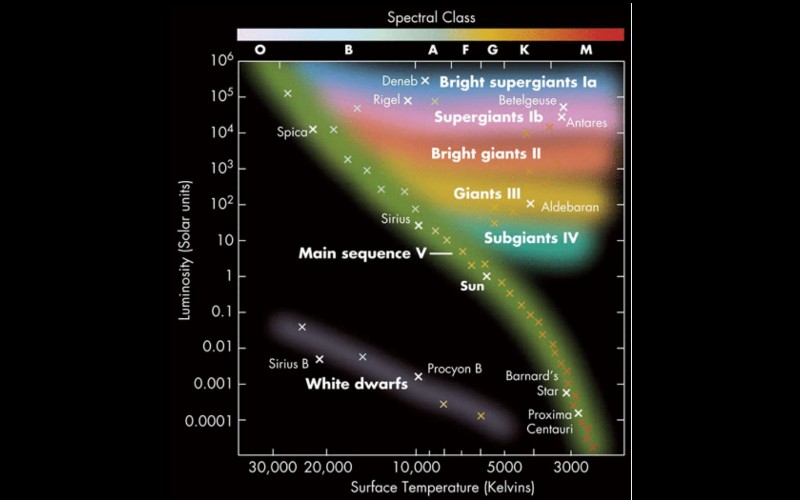
What to notice: Even a classic labeled HR diagram shows the same three geographies immediately: the main sequence, the cool luminous giant/supergiant region, and the hot faint white dwarf region. Named stars make the map feel physical rather than abstract.
Building the Diagram
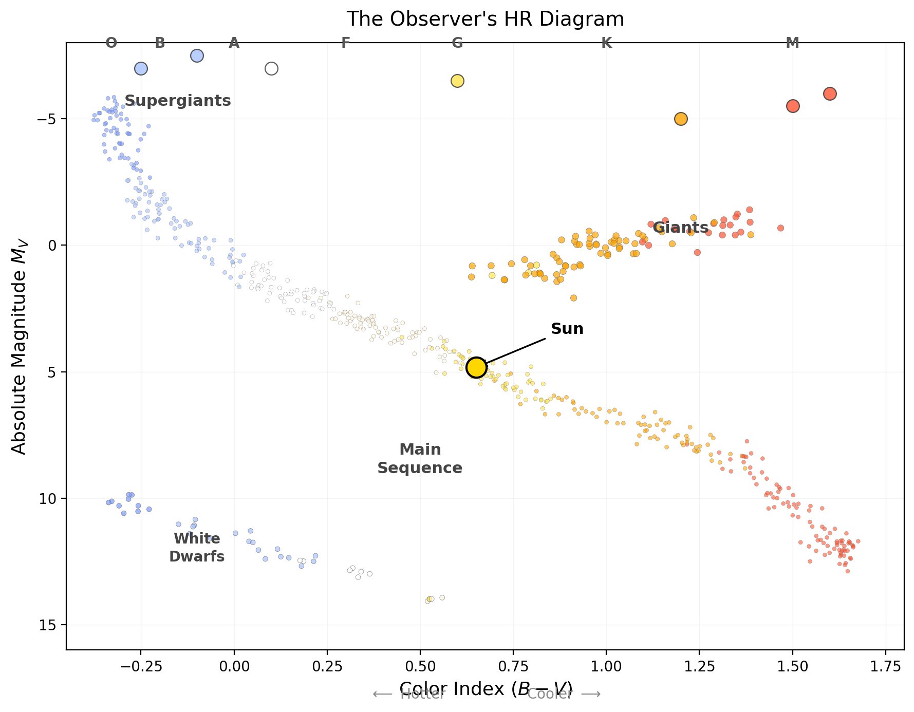
What to notice: The observer’s HR diagram plots absolute magnitude \(M_V\) against color index \((B-V)\). Three structures stand out: the main sequence (diagonal band, 90% of stars), the giant branch (upper right, cool but luminous), and white dwarfs (lower left, hot but faint). No theory is needed to build this diagram — it’s pure measurement. (Credit: ASTR 201 (generated))
The observer’s HR diagram (also called a color-magnitude diagram or CMD) plots:
- Vertical axis: Absolute magnitude \(M_V\) — with brighter (more negative) values at the top and fainter values at the bottom. (This is the inverted magnitude convention.)
- Horizontal axis: Spectral type (O B A F G K M) or, equivalently, color index \(B - V\) — with hot blue stars on the left and cool red stars on the right. (Temperature decreases from left to right — another astronomical convention.)
Crucially: Neither axis requires any physical theory. Spectral type is a direct classification from line patterns. Absolute magnitude is computed from apparent magnitude and distance (parallax). This diagram is pure measurement. Observable → Model → Inference: we measure \(m\) and spectral type, use the distance modulus to model \(M\), then infer structure from how stars populate the diagram.
What the Diagram Shows
When you plot thousands of stars, three features jump out:
1. The Main Sequence — a narrow diagonal band running from upper-left (hot, bright) to lower-right (cool, faint). About 90% of all stars fall on this band. The Sun sits roughly in the middle.
This is not a coincidence. As you learned in Lecture 4, mass determines luminosity (\(L \propto M^{3.5}\)) and temperature for main-sequence stars. The main sequence is a mass sequence — high-mass stars at the upper left, low-mass stars at the lower right. We’ll return to this connection in Part 4.
2. The Giant and Supergiant Region — a cluster of stars in the upper-right: cool (\(T \sim 3{,}000\text{–}5{,}000~\text{K}\)) but very luminous (\(100\text{–}10^4\,L_\odot\)). These are red giants and red supergiants. They cannot be main-sequence stars — a main-sequence star at \(3{,}500~\text{K}\) would be a dim M dwarf. Something must be making these stars both cool and luminous — and the only way to do that (recall Stefan-Boltzmann: \(L = 4\pi R^2 \sigma T^4\)) is if they have enormous radii. A red giant is typically \(10\text{–}100\,R_\odot\); a supergiant can exceed \(1{,}000\,R_\odot\).
3. The White Dwarf Sequence — a scattering of stars in the lower-left: hot (\(T \sim 10^4\text{–}3 \times 10^4~\text{K}\)) but very faint (\({\sim}0.01\,L_\odot\)). By the same logic — hot but faint means small — these are white dwarfs, with radii comparable to Earth (\(R \sim 0.01\,R_\odot\)). They are the remnant cores of dead stars.
Before reading further, think about this: if a star is both hot (\(T \sim 2.5 \times 10^4~\text{K}\)) and faint (\(L \sim 0.01\,L_\odot\)), what can you say about its radius? Use \(L = 4\pi R^2 \sigma T^4\) and think in ratios.
(Hint: Compare to the Sun. The star is \({\sim}4\times\) hotter and \(100\times\) fainter. What radius does that require?)
Without looking at a reference, sketch a blank HR diagram (luminosity on the vertical axis, temperature on the horizontal axis — remember, temperature decreases to the right). Now place each of these stars approximately:
- The Sun — G2 V, \(L = 1\,L_\odot\), \(T = 5{,}800~\text{K}\)
- Sirius — A1 V, \(L = 25\,L_\odot\), \(T = 9{,}900~\text{K}\)
- Betelgeuse — M1 I, \(L \sim 10^5\,L_\odot\), \(T \sim 3{,}600~\text{K}\)
- Sirius B — white dwarf, \(L \sim 0.03\,L_\odot\), \(T \sim 2.5 \times 10^4~\text{K}\)
- Proxima Centauri — M5 V, \(L = 0.0017\,L_\odot\), \(T \sim 3{,}000~\text{K}\)
After plotting, check: do your points fall in the main sequence, giant, or white dwarf regions? Which star is the odd one out (not on the main sequence)? Two of them are Betelgeuse (red supergiant — upper right) and Sirius B (white dwarf — lower left).
Luminosity Classes: Vertical Structure
Even at the same spectral type (same temperature), stars can differ enormously in luminosity. A K2 star could be a main-sequence dwarf (\(L \sim 0.4\,L_\odot\)) or a red giant (\(L \sim 200\,L_\odot\)) — same temperature, 500 times more luminous.
How do observers tell them apart? Through spectral line widths. Higher surface gravity (compact stars like dwarfs) means higher atmospheric pressure, which broadens spectral lines. Lower surface gravity (extended stars like giants) means narrower lines. This gives the luminosity classification system:
| Luminosity Class | Name | Example |
|---|---|---|
| I | Supergiant | Betelgeuse (\(\alpha\) Ori) |
| II | Bright giant | — |
| III | Giant | Arcturus (\(\alpha\) Boo) |
| IV | Subgiant | Procyon (\(\alpha\) CMi) |
| V | Main-sequence dwarf | Sun, Sirius A |
A complete stellar classification includes both spectral type and luminosity class. The Sun is a G2 V star: spectral type G2 (temperature \({\sim}5{,}800~\text{K}\)), luminosity class V (main-sequence dwarf). Betelgeuse is M1 I: spectral type M1 (\({\sim}3{,}600~\text{K}\)), luminosity class I (supergiant).
- On the observer’s HR diagram, which corner holds the hottest, most luminous stars? Which corner holds the coolest, faintest?
- A star has spectral type K5 and luminosity class III. Is it a dwarf, giant, or supergiant? Is it hotter or cooler than the Sun?
- Two stars both have spectral type G2 (same temperature as the Sun). Star A is luminosity class V; Star B is luminosity class III. Which is more luminous, and why?
- Why does spectral line width help distinguish giants from dwarfs?
Step 1 — Read the axes. Upper-left = hot + luminous (O/B supergiants). Lower-right = cool + faint (M dwarfs).
Step 2 — Decode the class label. K5 III = giant. It’s cooler than the Sun (K is cooler than G in the OBAFGKM sequence).
Step 3 — Compare stars at fixed temperature. Star B (class III, giant) is more luminous. Both are at \({\sim}5{,}800~\text{K}\), but the giant has a much larger radius, so \(L = 4\pi R^2 \sigma T^4\) gives a much higher luminosity.
Step 4 — Connect line width to gravity. Surface gravity: dwarfs are compact (small \(R\), high surface gravity \(g = GM/R^2\)), so their atmospheric pressure is high, broadening spectral lines. Giants are extended (large \(R\), low \(g\)), so their atmospheric pressure is low, producing narrower lines.
Three structures have emerged from the data. The main sequence (90% of stars, a diagonal band), the giant branch (cool but luminous — enormous radii), and white dwarfs (hot but faint — tiny radii). Luminosity classes add a third dimension: at the same temperature, a giant and a dwarf occupy very different positions. The map is no longer blank — it has geography.
Part 3: The Theorist’s HR Diagram — Overlaying Physics
Same Patterns, Physical Axes
The observer’s HR diagram uses observational quantities: absolute magnitude \(M_V\) and spectral type (or color index \(B-V\)). Theorists prefer physical quantities: luminosity \(L\) (in \(L_\odot\)) and effective temperature \(T_{\text{eff}}\) (in K). These are related to the observational quantities through calibrations: This is the same structure on calibrated axes: observables in Part 2, physical quantities in Part 3.
- \(M_V \to L\): Absolute magnitude converts to luminosity via the magnitude-luminosity relation
- Spectral type \(\to\) \(T_{\text{eff}}\): Each spectral subtype corresponds to a temperature (e.g., G2 \(\to\) \(5{,}800~\text{K}\), M0 \(\to\) \(3{,}850~\text{K}\))
\[ M - M_\odot = -2.5 \log_{10}\!\left(\frac{L}{L_\odot}\right) \] (Treat V-band as a proxy for bolometric here.)
The theorist’s HR diagram plots \(\log(L/L_\odot)\) on the vertical axis and \(\log T_{\text{eff}}\) on the horizontal axis — with temperature decreasing to the right (by convention, matching the observer’s diagram).
The remarkable fact: The same patterns appear on both versions. The main sequence, the giant branch, the white dwarf sequence — they’re all there regardless of which axes you use. This means the patterns are real features of stellar physics, not artifacts of the measurement system.
Lines of Constant Radius
The theorist’s diagram has a powerful advantage: because both axes are physical quantities, you can overlay theoretical relationships. The most important one comes from the Stefan-Boltzmann law — an equation you already know from Lecture 2:
\[ L = 4\pi R^2 \sigma T^4 \tag{3}\]
What it predicts
Given \(R\) and \(T\), it predicts the luminosity \(L\).
What it depends on
Scales as \(L \propto R^2 T^4\).
What it’s saying
Luminosity depends on surface area (\(R^2\)) and temperature (\(T^4\)). Double the temperature, get 16× the luminosity.
Assumptions
- Blackbody radiation
- Spherical, uniformly radiating surface
- Effective surface temperature
See: the equation
This connects three quantities: \(L\), \(R\), and \(T\). On the HR diagram, \(L\) and \(T\) are the two axes — so fixing \(R\) defines a line:
\[ L = 4\pi R^2 \sigma T^4 \quad \Rightarrow \quad \log L = \text{const} + 4 \log T \qquad (\text{at fixed } R) \]
These are lines of constant radius — diagonal lines on the theorist’s HR diagram. Each line represents all possible combinations of \(L\) and \(T\) for a star of a given radius.
At fixed radius, if \(T\) doubles, how does luminosity change — direction and power?
Luminosity increases very steeply: \(L \propto T^4\) at fixed \(R\), so doubling \(T\) gives \(L \rightarrow 2^4 L = 16L\). Same radius, much hotter surface, dramatically brighter star.
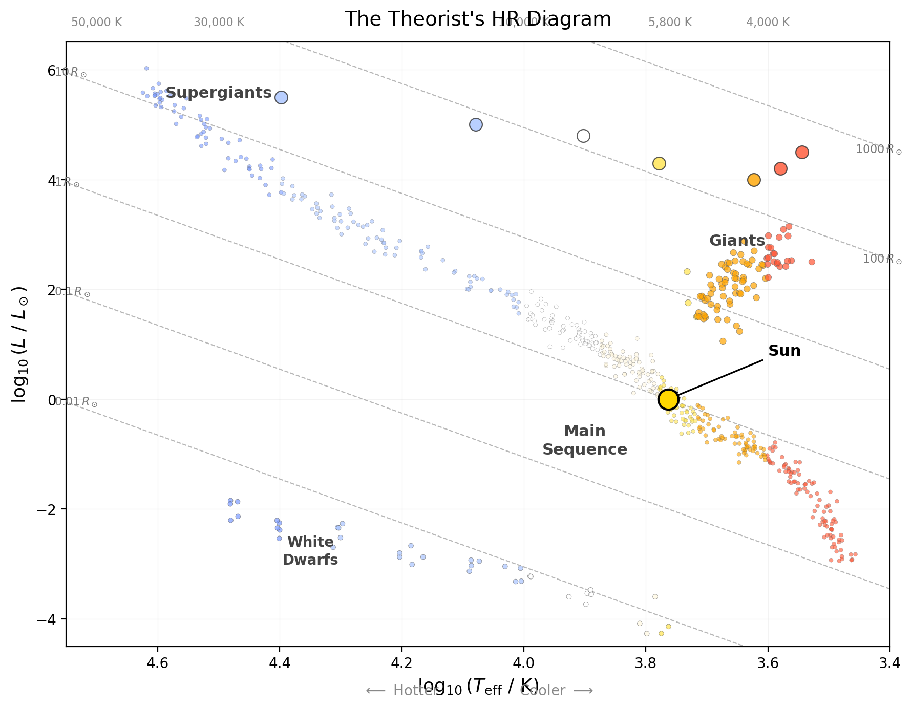
What to notice: The theorist HR diagram uses physical axes — \(\log(L/L_\odot)\) vs. \(\log T_{\mathrm{eff}}\) — and overlays lines of constant radius from the Stefan-Boltzmann law. Giants sit on lines of \(R \sim 10\text{–}100\,R_\odot\); white dwarfs sit on lines of \(R \sim 0.01\,R_\odot\) (Earth-sized). The same patterns appear as in the observer diagram, confirming they are real features of stellar physics. (Credit: ASTR 201 (generated))
Reading the diagram with radius lines:
- Stars along the main sequence span a range of radii: \({\sim}0.1\,R_\odot\) (M dwarfs) to \({\sim}10\,R_\odot\) (O stars)
- Giants sit on lines of \(R \sim 10\text{–}100\,R_\odot\) — that’s why they’re luminous despite being cool
- Supergiants reach \(R \sim 100\text{–}1{,}000\,R_\odot\)
- White dwarfs sit on lines of \(R \sim 0.01\,R_\odot\) — Earth-sized — explaining why they’re faint despite being hot
Problem: A red giant has \(L = 400\,L_\odot\) and \(T_{\text{eff}} = 4{,}000~\text{K}\). What is its radius compared to the Sun (\(T_\odot = 5{,}800~\text{K}\))?
Solution:
Use the ratio form of Stefan-Boltzmann (no CGS constants needed!):
\[\frac{L}{L_\odot} = \left(\frac{R}{R_\odot}\right)^2 \left(\frac{T}{T_\odot}\right)^4\]
Solve for \(R/R_\odot\):
\[ \left(\frac{R}{R_\odot}\right)^2 = \frac{L/L_\odot}{(T/T_\odot)^4} = \frac{400}{(4{,}000/5{,}800)^4} \]
Calculate the temperature ratio:
\[ \frac{4{,}000}{5{,}800} = 0.690 \]
\[ 0.690^4 = (0.690)^2 \times (0.690)^2 = 0.476 \times 0.476 = 0.226 \]
\[ \left(\frac{R}{R_\odot}\right)^2 = \frac{400}{0.226} = 1{,}770 \]
\[ \frac{R}{R_\odot} = \sqrt{1{,}770} = 42 \]
The red giant has a radius of \({\sim}42\,R_\odot\). If placed at the center of our solar system, it would extend past the orbit of Mercury (\(0.39~\text{AU} \approx 84\,R_\odot\))… well, halfway to Mercury.
Unit check: We used ratios throughout — all units cancel. The answer is in solar radii. \(\checkmark\)
Sanity check: A \(42\,R_\odot\) giant is typical for a star on the red giant branch. \(\checkmark\)
On the theorist’s HR diagram, which direction do lines of constant radius slope? (Hint: if \(T\) increases at fixed \(R\), what happens to \(L\)?)
A white dwarf has \(T_{\text{eff}} = 2 \times 10^4~\text{K}\) and \(L = 0.01\,L_\odot\). Estimate its radius in solar radii.
Where would a hypothetical star with \(R = R_\odot\) and \(T = 2 \times 10^4~\text{K}\) appear on the HR diagram? Is such a star observed?
Step 1 — Use fixed-radius scaling.
\[ L \propto T^4 \]
So lines of constant \(R\) slope upward to the left: hotter means more luminous, and the reversed temperature axis makes that direction appear from lower-right to upper-left.
Step 1 — Start from Stefan-Boltzmann in solar ratios.
\[ \left(\frac{L}{L_\odot}\right) = \left(\frac{R}{R_\odot}\right)^2 \left(\frac{T}{T_\odot}\right)^4 \]
Step 2 — Isolate the squared radius ratio by dividing by the temperature-ratio term.
\[ \left(\frac{R}{R_\odot}\right)^2 = \frac{L/L_\odot}{(T/T_\odot)^4} = \frac{0.01}{(2 \times 10^4 / 5{,}800)^4} \]
Step 3 — Evaluate the temperature ratio and fourth power.
\[ \frac{T}{T_\odot} = \frac{2 \times 10^4}{5{,}800} \approx 3.45,\qquad \left(\frac{T}{T_\odot}\right)^4 \approx 141 \]
Step 4 — Compute the squared radius ratio.
\[ \left(\frac{R}{R_\odot}\right)^2 = \frac{0.01}{141} = 7.1 \times 10^{-5} \]
Step 5 — Take the square root.
\[ \frac{R}{R_\odot} = \sqrt{7.1 \times 10^{-5}} \approx 8.4 \times 10^{-3} \approx 0.01\,R_\odot \]
The white dwarf is roughly Earth-sized (\(R_\oplus \approx 0.009\,R_\odot\)). \(\checkmark\)
Use Stefan-Boltzmann in solar units:
\[ \frac{L}{L_\odot} = \left(\frac{R}{R_\odot}\right)^2\left(\frac{T}{T_\odot}\right)^4 = (1)^2\left(\frac{2 \times 10^4}{5{,}800}\right)^4 = (3.45)^4 \approx 141 \]
So this star would be hot and moderately luminous, above and to the left of the Sun on the HR diagram. Real B-type main-sequence stars near \({\sim}2 \times 10^4~\text{K}\) are usually much more luminous because they also have larger radii, so this remains a useful thought experiment rather than a typical star.
Lines of constant radius now overlay the map. Stefan-Boltzmann connects \(L\), \(R\), and \(T\), so fixing \(R\) draws a diagonal line on the theorist’s HR diagram. You can read a star’s radius from its position: giants at \(10\text{–}100\,R_\odot\), white dwarfs at \({\sim}0.01\,R_\odot\). The map now encodes three physical properties — luminosity, temperature, and radius — even though only two are plotted.
Part 2 built a map from measurements alone: magnitudes, colors, spectral classes, and distances assembled into structure. Part 3 added radius and told us size, but not what orders stars along the main sequence. To explain that ordering, we now need the hidden parameter that sets both luminosity and temperature: mass.
Part 5: An Evolution Diagram — Why Patterns Need Physics
Stars Move on the HR Diagram
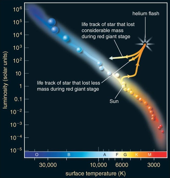
The most profound interpretation of the HR diagram is not as a static classification chart, but as a map of stellar evolution. A star does not stay in one place on the diagram forever. It moves — slowly on the main sequence, then dramatically as it evolves.
That motion is not arbitrary wandering across a plot; it is the response of a self-gravitating thermodynamic system to changing fuel conditions. When core hydrogen is exhausted, hydrostatic equilibrium cannot be maintained by the same fusion source, so the core contracts. Core contraction releases gravitational energy and heats deeper layers, changing where and how energy is generated. The envelope responds by expanding, which lowers surface temperature even while total luminosity can rise. HR-diagram tracks are therefore the visible footprint of gravity, thermodynamics, and nuclear burning acting together.
Visualizing Evolutionary Tracks
This schematic is a map-reading aid, not a precision plot. Follow each arrow as a phase transition and focus on direction of motion and branching endpoints rather than exact coordinates. The two tracks highlight the core contrast of this part: a solar-mass star ends as a white dwarf after a planetary nebula phase, while a high-mass star reaches core collapse and leaves a compact remnant. Read the arrows with standard HR conventions in mind: luminosity increases upward, and temperature decreases to the right.
Axis convention reminder: Luminosity up; temperature decreases to the right (hot left, cool right).

What to notice: This static schematic shows two evolutionary pathways on HR-diagram axes (luminosity up, temperature decreasing to the right): an approximately 1-solar-mass track from protostar contraction to main sequence to red giant to planetary-nebula/white-dwarf cooling, and an approximately 10-solar-mass track from main sequence to supergiant to core-collapse supernova with neutron-star/black-hole endpoints. (Credit: ASTR 201 (generated))
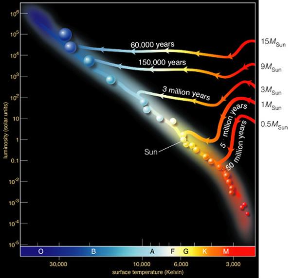
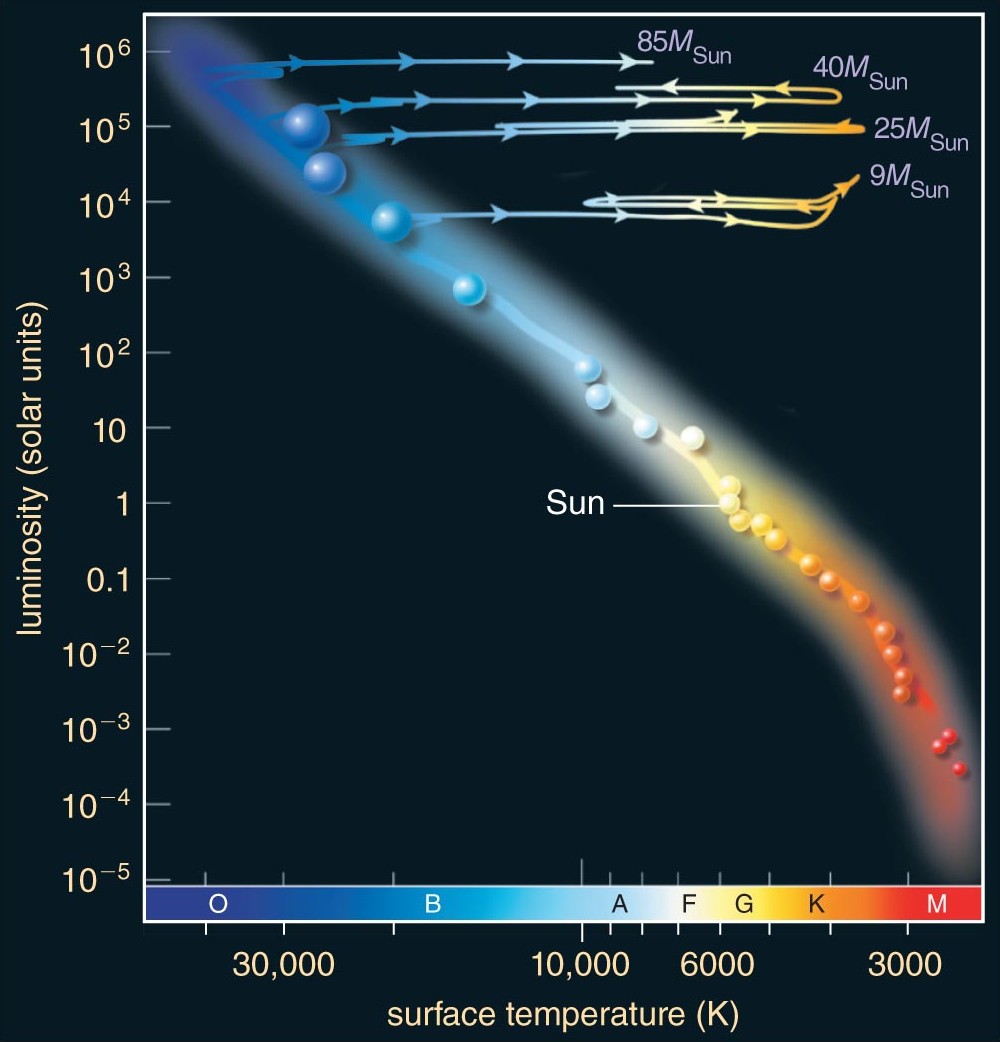
If you want a closer read on pace as well as direction, the enrichment figures below unpack the generic schematic into one view where timescale changes with mass and one view that follows a Sun-like star through its post-main-sequence landmarks.
What to notice: Evolution off the main sequence depends strongly on mass and timescale. High-mass stars evolve quickly (short arrows/times), while low-mass stars evolve slowly (long times). The same HR space encodes both pathway and pace.
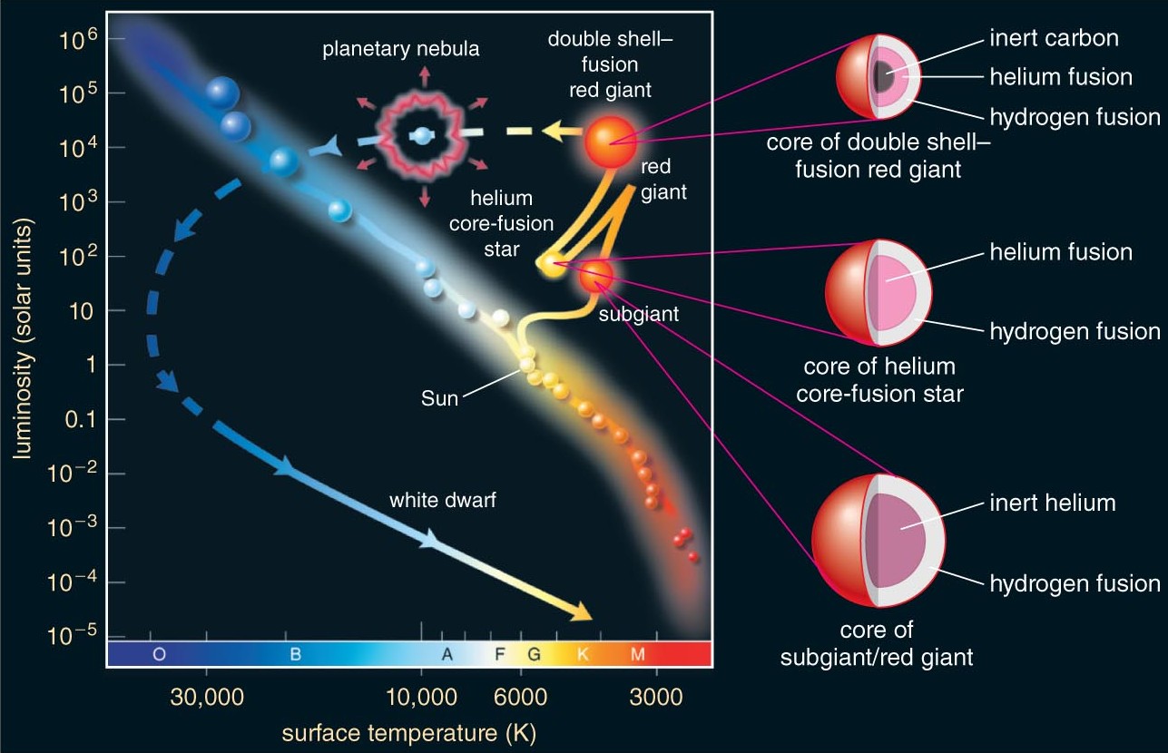
What to notice: A Sun-like star does not leave the main sequence in one jump. The track bends through subgiant and red-giant phases, then loops through a helium-burning stage before ending as a white dwarf after the planetary-nebula phase.
Even the trip onto the main sequence is mass-dependent. Massive protostars contract quickly; low-mass protostars spend much longer descending toward the hydrogen-burning sequence that will dominate most of their lives.
What to notice: Mass sets the clock even before stable hydrogen burning begins. High-mass protostars reach the main sequence quickly, while low-mass stars spend much longer contracting toward it.
Here is the life story of a star like the Sun, traced on the HR diagram:
Birth: The star forms from a collapsing gas cloud and contracts toward the main sequence. It starts cool and luminous (upper right) and moves down and to the left.
Main sequence (\({\sim}10~\text{Gyr}\)): The star settles into hydrogen-burning equilibrium as a G2 V star. It stays at roughly the same position for \({\sim}10\) billion years. This is why most stars are on the main sequence — that’s where they spend most of their lives.
Red giant phase: After exhausting core hydrogen, the core contracts and the envelope expands. The star becomes cooler but much more luminous — it moves to the upper right. It is now a red giant.
Death: The star sheds its outer layers (planetary nebula) and the core is left behind as a white dwarf — hot but tiny. The remnant appears in the lower left, then slowly cools and fades, moving down and to the right over billions of years.
Each transition corresponds to a new balance (or imbalance) between gravity and internal pressure, as the dominant source of pressure support changes.
Core contraction heats the interior because gravitational potential energy is converted into thermal energy. Envelope expansion then lowers surface temperature even while total luminosity may rise. Motion on the HR diagram is the surface trace of that interior energy redistribution.
A massive star (\(10\,M_\odot\)) follows a similar but faster and more dramatic path — it spends only \({\sim}20~\text{Myr}\) on the main sequence, becomes a supergiant, and may end its life in a core-collapse supernova rather than a planetary nebula.
The point is not just that massive stars end differently. The HR diagram shows that increasing mass changes the entire route through the upper part of the diagram, not merely the final remnant.
What to notice: High-mass stars follow distinct tracks by mass, but all of them race through the upper HR diagram far faster than Sun-like stars. Larger mass means hotter starting point, shorter lifetime, and a more dramatic supergiant evolution.
The key insight: Mass determines the path. A low-mass star evolves slowly along one track; a high-mass star races along a different, more dramatic track. The HR diagram is not just a map of where stars are now — it’s a map of where stars go as they age, with mass as the control parameter. Mass determines both the path and the timescale.
What the HR Diagram Does Not Encode
The HR diagram is powerful, but it is still a projection. Two plotted coordinates (\(L\) and \(T\)) cannot uniquely encode the full stellar state space. Important hidden coordinates include metallicity, rotation, magnetic fields, and binarity; age is also not uniquely encoded once stars leave the main sequence. Different combinations of these properties can place stars in similar regions while implying different internal structures and futures. So the HR diagram is best read as a structured projection of higher-dimensional stellar physics: excellent for pattern recognition and inference, but not a complete state description by itself.
What the HR Diagram Cannot Explain
The HR diagram reveals patterns. But it does not — by itself — explain them. Consider the questions it raises:
Why does the main sequence exist at all? What physical process creates a stable equilibrium where a star radiates at constant luminosity for billions of years?
Why does mass determine position on the main sequence? What is the physics that connects core mass to surface temperature and luminosity?
Why do stars become giants? What changes internally when hydrogen is exhausted, and why does the star expand rather than simply turning off?
Why is there a maximum mass for white dwarfs? (There is — it’s \({\sim}1.4\,M_\odot\), the Chandrasekhar limit.) What happens to more massive stellar cores?
Why is there a minimum mass for stars? (Below \({\sim}0.08\,M_\odot\), objects never ignite hydrogen fusion — they’re brown dwarfs.) What sets this threshold?
If the diagram were just a messy catalog, classification would be enough; because its structure is tight, repeated, and constrained, it points to governing equations beneath the data, so measurement alone is incomplete and physics is required.
None of these questions can be answered by measurement alone. They require models — physical theories of stellar interiors, nuclear fusion, and the balance between gravity and pressure. This is the subject of Module 3: Stellar Structure and Evolution.
Module 2 has been about measurement: using photons to determine stellar properties, one by one, culminating in the HR diagram. The diagram is the crown jewel of observational stellar astronomy — it organizes everything we’ve measured into a coherent picture.
But the HR diagram is also a challenge: explain this pattern. That challenge is the transition from Module 2 to Module 3.
The course throughline — Measure → Infer → Balance → Evolve — is playing out in real time:
- Measure (Module 1): Build the physics toolkit
- Infer (Module 2): Use photons to characterize stars → HR diagram
- Balance (Module 3): What keeps stars up? Hydrostatic equilibrium. What powers them? Nuclear fusion.
- Evolve (Module 3–4): What happens when the fuel runs out?
The HR diagram is the bridge between “what we see” and “why we see it.” Module 3 crosses that bridge.
The HR diagram is not a snapshot — it is an evolution diagram. Stars are born, live on the main sequence, evolve into giants, and die as white dwarfs (or supernovae). Mass determines the path and the pace. Your map now has geography (three structures), physics (radius lines, mass labels), and time (evolutionary tracks). Every star has an address — and mass writes the zip code.
The HR diagram is a projection of stellar structure onto observable axes, ordered primarily by mass on the main sequence, and evolution corresponds to changes in equilibrium between gravity and pressure.
Reference Tables
The Magnitude Scale: Key Values
| Object | Apparent Magnitude \(m\) | Absolute Magnitude \(M\) |
|---|---|---|
| Sun | \(-26.74\) | \(+4.83\) |
| Full Moon | \(-12.7\) | — |
| Venus (brightest) | \(-4.6\) | — |
| Sirius (brightest star) | \(-1.46\) | \(+1.42\) |
| Vega | \(+0.03\) | \(+0.58\) |
| Naked-eye limit | \({\sim}+6\) | — |
| Hubble Space Telescope limit | \({\sim}+31\) | — |
Main-Sequence Properties by Spectral Type
| Spectral Type | \(T_{\text{eff}}\) (K) | Mass (\(M_\odot\)) | Radius (\(R_\odot\)) | \(L\) (\(L_\odot\)) | \(M_V\) | Main-Seq Lifetime |
|---|---|---|---|---|---|---|
| O5 | \(4.2 \times 10^4\) | \(40\) | \(12\) | \(5 \times 10^5\) | \(-5.7\) | \({\sim}4.5~\text{Myr}\) |
| B0 | \(3 \times 10^4\) | \(15\) | \(7\) | \(3 \times 10^4\) | \(-4.0\) | \({\sim}10~\text{Myr}\) |
| A0 | \(9{,}900\) | \(2.5\) | \(2.5\) | \(40\) | \(+0.6\) | \({\sim}1~\text{Gyr}\) |
| F0 | \(7{,}200\) | \(1.6\) | \(1.5\) | \(6.5\) | \(+2.7\) | \({\sim}3~\text{Gyr}\) |
| G2 (Sun) | \(5{,}800\) | \(1.0\) | \(1.0\) | \(1.0\) | \(+4.8\) | \({\sim}10~\text{Gyr}\) |
| K0 | \(5{,}300\) | \(0.8\) | \(0.85\) | \(0.4\) | \(+5.9\) | \({\sim}20~\text{Gyr}\) |
| M0 | \(3{,}850\) | \(0.5\) | \(0.6\) | \(0.08\) | \(+8.8\) | \({\sim}60~\text{Gyr}\) |
| M5 | \(3{,}000\) | \(0.1\) | \(0.15\) | \(0.001\) | \(+12.3\) | \(> 100~\text{Gyr}\) |
Order-of-magnitude only; values depend on metallicity, rotation, and mass loss.
Practice Problems
Useful constants: \(\sigma = 5.67 \times 10^{-5}~\text{erg}~\text{cm}^{-2}~\text{s}^{-1}~\text{K}^{-4}\), \(L_\odot = 3.828 \times 10^{33}~\text{erg/s}\), \(T_\odot = 5{,}800~\text{K}\), \(R_\odot = 6.96 \times 10^{10}~\text{cm}\), \(M_\odot = 1.99 \times 10^{33}~\text{g}\), \(c = 3.0 \times 10^5~\text{km/s}\), \(1~\text{pc} = 3.086 \times 10^{18}~\text{cm}\).
Conceptual
- ⭐ The backward scale. Rank the following objects from brightest to faintest in apparent magnitude: the Sun (\(m = -26.74\)), Sirius (\(m = -1.46\)), Polaris (\(m = 1.98\)), the faintest star visible to the naked eye (\(m \approx 6\)). Now explain why “brightest” corresponds to the smallest (most negative) number.
- ⭐⭐ Reading the HR diagram. Three stars occupy different regions of the HR diagram:
- Star X: upper left (hot and luminous)
- Star Y: lower right (cool and faint)
- Star Z: upper right (cool and luminous)
- Which star is most likely a main-sequence O star? A main-sequence M dwarf? A red giant?
- Which of these stars must have the largest radius? Explain using Stefan-Boltzmann reasoning.
- Which is most massive, assuming the two main-sequence stars follow \(L \propto M^{3.5}\)?
- ⭐⭐ Observer vs. theorist. Explain the difference between the observer’s HR diagram (\(M_V\) vs. spectral type) and the theorist’s HR diagram (\(\log L\) vs. \(\log T_\text{eff}\)). Why do the same patterns appear on both versions? What additional insight does the theorist’s version provide that the observer’s version does not?
- ⭐ Why 10 parsecs? Absolute magnitude is defined as the apparent magnitude a star would have at \(d = 10~\text{pc}\). Why is a standard distance necessary for comparing stars? What would happen to the HR diagram if you plotted apparent magnitude instead of absolute magnitude on the vertical axis?
Calculation
- ⭐ Magnitude-flux conversions. Two stars have apparent magnitudes \(m_A = 2.0\) and \(m_B = 7.0\).
- What is the magnitude difference \(\Delta m\)?
- What is the flux ratio \(F_A/F_B\)? (Use \(F_A/F_B = 10^{0.4 \times \Delta m}\).)
- If Star A is at \(d_A = 10~\text{pc}\) and Star B is at \(d_B = 100~\text{pc}\), and both have the same luminosity, verify that the magnitude difference is consistent with the inverse-square law.
- ⭐⭐ Distance modulus practice. A star cluster contains a main-sequence A0 star with known absolute magnitude \(M_V = +0.6\). You measure its apparent magnitude as \(m = 10.6\).
- Calculate the distance modulus \(m - M\).
- Solve for the distance in parsecs.
- Express the distance in kiloparsecs. Is this star in the Milky Way’s disk (typical scale \({\sim}10~\text{kpc}\))?
- Sanity check: at this distance, how many times fainter does the star appear compared to the same star at \(10~\text{pc}\)?
- ⭐⭐ Radius from the HR diagram. Use the solar-unit form of Stefan-Boltzmann (\(L/L_\odot = (R/R_\odot)^2 (T/T_\odot)^4\)) to find the radius of each star below:
- A red giant with \(L = 200\,L_\odot\) and \(T_\text{eff} = 4{,}600~\text{K}\). Show \((R/R_\odot)^2\) first, then take the square root.
- A white dwarf with \(L = 0.005\,L_\odot\) and \(T_\text{eff} = 1.5 \times 10^4~\text{K}\).
- Compare both radii to the Sun’s. Is the giant larger or smaller than Earth’s orbit (\(1~\text{AU} \approx 215\,R_\odot\))?
- ⭐⭐ Lines of constant radius. On the theorist’s HR diagram, a line of constant radius satisfies \(\log(L/L_\odot) = 2\log(R/R_\odot) + 4\log(T/T_\odot)\).
- For \(R = 10\,R_\odot\), calculate the luminosity at \(T_\text{eff} = 3{,}000~\text{K}\) and at \(T_\text{eff} = 3 \times 10^4~\text{K}\).
- For \(R = 0.01\,R_\odot\) (roughly Earth-sized), calculate the luminosity at \(T_\text{eff} = 10^4~\text{K}\).
- Does the \(R = 0.01\,R_\odot\) line pass through the main sequence, the giant branch, or the white dwarf region?
Synthesis
- ⭐⭐ Placing stars on the HR diagram. For each star below, calculate the missing quantity, identify the star’s HR-diagram region (main sequence, giant, or white dwarf), and justify your classification:
- \(T_\text{eff} = 3{,}500~\text{K}\), \(L = 2{,}000\,L_\odot\). Find \(R/R_\odot\).
- \(T_\text{eff} = 2.5 \times 10^4~\text{K}\), \(R = 0.01\,R_\odot\). Find \(L/L_\odot\).
- \(L = 30\,L_\odot\), \(T_\text{eff} = 9{,}500~\text{K}\). Find \(R/R_\odot\).
- For star (c), use the mass-luminosity relation to estimate its mass. Is this consistent with an A-type main-sequence star?
- ⭐⭐ The main sequence as a mass sequence. Using the reference table in this reading:
- Verify that the mass-luminosity relation \(L \propto M^{3.5}\) approximately holds for an O5 star (\(M = 40\,M_\odot\), \(L = 5 \times 10^5\,L_\odot\)) and for an M5 dwarf (\(M = 0.1\,M_\odot\), \(L = 0.001\,L_\odot\)). How close is \(3.5\) to the actual exponent for each?
- Using \(t_\text{MS} \propto M^{-2.5}\), verify the lifetimes listed in the table for the O5 and M5 stars (\(t_\odot = 10~\text{Gyr}\)).
- The universe is \(13.8~\text{Gyr}\) old. Stars with lifetimes shorter than this have already evolved off the main sequence. What is the approximate mass of the most massive star that could still be on the main sequence in a \(13.8~\text{Gyr}\)-old cluster? (Hint: set \(t_\text{MS} = 13.8~\text{Gyr}\) and solve for \(M\).)
- ⭐⭐⭐ Spectroscopic parallax: a complete inference chain. You observe a star with:
- Spectral type: G2 V (main-sequence, solar type)
- Apparent magnitude: \(m = 9.83\)
- From the spectral type, assign \(M_V\) using the reference table. What absolute magnitude corresponds to a G2 V star?
- Calculate the distance modulus and solve for the distance in parsecs.
- This star’s Doppler shift gives \(v_r = 25~\text{km/s}\) (receding). Calculate \(\Delta\lambda/\lambda_0\).
- What assumptions have you made? List at least three, and for each, describe how a violation would affect your distance estimate (too large or too small).
- ⭐⭐⭐ Why giants are giant. A star begins life as a \(2\,M_\odot\) main-sequence star and later evolves into a red giant with \(L = 100\,L_\odot\) and \(T_\text{eff} = 4{,}500~\text{K}\).
- Using the reference table, estimate the main-sequence luminosity and temperature of a \(2\,M_\odot\) star. Calculate its main-sequence radius in \(R_\odot\).
- Calculate the red giant’s radius in \(R_\odot\).
- By what factor did the radius increase from the main sequence to the giant phase?
- Despite expanding enormously, the star’s mass barely changed (it lost very little mass). Explain qualitatively why the luminosity increased even though the surface temperature decreased. (Hint: which factor in \(L = 4\pi R^2 \sigma T^4\) changed more dramatically?)
- On the HR diagram, sketch (qualitatively) the path this star took from the main sequence to the giant branch. In which direction did it move first? Why does the HR diagram look like an evolution diagram?
Summary: Finding Patterns, Needing Models
The magnitude system is a logarithmic brightness scale where 5 magnitudes = a factor of 100 in flux. Absolute magnitude \(M\) removes the distance factor, placing all stars at a standard \(10~\text{pc}\).
The distance modulus (\(m - M = 5\log_{10}\!\left(\frac{d}{10\,\mathrm{pc}}\right)\)) connects observed brightness, intrinsic brightness, and distance — it is the inverse-square law in logarithmic form.
The observer’s HR diagram (\(M_V\) vs. spectral type) is pure measurement — no theory needed. It reveals three structures: the main sequence, the giant branch, and the white dwarf sequence.
The theorist’s HR diagram (\(\log L\) vs. \(\log T_{\text{eff}}\)) overlays physics: lines of constant radius from Stefan-Boltzmann show that giants are enormous and white dwarfs are tiny.
The main sequence is a mass sequence — ordered by mass from \({\sim}0.08\,M_\odot\) (lower right) to \({\sim}150\,M_\odot\) (upper left). This is the mass-luminosity relation made visible.
The HR diagram is an evolution diagram. Stars move on the diagram as they age, and mass determines the path. The main sequence is where stars live; the giant branch is where they age; the white dwarf sequence is where they end up.
Patterns demand physics. The HR diagram raises questions — why does the main sequence exist? why do stars become giants? what sets the maximum white dwarf mass? — that Module 3 will answer.
Observable → Model → Inference: The HR Diagram Chain
Observable: Apparent brightness and color (or spectral type) of many stars — measured with photometry and spectroscopy. Combined with parallax distances, these yield absolute magnitudes and color indices for each star.
Model: The magnitude system converts flux ratios to a logarithmic scale; the distance modulus connects apparent and absolute magnitude through the inverse-square law. Blackbody radiation (Wien’s law) connects color to temperature. The Stefan-Boltzmann law connects luminosity and temperature to radius. Stellar structure models connect luminosity and temperature to mass and evolutionary state.
Inference: From photometry alone, we determine each star’s luminosity, temperature, and radius. The HR diagram reveals that stars are not randomly distributed — they cluster into a main sequence (a mass sequence), a giant branch (evolved stars with bloated envelopes), and a white dwarf sequence (dead stellar cores). Mass, which does not appear on either axis, organizes the entire pattern. The diagram is simultaneously a classification tool, a mass map, and an evolution chart — and the patterns it reveals are the questions that Module 3 must answer.
- Observables: photometry, spectroscopy, and parallax supply \(m\), color/spectral type, and distance.
- Models/Transforms: distance modulus and calibrations map those measurements to \(M\), \(L\), and \(T_{\text{eff}}\).
- Inferences: HR structure reveals radius trends, the mass-ordered main sequence, and evolutionary pathways.
This short Hubble visualization shows how a cluster HR diagram is constructed from observations and why the turnoff point is such a powerful age diagnostic.
The ESA’s Gaia spacecraft has measured parallaxes, colors, and magnitudes for over a billion stars — the largest stellar census ever assembled. This animation shows how Gaia’s raw observations of FGKM-type stars are transformed into physical properties (temperature and luminosity) and plotted on the HR diagram. Every step you’ve learned in this reading — distance modulus, color-to-temperature calibration, apparent-to-absolute magnitude — is happening here at industrial scale.
Credit: ESA/Gaia/DPAC, CC BY-SA 3.0 IGO. Animation by L. Rohrbasser & K. Nienartowicz (Univ. of Geneva), in collaboration with O. Creevey (OCA, Nice), L. Eyer (Univ. of Geneva), and C. Reylé (UTINAM/CNRS, Besançon). Published for Gaia Data Release 3 (2022); stellar sample from Gaia Collaboration, Creevey et al. 2023, A&A.
The HR diagram is the culmination of Module 2: every measurement tool you’ve learned — parallax, photometry, spectroscopy, binary orbits — feeds into it. But it’s also the starting point for Module 3: Stellar Structure and Evolution. We’ll ask: what holds a star up against gravity? (Hydrostatic equilibrium.) What powers a star? (Nuclear fusion.) What happens when the fuel runs out? (Evolution off the main sequence.) And what sets the Chandrasekhar limit for white dwarfs? (Quantum mechanics — degeneracy pressure.) The HR diagram told us what. Module 3 tells us why.
Exam 1 (March 5) covers Modules 1 and 2 — everything from dimensional analysis through the HR diagram. The formula sheet and equation cards you’ve accumulated are your toolkit. The exam tests whether you can use these tools, not whether you’ve memorized them.