Lecture 16: The H-R Diagram
Organizing the Universe’s Stars
The Big Idea
When you plot the temperature and luminosity of thousands of stars, one graph emerges that contains nearly all of stellar physics — organized by a single, hidden variable: mass. The Hertzsprung-Russell diagram is astronomy’s most important graph.
This page answers three questions:
- How do astronomers measure stellar temperature?
- What happens when we plot temperature versus luminosity?
- Why do stars fall into specific regions instead of scattering randomly?
Punchline: The H-R diagram works because stellar mass shapes temperature, luminosity, radius, and lifetime.
This reading builds from spectral classification (the x-axis) through the Stefan-Boltzmann law (the physics) to interpretation of the H-R diagram itself.
Default expectation (best): Read the whole page before lecture, pausing at each Check Yourself question.
If you’re short on time (~20 min): Focus on:
- The Big Idea above
- Spectral Types subsection (including the reference table)
- The H-R Diagram itself: Regions of the Diagram subsection
- The Stefan-Boltzmann explanation
- Then come back for Deep Dives and practice problems later
Goal after 20 minutes: You should be able to answer three questions: What do the axes represent? What is the main sequence? Why are red giants luminous even though they are cool?
Reference mode: Use the Spectral Type Reference Table and Glossary while studying and while working practice problems.
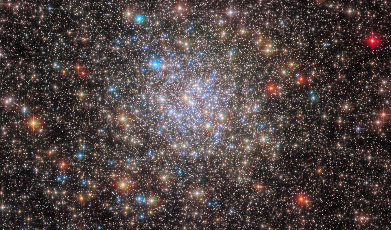
This short Hubble visualization is worth watching before the reading because it shows the exact observational move behind the H-R diagram: start with a real cluster image, sort stars by color and brightness, and reveal the structure hidden inside the population.
Caption: A Hubble Space Telescope color image of the core of the globular star cluster Omega Centauri is used to construct a Hertzsprung-Russell diagram of the stellar populations in the cluster. When stars are sorted by brightness and color they can be used to create a graph that astronomers use to trace stellar evolution.
Credit: NASA, ESA, and J. Anderson, R. van der Marel, G. Bacon, and M. Estacion (STScI)
Astronomy’s Most Important Graph
Imagine you are an astronomer in 1910. You have a list of 1,000 nearby stars. For each, you know:
- Temperature — derived from spectral type or color
- Luminosity — calculated from distance and apparent brightness
You decide to make a scatter plot: temperature on the x-axis, luminosity on the y-axis. You plot each star as a single point.
What would you expect to see? Random scatter? Maybe stars evenly distributed across the diagram?
You would be surprised. Instead, you would see structure. Most stars would lie along a single diagonal band — a trend so clean it seemed almost impossible. Stars did not scatter randomly across the temperature-luminosity plane. They obeyed a hidden law.
This graph — the Hertzsprung-Russell diagram, or H-R diagram — became the foundation of stellar physics. Every star, every phase of stellar evolution, every mystery about why stars shine — all of it lives on this one diagram.
Today’s reading has one goal: teach you to read and interpret it.
Imagine plotting 1,000 stars by hand in 1911 and watching a clean diagonal band appear on your paper. That was the moment astronomers realized stars were not a random collection of lights. They obeyed hidden physical laws.
The H-R diagram is a map of stellar structure, not a random scatter plot of stars.

What to notice: the logic runs in stages. Position change gives parallax, parallax gives distance, brightness plus distance gives luminosity, and luminosity combined with temperature places the star on the H-R diagram.
Spectral Classification: The x-Axis
Before we can build an H-R diagram, we need a way to measure stellar temperature. We can’t stick a thermometer on a star (it’s too far away), so we use the spectrum — the pattern of light emitted at different wavelengths.
Annie Jump Cannon and the Alphabet of Stars
In 1901, at Harvard Observatory, a deaf astronomer named Annie Jump Cannon began a classification project that would change astronomy forever. She examined the spectral lines of hundreds of thousands of stars and realized that spectral patterns followed a sequence. This sequence correlated directly with temperature.
Cannon’s original classification used letters: A, B, C, D, and so on. Later, as understanding improved, the unnecessary categories were dropped, leaving the sequence we use today:
O \(\rightarrow\) B \(\rightarrow\) A \(\rightarrow\) F \(\rightarrow\) G \(\rightarrow\) K \(\rightarrow\) M
(Astronomers remember this with the mnemonic: “Oh Be A Fine Girl, Kiss Me.” Or, if you prefer modern astronomy: “Oh Be A Famous Astrophysicist, Keep Mentoring.”)
Each type represents a different temperature range and a different set of dominant spectral lines.
Spectral Line: An absorption or emission line at a specific wavelength, caused by electrons jumping between energy levels in atoms.
What Each Type Tells Us
The spectral type reveals which absorption lines are strongest. Different atoms and ions produce their strongest absorption features at different temperatures, so the spectrum is essentially a temperature thermometer written in atoms.
Here’s the physical reason:
- O stars (very hot, >30,000 K): Ionized helium lines stand out; hydrogen lines are present but not at their strongest.
- B stars (hot, 10,000–30,000 K): Neutral helium and hydrogen lines are both important.
- A stars (hot, ~7,500–10,000 K): Hydrogen Balmer lines reach their maximum strength.
- F stars (warm, ~6,000–7,500 K): Hydrogen lines weaken, while ionized calcium and metal lines become more prominent.
- G stars (warm, ~5,200–6,000 K): Our Sun is a G2 star. Metal lines are strong, and hydrogen lines are weaker than in A-stars.
- K stars (cool, ~3,700–5,200 K): Neutral metal lines are strong, and some molecules begin to appear.
- M stars (coolest, <3,700 K): Molecular bands, especially titanium oxide (TiO), dominate many spectra.
Each type is subdivided into 10 subclasses (0–9). Our Sun is G2V — a G-type star, subclass 2, on the main sequence (we’ll explain the “V” soon).
What to notice: in the globular cluster NGC 6355, star colors range from blue-white (hot) through yellow to orange-red (cool) — Wien’s Law in one image. (Credit: NASA, ESA, Hubble)
Color is not cosmetic. In a crowded cluster like this one, the blue-white stars really are hotter and the orange-red stars really are cooler. You are seeing Wien’s law written across the image before we ever draw a graph.
Reference: Spectral Types at a Glance
| Spectral Type | Temperature (K) | Color | Dominant Lines | Example Stars |
|---|---|---|---|---|
| O | >30,000 | Blue | Ionized helium, weak hydrogen | Alnitak, Zeta Puppis |
| B | 10,000–30,000 | Blue-white | Hydrogen, neutral helium | Rigel, Spica |
| A | 7,500–10,000 | White | Strong hydrogen Balmer lines | Sirius A, Vega |
| F | 6,000–7,500 | Yellow-white | Ionized calcium, weakening hydrogen | Procyon A, Canopus |
| G | 5,200–6,000 | Yellow | Metal lines, weaker hydrogen | Sun, Alpha Centauri A |
| K | 3,700–5,200 | Orange | Neutral metals, some molecules | Aldebaran, Arcturus |
| M | 2,400–3,700 | Red | Molecular bands (TiO, CN) | Betelgeuse, Proxima Centauri |
The spectral type is a temperature scale written in atoms. As temperature drops from O to M, ionized-helium features fade, hydrogen peaks in A stars, and molecules dominate the coolest spectra. The sequence is not arbitrary — it directly reflects atomic physics.
Our Sun is a G2 star with a temperature of 5,778 K. Where does that fall on the O-B-A-F-G-K-M sequence, and what color should the Sun appear?
G2 is in the G range (5,200–6,000 K), so 5,778 K fits perfectly. In spectral classification, G-type stars are described as yellow or yellow-white. From space, the Sun’s visible light is roughly white overall, but in the OBAFGKM sequence it sits in the yellow G-star category.
Spectral type is temperature written in absorption lines.
Building the H-R Diagram: The Two Axes
Now we have a way to measure temperature: spectral type (or equivalently, color, or Wien’s law temperature). But an H-R diagram needs two axes. The second is luminosity.
The Axes, Carefully Drawn
Horizontal axis (x): Temperature
Here’s where we need to be careful. The temperature axis is reversed. Temperature increases from right to left, not left to right. This is a historical accident — early observers drew it this way, and the convention stuck — but it has become standard. Get used to it.
- Left side: Hot temperatures (30,000 K and hotter)
- Right side: Cool temperatures (2,400 K and cooler)
We often label the x-axis with spectral type (O, B, A, F, G, K, M from left to right) to make it easier to remember.
Vertical axis (y): Luminosity
Luminosity is plotted on a logarithmic scale — each step up multiplies the luminosity by 10. This is essential because the range of stellar luminosities is enormous: from ~0.0001 \(L_\odot\) (white dwarfs) to ~1 million \(L_\odot\) (red supergiants). A linear scale would compress most stars into an illegible band.
- Bottom: Low luminosity (faint stars)
- Top: High luminosity (bright stars)
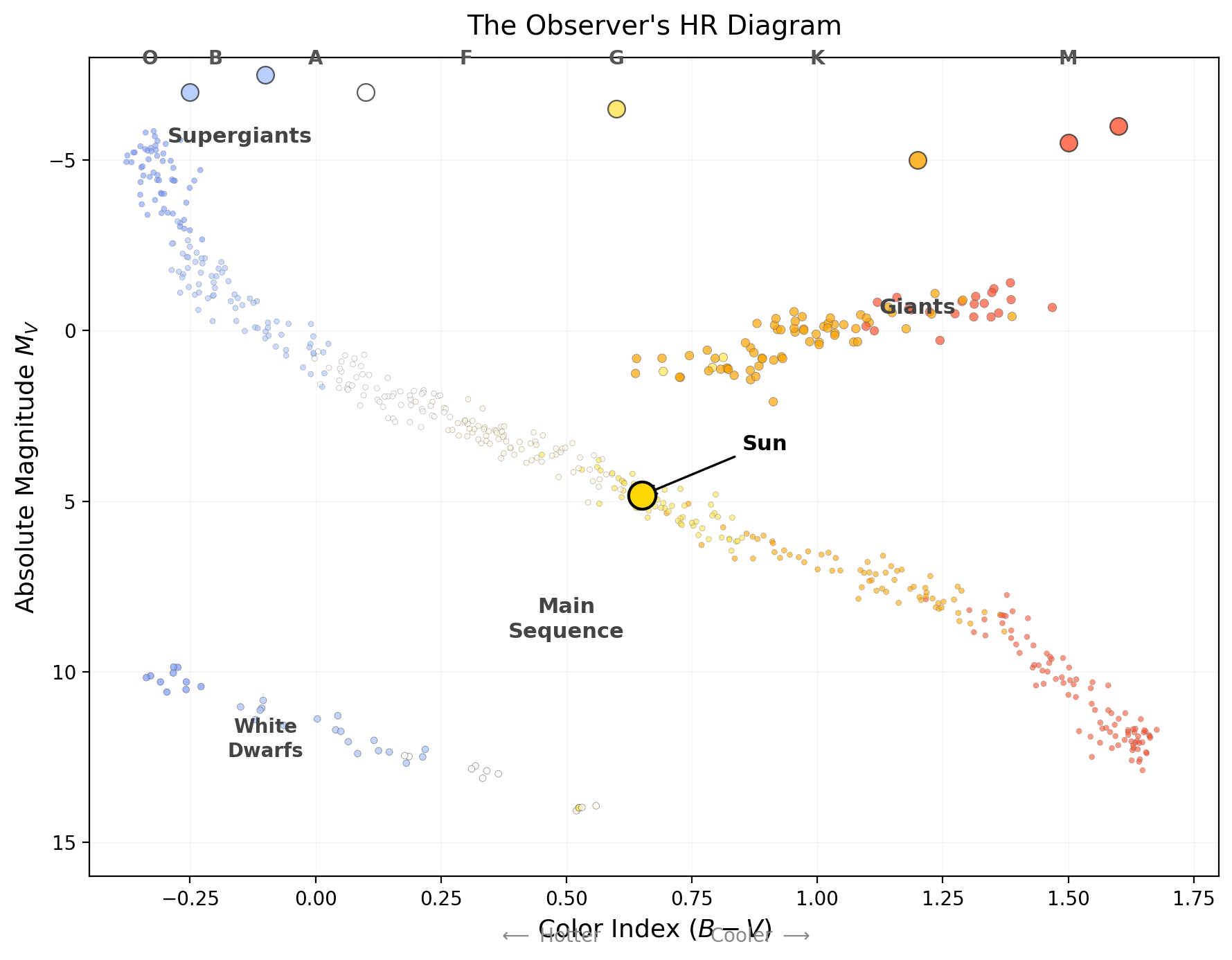
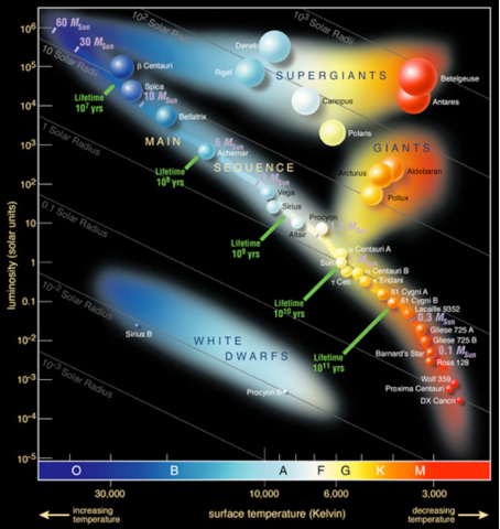
What to notice: the observer’s H-R diagram uses quantities astronomers measure most directly for many stars: color and absolute magnitude. The same four regions still appear: main sequence, giants, supergiants, and white dwarfs.
Why the Reversed x-Axis Matters (And Why You’ll Get It Wrong First)
Your brain says: “Hot on the left, cold on the right.” But the H-R diagram says the opposite. This is a common stumbling block.
Why did Hertzsprung and Russell do this? In 1911–1913, they plotted spectral class (O, B, A, …, M) on the horizontal axis. Since spectral class runs O \(\rightarrow\) M (which corresponds to hot \(\rightarrow\) cool), when you plot it left to right, temperature appears reversed. When the field adopted this convention, it stuck.
How to remember: Think “O on the left” (O is the hottest type). Then the rest follows.
“The H-R diagram has temperature on the x-axis, so hotter is to the right.” — WRONG. Hotter is to the left. This single reversed axis catches half of all intro astronomy students on the first H-R diagram quiz.
On an H-R diagram, which direction would you move to find hotter stars?
To the LEFT. The x-axis is reversed: hot (O-type) stars are on the left, cool (M-type) stars are on the right.
The H-R diagram uses a reversed temperature axis: hotter is left, cooler is right.
Plotting Thousands of Stars: The Pattern Emerges
What to notice: this is the first-look map students need. The diagonal main sequence dominates, giants and supergiants sit high on the right, and white dwarfs sit low on the left. The Sun lands near the middle of the main sequence, not at the center of the whole diagram.
When you first look at an H-R diagram, notice three things:
- Most stars lie on the diagonal band — the main sequence
- Upper right: cool but luminous — giants and supergiants
- Lower left: hot but dim — white dwarfs
Mental rule: the H-R diagram is really a map of stellar size. The Sun sits near the middle of the main sequence, not in the middle of the whole graph.
Before reading on, stare at the diagram for 20 seconds and answer:
- Where are the hottest stars?
- Where are the most luminous stars?
- Are hot stars always bright?
The hottest stars are on the left, the most luminous stars are at the top, and hot stars are not always bright. White dwarfs live in the lower left: hot, but dim because they are tiny.
Imagine Hertzsprung and Russell taking their spectroscopic data and plotting thousands of points on a temperature-luminosity graph. What would they see?
If stars were randomly scattered, the diagram would be a cloud of points. But stars are not random. They follow patterns.
Roughly 90% of all stars fall along a single, clean diagonal band running from the upper left (hot, luminous) to the lower right (cool, dim). This band is called the main sequence.
The remaining 10% appear in other regions:
- Upper right: Cool but very luminous stars — the red giants and supergiants
- Lower left: Hot but very dim stars — the white dwarfs
This clustering is not a coincidence. It reveals the physics of stellar structure.
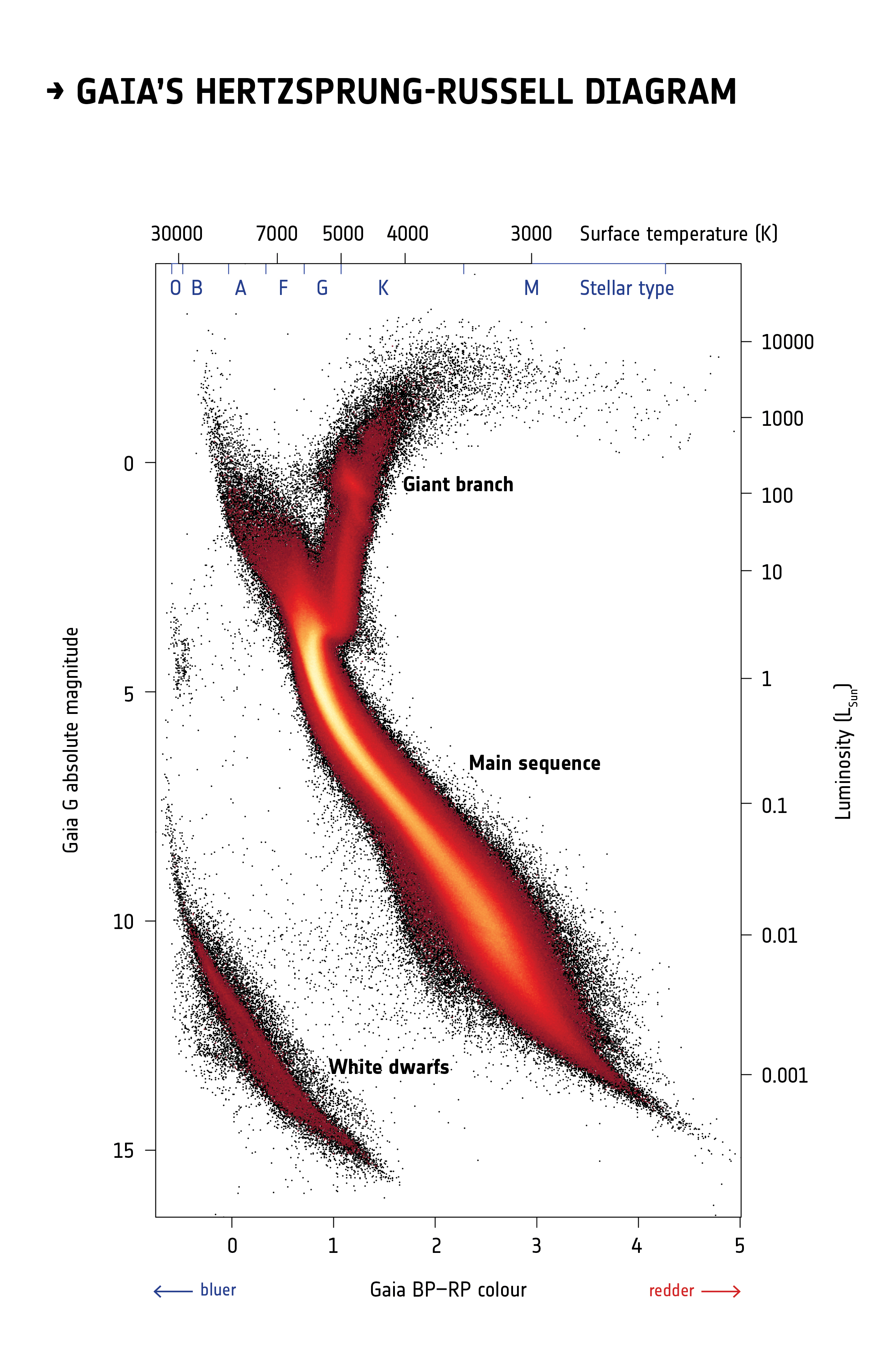
What to notice: this is not a cartoon. Gaia measured these stars directly, and the same structures still appear: a dense main sequence, a giant branch peeling upward, and a separate white-dwarf track. Real survey data still obey the same stellar physics. (Credit: ESA / Gaia)
Gaia makes this point especially powerful because it is a survey, not an illustration. When astronomers plot real stars by color and brightness, the universe still organizes itself into the same lanes. The H-R diagram is not a tidy classroom sketch; it is a pattern nature actually draws.
The Four Regions: A Map of Stellar Physics
1. The Main Sequence (Diagonal Band)
The main sequence is where ~90% of stars spend ~90% of their lives. It’s a trend so strong that it had to reflect something fundamental about how stars work.
Stars on the main sequence have a simple property: their energy comes from hydrogen fusion in the core. As long as a star burns hydrogen, it stays on the main sequence. The more massive the star, the hotter its core, the faster it burns hydrogen, and the more luminous it becomes.
Upper left: Massive O- and B-type stars, luminous, short-lived. Lower right: Low-mass M-type stars, dim, long-lived.
Main Sequence: The diagonal band on an H-R diagram where 90% of stars lie. All main sequence stars are supported by hydrogen fusion in their cores.
2. The Red Giant Branch (Upper Right)
In the upper right, we find stars that are cool (typically spectral type K or M, sometimes G) but extraordinarily luminous. Betelgeuse, Aldebaran, and Antares live here.
How can a cool star be so bright? The answer: size. These stars have expanded to enormous radii — sometimes 100 times larger than the Sun. Even though each square meter of surface is cooler (hence the red color), the total surface area is so vast that the luminosity is huge.
These stars have finished burning hydrogen in their cores and have begun a new phase of evolution. The red giant branch will be explored in detail in Lecture 19.
3. White Dwarfs (Lower Left)
The lower left corner contains hot, dim stars — a bizarre combination. These are white dwarfs: the dense, Earth-sized remnants of dead stars.
A white dwarf is so hot (often >10,000 K, sometimes hotter) that it glows blue-white. But because it’s only the size of Earth, its total luminosity is tiny — often less than 1% of the Sun’s.
White dwarfs represent the final fate of stars like our Sun (Lecture 19).
4. Supergiants (Very Upper Right)
A handful of stars are even more luminous and larger than red giants. These supergiants (like Betelgeuse and Rigel) are in rare, short-lived phases of stellar evolution.
The H-R diagram is a map of stellar physics: main-sequence stars, giants, supergiants, and white dwarfs occupy distinct regions for physical reasons.
The Stefan-Boltzmann Law: Why Giants Are Luminous
We’ve observed the H-R diagram. Now we explain it using physics.

What to notice: luminosity is not just about temperature. A star can shine intensely because it is very hot, because it has an enormous surface area, or because both effects work together.
A star can be luminous because it is hot, because it is large, or because both effects work together. The H-R diagram becomes much easier to read once you stop treating brightness as a one-variable story.
The Stefan-Boltzmann law (from Lecture 8) connects luminosity, temperature, and radius:
\[ L = 4\pi R^2 \sigma T^4 \]
For proportional reasoning, we often use
\[ L \propto R^2 T^4 \]
For Sun-based comparisons, the cleanest working form is
\[ \frac{L}{L_\odot} = \left(\frac{R}{R_\odot}\right)^2 \left(\frac{T}{T_\odot}\right)^4 \]
where:
- \(L\) is luminosity (power radiated, in watts or \(L_\odot\))
- \(R\) is the star’s radius
- \(\sigma\) is the Stefan-Boltzmann constant
- \(T\) is the surface temperature
This equation is the key to understanding the H-R diagram.
Stefan-Boltzmann Law: Luminosity is proportional to surface area times the fourth power of temperature. A star’s luminosity depends on both its size and its heat.
Which star is larger?
- A) Hot and dim
- B) Cool and bright
Make a prediction before you do any algebra.
Rearranging for Insight
We can rewrite the Stefan-Boltzmann law to isolate radius:
\[ R^2 \propto \frac{L}{T^4} \]
\[ R \propto \sqrt{\frac{L}{T^4}} \]
equivalently,
\[ R \propto \frac{\sqrt{L}}{T^2} \]
This tells us that on an H-R diagram, lines of constant radius are diagonal lines.
Consider a star that is cool (low \(T\)) but luminous (high \(L\)). To achieve this balance, it must have a large radius. A red giant satisfies this: low temperature, huge radius, high luminosity.
Conversely, a hot (high \(T\)), dim (low \(L\)) star must have a tiny radius. This is a white dwarf.
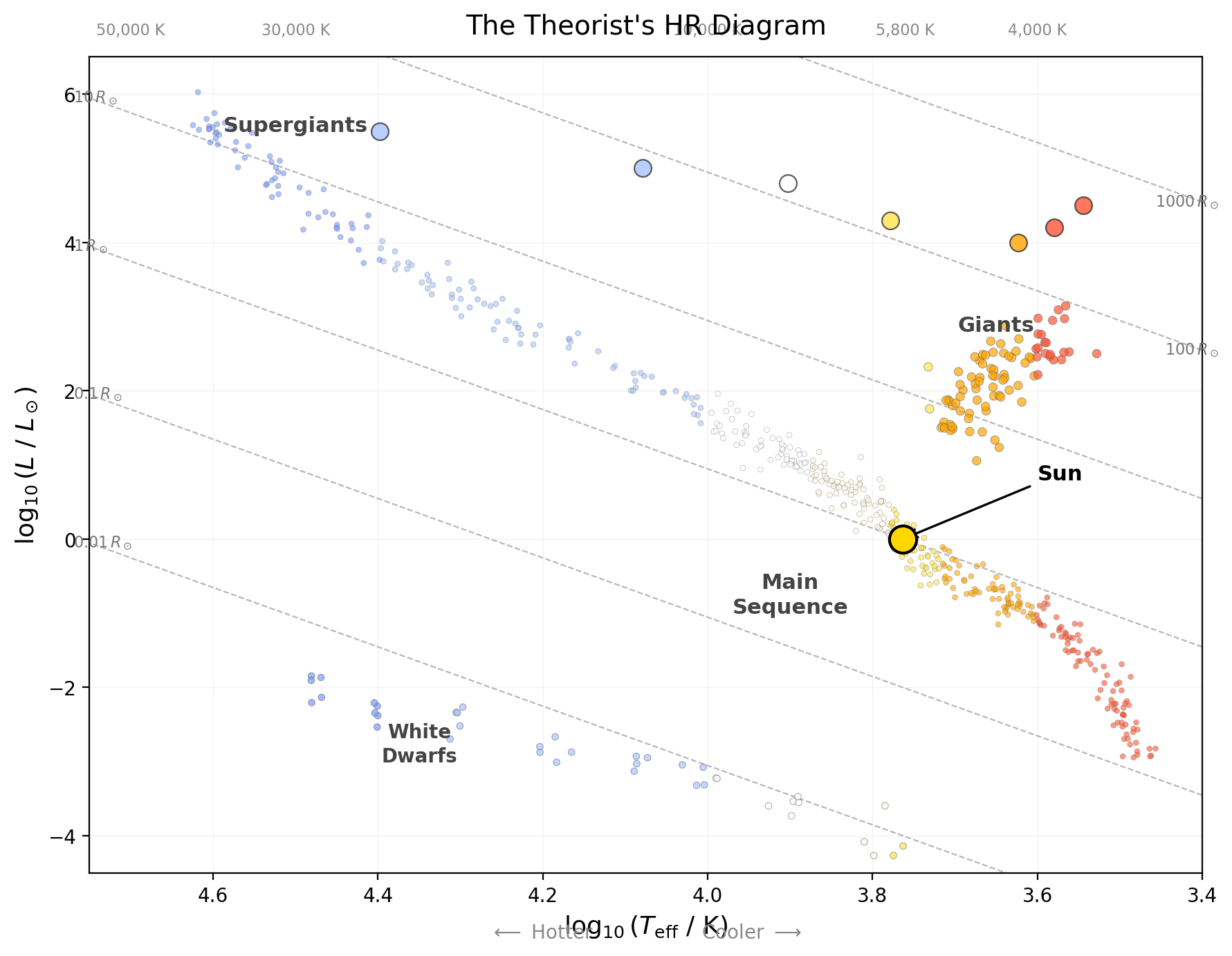
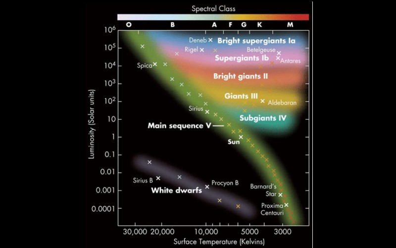
What to notice: the theorist’s H-R diagram makes the physics explicit. Dashed diagonals mark constant radius, so red giants line up with huge radii while white dwarfs sit on tiny-radius tracks.
The larger star is B: the cool but bright one. If a star is cool yet still highly luminous, the only way to compensate is with a huge surface area. That is the red-giant logic in one sentence.
Worked Example: Why Is Betelgeuse So Luminous?
Given: Betelgeuse is a red supergiant with temperature \(T_{\text{Betelgeuse}} \approx 3{,}500 \, \mathrm{K}\) and luminosity \(L_{\text{Betelgeuse}} \approx 140{,}000 \, L_\odot\). The Sun has \(T_\odot \approx 5{,}800 \, \mathrm{K}\), \(L_\odot = 1 \, L_\odot\), and \(R_\odot = 1 \, R_\odot\).
Relation:
\[ \frac{L_{\text{Betelgeuse}}}{L_{\odot}} = \left(\frac{R_{\text{Betelgeuse}}}{R_{\odot}}\right)^2 \left(\frac{T_{\text{Betelgeuse}}}{T_{\odot}}\right)^4 \]
Rearranged relation:
\[ \frac{R_{\text{Betelgeuse}}}{R_{\odot}} = \sqrt{\frac{L_{\text{Betelgeuse}}/L_\odot}{\left(T_{\text{Betelgeuse}}/T_\odot\right)^4}} \]
Substitute:
\[ \frac{R_{\text{Betelgeuse}}}{R_{\odot}} = \sqrt{\frac{140{,}000}{\left(3{,}500/5{,}800\right)^4}} \]
Evaluate:
\[ \frac{R_{\text{Betelgeuse}}}{R_{\odot}} = \sqrt{\frac{140{,}000}{0.132}} \]
\[ \frac{R_{\text{Betelgeuse}}}{R_{\odot}} \approx \sqrt{1.06 \times 10^6} \approx 1.03 \times 10^3 \]
\[ R_{\text{Betelgeuse}} \approx 1{,}030 \, R_\odot \]
Interpretation: Betelgeuse is about 1,000 times the Sun’s radius. It is enormously luminous not because its surface is especially hot, but because its surface area is enormous.
The Stefan-Boltzmann law shows that on the H-R diagram, stars of the same radius lie along diagonal lines. Red giants are luminous because they are huge, not because they are hot. White dwarfs are dim because they are tiny, despite being hot.
Two stars have the same luminosity but different temperatures: Star A is hot (10,000 K) and Star B is cool (5,000 K). Which star must be larger, and which region of the H-R diagram would you expect it to move toward?
Given: \(L_A = L_B\), \(T_A = 10{,}000 \, \mathrm{K}\), and \(T_B = 5{,}000 \, \mathrm{K}\).
Relation:
\[ \frac{L_B}{L_A} = \left(\frac{R_B}{R_A}\right)^2 \left(\frac{T_B}{T_A}\right)^4 \]
Since the luminosities are equal, \(\frac{L_B}{L_A} = 1\), so
Rearranged relation:
\[ 1 = \left(\frac{R_B}{R_A}\right)^2 \left(\frac{T_B}{T_A}\right)^4 \]
\[ \left(\frac{R_B}{R_A}\right)^2 = \left(\frac{T_A}{T_B}\right)^4 \]
\[ \frac{R_B}{R_A} = \left(\frac{T_A}{T_B}\right)^2 \]
Substitute:
\[ \frac{R_B}{R_A} = \left(\frac{10{,}000}{5{,}000}\right)^2 = 2^2 \]
Evaluate:
\[ \frac{R_B}{R_A} = 4 \]
Interpretation: Star B is 4 times larger than Star A, so it would sit farther toward the giant region of the H-R diagram: cooler, but still luminous.
high luminosity + low temperature \(\Rightarrow\) large radius
low luminosity + high temperature \(\Rightarrow\) small radius
Red giants are luminous because they are huge, not because they are hot.
The Main Sequence Is a Mass Sequence
Here’s the profound insight that makes the H-R diagram so powerful:
The position of a star on the main sequence is determined almost entirely by its mass.
More massive stars:
- Burn hydrogen faster (higher core pressure and temperature)
- Are more luminous
- Are hotter (bluer)
- Lie on the upper left of the main sequence
- Have short lifetimes
Less massive stars:
- Burn hydrogen slowly
- Are less luminous (dimmer)
- Are cooler (redder)
- Lie on the lower right of the main sequence
- Have long lifetimes
This is the mass-luminosity relation — a fundamental law of stellar physics that we’ll explore in depth in Lecture 17. For now, the key insight is this:
On the main sequence, mass determines everything: luminosity, temperature, radius, and lifetime. The H-R diagram is fundamentally a mass diagram.
What to notice: several ideas stack on top of each other here. Constant-radius lines run diagonally, mass labels climb toward the upper left, and stellar lifetimes shrink dramatically for hot luminous stars. Moving along the main sequence mostly means changing mass, not age.
This figure is the visual version of the whole lecture. The diagonal guide lines show radius, the labels along the main sequence show mass, and the lifetime markers remind you that high-mass stars live fast while low-mass stars linger for billions to trillions of years.
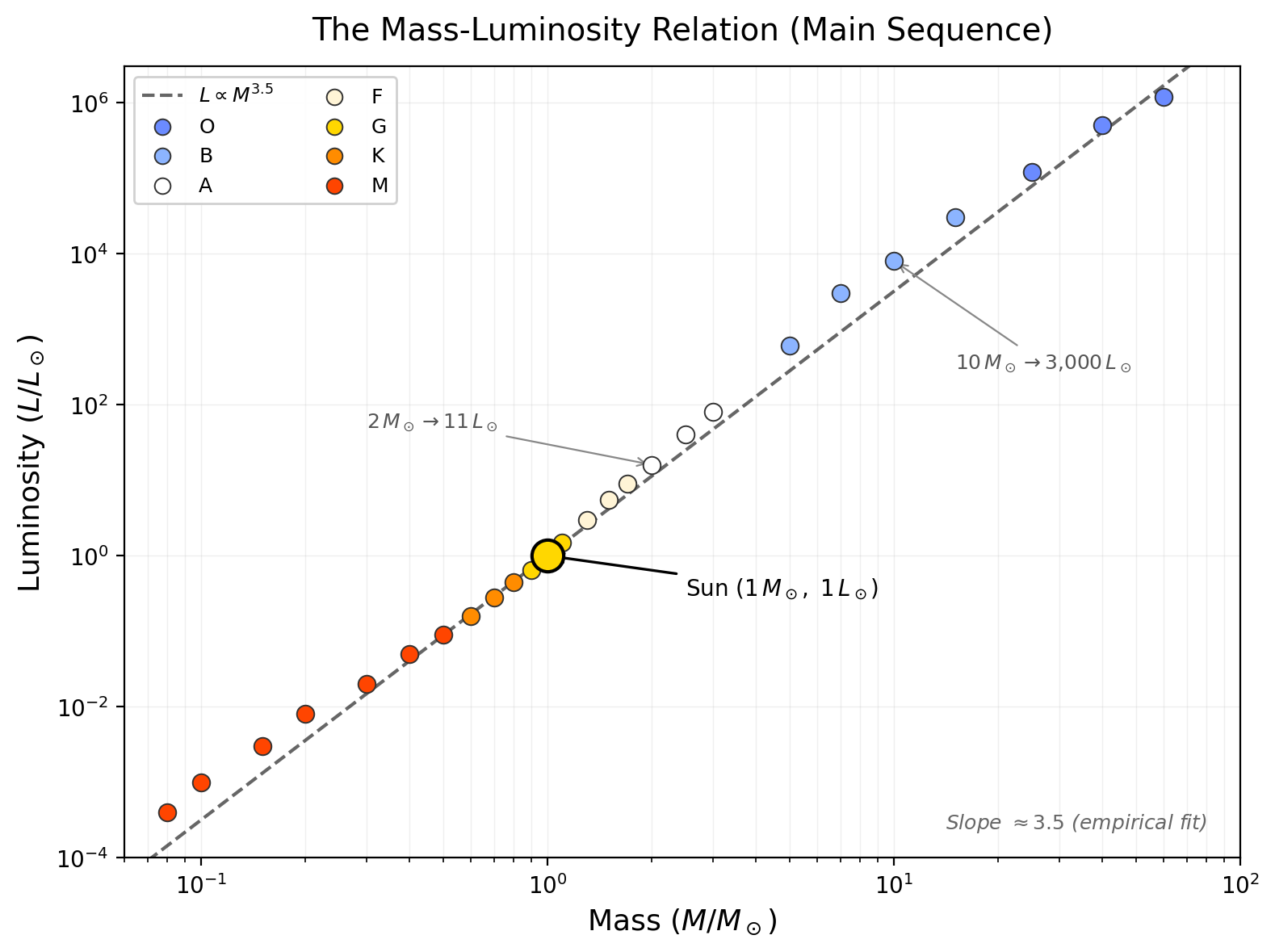
What to notice: along the main sequence, luminosity rises much faster than mass. Small changes in mass produce enormous changes in power output, which is why massive stars burn through their fuel so quickly.
The mass-luminosity relation is why the main sequence is so steep. Doubling mass does not merely double luminosity. It can increase luminosity by an order of magnitude or more, which is why the upper-left stars are brilliant and short-lived.
higher mass
\(\rightarrow\) higher core pressure and temperature
\(\rightarrow\) faster fusion
\(\rightarrow\) higher luminosity and hotter surface
\(\rightarrow\) position toward the upper left of the main sequence
Mass Sets Main-Sequence Position
On the main sequence, mass is the main variable that determines where a star sits. Lower-mass stars occupy the cool, dim lower-right end. Higher-mass stars occupy the hot, luminous upper-left end.
A star does not slide along the main sequence as it ages. During core hydrogen burning, it stays roughly in one region of the sequence. The main sequence is therefore best read as a population of stars with different masses, not as a path that one star traces from lower right to upper left.
A star is exactly halfway along the main sequence (in terms of temperature) between an O-type and an M-type star. Is it halfway in mass? In luminosity?
No to both. The main sequence is not linear in mass or luminosity. Luminosity increases steeply with mass (approximately \(L \propto M^{3.5}\) for main sequence stars). So the star at the midpoint temperature is much closer to the M-type end in terms of mass and luminosity. Most main sequence stars are actually low-mass, cool, and dim — a single massive O-type star is as luminous as thousands of M-dwarfs combined.
Why are there far more M-dwarfs than O-stars in a nearby-star census?
Two effects work in the same direction. Low-mass stars are formed more often, and they live much longer. O-stars are rare and burn out quickly, so a snapshot of the nearby galaxy is overwhelmingly dominated by cool red dwarfs.
Along the main sequence, moving upward and left mostly means increasing mass.
Common Misconceptions About the H-R Diagram
WRONG. The main sequence is a snapshot of stars at different masses, not an evolutionary track. A star does not drift across the main sequence as it ages. During its hydrogen-burning phase, a star stays roughly in the same spot on the main sequence. Only when the core hydrogen is exhausted does a star leave the main sequence and move toward the red giant region (that’s the topic of Lecture 19).
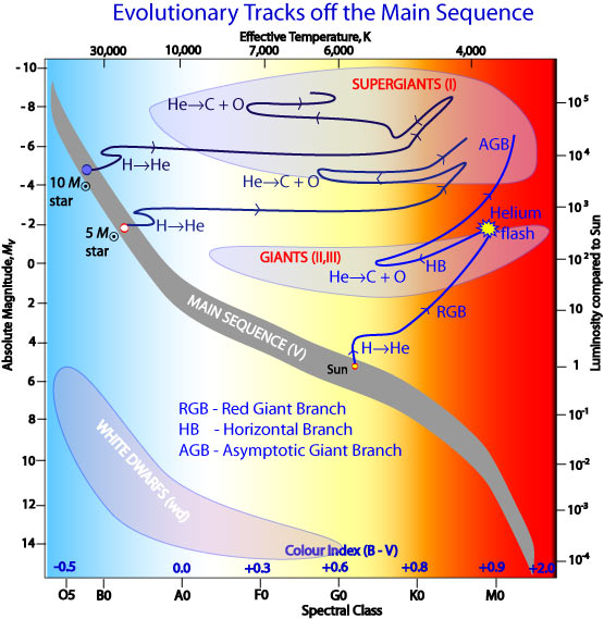
What to notice: once a Sun-like star exhausts core hydrogen, it does not drift gently. It leaves the main sequence, climbs the red giant branch, flashes helium, and later returns to the upper right on the asymptotic giant branch.
WRONG. Red giants are incredibly luminous despite their cool (red) color. Red comes from low temperature, but large radius compensates. Antares is a red supergiant 16,000 times more luminous than the Sun, yet it’s barely visible to the naked eye because it’s so far away. Nearby, Sirius (a hot white star) appears much brighter to us, but Antares would outshine it if they were at the same distance.
WRONG. Different types of stars occupy different regions. Most stars we observe are main sequence dwarfs (small, dim M-types) because they outnumber giants 100 to 1. But bright giants are overrepresented in naked-eye catalogs because we can see them from far away. If you list “bright stars,” you’re biased toward giants; if you count “nearby stars,” you’re biased toward low-mass dwarfs.
Deep Dive: The Historical Discovery
Independently, in 1911–1913, two astronomers — Ejnar Hertzsprung (a Danish chemist) and Henry Norris Russell (an American astrophysicist) — discovered the pattern. They did not have computers or even electronic calculators. They plotted points by hand.
What they found was so striking that it seemed impossible at first. Why would a random sample of 300 stars arrange themselves into such an organized pattern? The answer had to be that luminosity and temperature were physically connected.
Hertzsprung’s interpretation was quick: the relationship must come from stellar radius and temperature. By the 1920s, astrophysicists realized that main sequence stars were fundamentally different objects from red giants — not in age, but in structure. Main sequence stars burn hydrogen in their cores in a self-regulating way. Red giants have different internal structures. This distinction is the foundation of stellar astrophysics.
The H-R diagram unified astronomy. A single graph revealed that stars are not all the same. They have types, structures, and lifespans determined by a hidden variable: mass.
The H-R diagram mattered because it revealed that stellar temperature and luminosity are physically connected, not randomly paired.
Observable: We measure the brightness and spectral type of a star.
Model: We know that luminosity comes from a star’s surface area and temperature (Stefan-Boltzmann law). Since \(R^2 \propto L/T^4\), or equivalently \(R \propto \sqrt{L}/T^2\), we can infer stellar size from luminosity and temperature together.
Inference: Most stars fall on a diagonal band (the main sequence). Using stellar structure theory, we infer that main sequence stars are powered by hydrogen fusion, and their position is determined by mass. Red giants are in a different evolutionary phase: their cores have run out of hydrogen. White dwarfs are dead stellar cores.
A Practical Example: Reading the H-R Diagram
Let’s practice interpreting an H-R diagram with a concrete example.
Given: You discover a new star. Spectroscopy tells you it is a G5 star, so its temperature is about \(5{,}500 \, \mathrm{K}\). You measure its luminosity as \(100 \, L_\odot\). Where does it lie on the H-R diagram?
Step 1: Plot the temperature.
- G5 is a G-type star, so look at the G region on the x-axis (between F and K, hot \(\rightarrow\) cool reversed).
Step 2: Plot the luminosity.
- 100 \(L_\odot\) is 100 times more luminous than the Sun. On a logarithmic scale, that’s two decades above the Sun. Draw a horizontal line to 100 on the y-axis.
Step 3: Interpret with the Stefan-Boltzmann law.
Relation:
\[ \frac{L}{L_\odot} = \left(\frac{R}{R_\odot}\right)^2 \left(\frac{T}{T_\odot}\right)^4 \]
Rearranged relation:
\[ \frac{R}{R_\odot} = \sqrt{\frac{L/L_\odot}{\left(T/T_\odot\right)^4}} \]
Because \(T \approx T_\odot\) for a G5 star, this simplifies to
\[ \frac{L}{L_\odot} \approx \left(\frac{R}{R_\odot}\right)^2 \]
so
\[ \frac{R}{R_\odot} \approx \sqrt{\frac{L}{L_\odot}} \]
Substitute:
\[ \frac{R}{R_\odot} \approx \sqrt{100} \]
Evaluate:
\[ \frac{R}{R_\odot} \approx 10 \]
Interpretation: The star’s radius is about \(10 \, R_\odot\), so it belongs on the red giant branch, not on the main sequence.
Step 4: Predict the future.
- This is not a main sequence star, so it’s not burning hydrogen in its core. It’s an evolved star — a red giant in its death throes. In a few billion years (for Sun-like stars) or much sooner (for more massive ones), it will shed its outer layers and become a white dwarf.
A star’s H-R diagram position lets you infer not just temperature and luminosity, but also size and evolutionary state.
Deep Dive: Colors on the H-R Diagram
We’ve mentioned color many times (O-type stars are blue, M-type stars are red), but let’s connect it explicitly to the H-R diagram.
The color of a star is determined by its temperature via Wien’s displacement law (Lecture 8):
\[ \lambda_{\max} T = 2.90 \times 10^{-3} \text{ m} \cdot \text{K} \]
Hotter stars peak in the blue; cooler stars peak in the red.
On an H-R diagram:
- Left side (hot): Stars are blue
- Right side (cool): Stars are red
But here’s a subtlety: the color you see also depends on how bright the star is. A faint red dwarf looks dim and reddish. A bright red supergiant looks brilliant and deep red. The intrinsic color is the same (both determined by temperature), but the brightness makes a perceptual difference.
In professional astronomy, we use color indices — the difference in brightness between two wavelength bands (e.g., blue vs. red) — to infer temperature without needing a full spectrum. The (B — V) color index (blue magnitude minus visual magnitude) is especially common. On an H-R diagram, the x-axis is sometimes labeled with (B — V) instead of spectral type.
The More You Know: Hertzsprung Gap
One peculiar feature of the H-R diagram is the Hertzsprung gap — a sparse region between the main sequence and the red giant branch, especially noticeable around spectral type A.
Where are all the medium-mass A-type stars? Why do they seem to “jump” from the main sequence to the red giant branch?
The answer is timescales. For stars of intermediate mass (~1.5–2 \(M_\odot\)), the transition from core hydrogen burning to red giant evolution happens fast — on a timescale of millions of years, not billions. So at any given time, very few are caught in the transition. The gap is sparse because stars cross this part of the diagram quickly.
This detail is less critical for an intro course, but it illustrates how the H-R diagram reveals the dynamics of stellar evolution.
Deep Dive: Absolute Magnitude and the Distance Ladder
In Lecture 15, we learned that apparent magnitude \(m\) (what we see) and absolute magnitude \(M\) (intrinsic brightness) are related by distance.

What to notice: a bright-looking star is an ambiguous clue. It could be nearby, intrinsically powerful, or both. Astronomy becomes a science when we separate those possibilities.
The H-R diagram is often plotted with absolute magnitude on the y-axis instead of luminosity. Absolute magnitude is simply a logarithmic brightness scale:
\[ M = -2.5 \log_{10} L + \text{constant} \]
(The constant just sets the zero point; absolute magnitude is defined so that the Sun has \(M_V \approx 4.8\) in the visual band.)
Higher (numerically larger) values of \(M\) mean dimmer stars. Lower (more negative) values mean brighter stars.
When you see an H-R diagram plotted as absolute magnitude vs. color or spectral type, it’s the same diagram — just with a logarithmic brightness scale that runs downward instead of upward. Many professional H-R diagrams use this convention.
Summary: The H-R Diagram as a Decoder Ring
Observable
Astronomers begin with two measurable clues: color or spectral type and intrinsic brightness. Once those are placed on a graph, stars stop looking random.
Model
The Stefan-Boltzmann law tells us that luminosity depends on temperature and radius. Stellar structure adds the next layer: along the main sequence, mass controls core conditions, which in turn control temperature, luminosity, radius, and lifetime.
Inference
Use these five memory anchors:
- Hotter is left; cooler is right.
- Most stars lie on the main sequence.
- Giants are cool but bright because they are huge.
- White dwarfs are hot but dim because they are tiny.
- Along the main sequence, moving upward-left mostly means increasing mass.
The H-R diagram is a map of stellar structure: temperature on one axis, luminosity on the other, and radius plus mass hiding underneath.
Observable: For thousands of nearby stars, measure spectral type and luminosity.
Model: Plot on a two-axis graph. Luminosity depends on both temperature and radius via Stefan-Boltzmann. Stellar structure theory connects mass to core temperature and thus luminosity.
Inference:
- Most stars lie on the main sequence, where position mainly tracks mass rather than age.
- Red giants are evolved stars with different internal structures.
- White dwarfs are stellar remnants.
- Stars do not randomly scatter in temperature-luminosity space; they follow clean, physically determined sequences.
Practice Problems
Solutions are available in the Lecture 16 Solutions.
Core Problems (Start Here)
Problem 1: Spectral Type and Temperature
The star Rigel has spectral type B8. The star Betelgeuse has spectral type M1. Which is hotter? By approximately how much?
Problem 2: Reading the H-R Diagram
On an H-R diagram, you locate a star at (spectral type A5, luminosity 10 \(L_\odot\)). Is this star on the main sequence? How do you know?
Problem 3: Stefan-Boltzmann Reasoning
Two main sequence stars have the same luminosity. Star A is hotter than Star B. Which is larger? Justify your answer using the Stefan-Boltzmann law.
Problem 4: Giants vs. Dwarfs
Explain why a cool red giant can be much more luminous than a hot white dwarf, even though the white dwarf is hotter.
Problem 5: The Main Sequence as Mass
If you move up and to the left along the main sequence (hotter, more luminous), are you moving to more massive or less massive stars? Explain.
Challenge Problems (Deepen Your Understanding)
Challenge 1: Radius from the H-R Diagram
Sirius A is an A1 main sequence star with luminosity 26 \(L_\odot\) and temperature 9,940 K. The Sun is a G2 main sequence star with luminosity 1 \(L_\odot\) and temperature 5,778 K.
Using the Stefan-Boltzmann law, calculate the radius of Sirius A in units of solar radii.
How would Sirius A appear on an H-R diagram relative to the Sun? (Move left or right? Up or down?)
Challenge 2: A Mysterious Star
An astronomer observes a star and determines: spectral type G0 (temperature ~6,000 K), luminosity 0.0001 \(L_\odot\).
Is this star on the main sequence? How do you know?
What region of the H-R diagram does it occupy?
Estimate its radius using the Stefan-Boltzmann law. (Hint: The Sun is G2, 5,778 K, 1 \(L_\odot\), and 1 \(R_\odot\).)
What type of star might this be (main sequence dwarf, white dwarf, or red giant)?
Challenge 3: The Hertzsprung-Russell Diagram and Stellar Lifetime
Stars on the upper left of the main sequence (hot, massive, luminous) burn their fuel much faster than stars on the lower right (cool, low-mass, dim). The lifetime of a main sequence star scales roughly as \(\tau \propto M/L\).
If a 10 \(M_\odot\) star is about 3,000 times more luminous than the Sun, estimate its main sequence lifetime relative to the Sun’s (~10 billion years).
Why does the H-R diagram show so few O and B stars relative to M dwarfs, even though they’re born in similar numbers? (Hint: Think about timescales.)
Glossary
- ★ Absolute Magnitude
- The brightness a star would have if placed at a standard distance of 10 parsecs. A logarithmic scale (lower/more negative = brighter).
- ★ Hertzsprung-Russell Diagram (H-R Diagram)
- A scatter plot of stellar luminosity (y-axis) vs. temperature (x-axis). Reveals that stars are not randomly distributed but organized by physical processes.
- ★ Main Sequence
- The diagonal band on an H-R diagram containing ~90% of all stars. Stars on the main sequence burn hydrogen in their cores; their position is determined by mass.
- ★ Red Giant
- A star in an advanced evolutionary phase with a huge radius (10–100 solar radii), cool surface (K or M spectral type), but enormous luminosity. Located in the upper-right region of the H-R diagram.
- ★ Red Supergiant
- An even larger and more luminous version of a red giant, with radius 100–1,000 solar radii. Examples: Betelgeuse, Antares.
- ★ Spectral Class/Type
- A classification of stars based on the pattern of their spectral lines, which directly reflects surface temperature. Sequence: O, B, A, F, G, K, M (hot to cool).
- ★ Stefan-Boltzmann Law
- \(L = 4\pi R^2 \sigma T^4\). Luminosity is proportional to surface area and the fourth power of temperature. Shows why large stars can be luminous despite being cool.
- ★ White Dwarf
- A dense stellar remnant, roughly Earth-sized, with a very hot surface (often >10,000 K) but low luminosity. Located in the lower-left region of the H-R diagram.
- ★ Wien's Displacement Law
- \(\lambda_{\max} \propto 1/T\). The peak wavelength of a star's thermal radiation is inversely proportional to its temperature. Hotter stars are bluer; cooler stars are redder.
Looking Ahead
Next lecture (Lecture 17), we’ll derive the mass-luminosity relation — the quantitative rule that connects a star’s mass to its position on the main sequence. We’ll see why more massive stars are more luminous and why this relationship is so clean.
After that (Lectures 18-21), we’ll explore how stars evolve: How stars form, what happens when a main sequence star exhausts its core hydrogen, how red giants form, and why some stars become white dwarfs while others explode.
The H-R diagram is the foundation. Master it now, and the rest of stellar evolution will fall into place.